Monday, February 26, 2018

The Clark: A Fine Museum

Williamstown is in the northwest corner of Massachusetts. It is the home of Williams College, one of the so-called Little Ivies -- small, elite colleges in the Northeast that in some respects are comparable to the more famous Ivy League schools such as Harvard, Yale, Princeton, Dartmouth, Penn and so forth.

Also in Williamstown is the Sterling and Francine Clark Art Institute, founded by Singer Sewing Machine heir Robert Sterling Clark. Its web page is here. A major part of the Institute is its museum which houses some outstanding paintings.

It happened that for more than four years I lived and worked in the Albany, New York area, about 45 miles west of Williamstown. During that time, I'd drive through Williamstown maybe three or four time a year. And never visited The Clark. That's because I was focusing on demography and my interest in art was at a comparatively low ebb. Moreover, I was still somewhat in the brainwashed-by-modernist-ideology zone and besides, not a fan of French Impressionism. So if I'd been informed about the Clark and its collection, it wouldn't have interested me.

In more recent times, I've become aware of what The Clark has. But by then I was living in Seattle and seldom got to the East Coast, let alone western Massachusetts. In September I finally arranged a trip to visit a number of art museums that I either hadn't seen before or hadn't visited in years. Which is how I got to The Clark at last.

Indeed, its collection is very good. Below are some of the paintings I saw. The images are pulled from The Clark's website and can be enlarged slightly.

Gallery

Fumée d'ambre gris - 1880 - John Singer Sargent
This is one of my very favorite Sargent paintings.

Nymphs and Satyr - 1873 - William Bouguereau
And this is my very favorite Bouguereau. So that Sargent and this Bouguereau made the visit well worth the effort. Below are some other paintings of interest.

Carolus Duran - 1879 - John Singer Sargent
Sargent studied under Duran, and painted this well-known portrait.

Self-Portrait - 1857-58 - Edgar Degas

Rouen Cathedral, The Façade in Sunlight - 1892-94 - Claude Monet
One of a large series featuring the cathedral at different times of day.

Waiting - c.1887 - Henri de Toulouse-Lautrec
Not the usual sort of Lautrec work.

The Bridle Path, White Mountains - 1867 - Winslow Homer
Again, something different from what the artist is known for.

Crossing the Street - 1873-75 - Giovanni Boldini
Painted after Boldini moved to Paris, but before he developed his flashy, bold, portrait style.

Friends or Foes? (The Scout) - 1902-05 - Frederic Remington

Thursday, February 22, 2018

Yves Tanguy, Self-Taught Surrealist

Raymond Georges Yves Tanguy (1900-1955) suddenly decided to become an artist not long after he completed his French Army service. Shortly after that, he became involved with the new Surrealist movement. Even though he wasn't formally trained as an artist, he acquired the necessary oil painting skills to produced"finished" looking works. On the other hand, so far as I've been able to find on the Internet, Tanguy never painted anything recognizable: no people, no still-lifes, no landscapes. To that extent, lack of formal art training didn't matter to him or to the many prominent museums that acquired his paintings.

His Wikipedia entry is here, and his Guggenheim page is here.

Once Tanguy settled into his version of Surrealism, he mostly painted variations of a basic plan. Its elements included a fairly plain "sky" area that usually took up a large share of the upper part of his canvases along with various visually solid (i.e., not flat) shapes in the lower part. Effort was made to depict those shapes to appear as realistic as possible, not as sketchy or outlined elements as conventional 1930s modernists such as Picasso might have done. This practice was in line with the Surrealist visual arts thought of Salvador Dalí: the invented world should be depicted as if it were real.

Below are examples of Tanguy's work in chronological order. Most are found in major museum collections.

Gallery

Mama, Papa is Wounded! - 1927
From around the time of his first exhibit, also fairly early in terms of visual (non-literary) Surrealism.

The Sun in Its Jewel Case - 1937
Painted during Surrealism's glory years.

Slowly Toward the North - 1942
Tanguy sometimes painted dark scenes.

La produge - 1943

The Rapidity of Sleep - 1945

The Wish - 1949

The Invisibles - 1951

Imaginary Numbers - 1954
A late painting made shortly before his fatal stroke.  It and some similar ones were a break from his usual style.

Monday, February 19, 2018

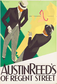
Tom Purvis' Austin Reed Posters

Tom Purvis (1888-1959) was a leading British poster artist during the 1920s and 1930s, especially after his style evolved into simplified shapes with areas of flat color and no outlining.

Purvis' Wikipedia entry is here, but as of the time this post was drafted (late December 2017), it was not very informative. More biographical information can be found here, but you will need to scroll down to find it.

Although he worked for a number of clients, he is best known for his railroad posters and those for Austin Reed, a clothier. Both Austin Reed and Purvis were at their peak when the posters shown below were created. Purvis moved on to portrait work and religious painting in the years following World War 2. Austin Reed went bankrupt in 2016 and its remains were acquired by Edinburgh Woolen Mill. As I write this, there are no Austin Reed stores in London.

Gallery

For most of its existence, Austin Reed's flagship store was located at the lower end of Regent Street, not far from Piccadilly Circus.

Judging by the woman's hairdo and dress, this poster was painted no earlier that the very late 1930s.

This poster is from around 1935.


This is from 1932.

An earlier poster. The woman's costume is from the mid-to-late 1920s. Note the different Purvis technique.


Fenchurch Street is in the City. That was more convenient for City workers, avoiding a trek to Regent Street in the West End.

Thursday, February 15, 2018

George Wunder's Terry and the Pirates Background Detailing

American newspaper comic strips were greatly reduced in size decades ago and their content was reduced to various kinds of humor. Gone were the plot-continuity strips occupying a half or even a full page such as were found in 1930s Sunday papers.

One such strip was Terry and the Pirates, an adventure series taking place in China. When World War 2 came along, it evolved into a military-themed strip. By late 1946 Milton Caniff, its creator, had tired of the distribution syndicate's control and moved on to create an Air Force themed adventure strip.
Due to its popularity, Terry was continued by another artist, George S. Wunder (1912-1987) -- Wikipedia entry here. Wunder has been criticized, with some justification, for his treatment of faces. But what interests me here is the degree of background detailing found in his version of Terry, a carryover from strips of the 1930s and still common into the 1950s. That is, Wunder ranked up there with other cartoonists whose strips still went well beyond containing mostly faces and dialog balloons.

Background settings require a lot of extra work for the cartoonist who was under pressure to maintain about a six-week backlog to allow for production and distribution to newspapers carrying the strip (and for times when the artist was ill or otherwise not productive). The link to Wunder mentions that he took on an assistant in 1962, implying he did it all before that time (and stating that he continued to do the Sunday strips alone). A rational division of labor would be for the main artist to deal with the characters and leave backgrounds and other detailing to assistants.

Below are some examples of Wunder's Terry and the Pirates from his first five years on the job. Click on the images to enlarge.

Gallery


October 27, 1947
A daily panel featuring Terry, Pat Ryan, Hotshot Charlie and slang-talking Chopstick Joe who is always on the lookout for making money.

June 22, 1947
Now for some Sunday strips...

July 13, 1947

May 1, 1949

July 31, 1949

September 22, 1951
This seems to be original art -- note how the title and artist's name are attached to provide consistent branding over time.

Monday, February 12, 2018

Dennis Miller Bunker: Died Far Too Young


The painting above is "Dennis Miller Bunker Painting at Calcot" by John Singer Sargent (1888). Dennis Miller Bunker (1861-1890) lived just 29 years, but showed considerable promise, as Sargent seemed to have realized.

Some biographical information is here, and some of Bunker's thoughts regarding being an artist can be found here.

Bunker was a solid traditional/representational painter who spent a year or two in France when French Impressionism was gaining acceptance and Post-Impressionism was getting underway (Manet died in 1883 and Seurat was about to paint his masterpiece, "Un dimanche après-midi à l'île de la Grande Jatte"). He made some oil sketches that seem to lie in the gray zone between being simply sketches and being a sort of Impressionism -- it's difficult to tell. But he largely continued on a traditional path after returning to America. There is no way of telling what he might have painted had he lived into the era of modernist "isms."

Gallery

The Shed, Cold Spring Harbor - 1880
Painted when Bunker was about 19.

Beached - c. 1882
Another fairly elaborate sketch -- note that here and in the previous work he signed with only his initials.

Lacroix, St-Ouen, Oise - 1883

Brittany Town, Morning, Larmor - 1884
Some French plein air type scenes.

Tree - 1884
This painting is also signed using initials.

Anne Page - 1887
A portrait reminiscent of Whistler's work.

Second Portrait of a Woman - undated

The Mirror - 1890 - (Julia "Dudie" Blair)
A late work. I wrote about her here.

Thursday, February 8, 2018

Railway Posters by Frank Newbould

Frank Newbould (1887-1951) was an almost exact contemporary of fellow poster artist, the better-known Tom Purvis. Both did a good deal of poster art for British railway companies in the 1930s, especially the LNER (London and North Eastern Railway). Also, by 1930 both were using a style featuring many broad areas of flat colors where outlining was scarce or entirely absent. Unfortunately, I don't have enough information to say who practiced that style first (I suspect Purvis), though it became associated with the LNER due to its extensive use.

Not a lot of biographical information on Newbould is on the Internet, so this Wikipedia entry will have to do for now.

Newbould's work was strong, but I rate him not as good as Purvis or Fred Taylor, another railway poster man. Below are his posters for domestic sites. He also did Continental scenes that I might deal with later.

Gallery

A nice, strong poster for the spa town not far from York.

A silkscreen look, even though this was probably a lithograph.

Another nice design, this for an East Anglia port town.

Post for a Scottish destination.

On the North Sea coast, a few miles north of the mouth of the Tyne.

A more extremely simplified design, this for the Great Western Railway.

Yorkshire coastal town about 15 miles south of Scarborough.

This poster and the one above have a different typographical theme than the others.  My guess is that they date from shortly before British railroads were nationalized in 1948.