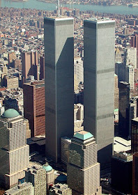
The 10th anniversary of the destruction of New York City's World Trade Center is coming in a few months. Since this is an art and design blog, I thought it might be worthwhile to mention the WTC's architect, Minoru Yamasaki (1912-1986). His Wikipedia entry is here, and contains a long list of the buildings he designed. For a more detailed biography, however, click here -- though be warned it's a bit Seattle-centric.
Yamasaki, like his near-contemporary Edward Durell Stone, could not quite come to terms with International Style architecture and resorted to applying touches of decoration. That decoration usually had an industrial, cookie-cutter repetition to it -- perhaps an early Postmodern wink-and-nudge that the decoration wasn't (or maybe really was) serious; perhaps there's a justification for ambiguity.
The World Trade Center design didn't appear from a void. A structural prototype of sorts was built in Yamasaki's home town, Seattle, a few years earlier and some design themes were tested there too. Let's take a look.
Gallery
World Trade Center (1970-71) - general view
World Trade Center - street-level
The towers were so huge and surrounded by other buildings that a comprehensive take isn't possible from photography. At the top is an aerial image that corresponds to what many of us have in mind when the WTC is mentioned. But the structures weren't all just narrow windows flanked by vertical strips; at the base some of those strips merged into Gothic-like pointed arches, as can be seen in the photo immediately above.
Pacific Science Center (1962) general view
Century 21, Seattle's 1962 international exposition, included a work by Yamasaki -- a cluster of structures now named the Pacific Science Center. The best-known feature is the Gothic towers shown here.
Pacific Science Center - ground-level view
For our purposes, the base detailing is of most interest. Note the similarity to the Trade Center street-level two photos up. No, the detailing isn't identical, but the spirit is consistent.
IBM Building, Seattle (1963)
Apologies for the poor image, but it was the best I could grab off the Web showing the entire building. My understanding is that structural ideas used in the WTC were first developed for the IBM building. Some of this is apparent in the similar window treatment. The only superficial differences of note are the use of rounded, rather than pointed, arches at the bottom and the lack of elevator lobby breaks. Seattle's IBM Building still stands, though it's now overshadowed by larger structures nearby.


No comments:
Post a Comment