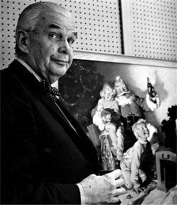
Haddon Sundblom (1899-1976) is one of those illustrators whose work I greatly respect and almost, but don't quite, love.
His Wikipedia entry offers a too-short sketch of his career. At least it makes the point that a number of other competent illustrators worked at his studio and were influenced by him; this is one of his important claims to fame.
Leif Peng has dealt with Sundblom on his blog, and you might want to click on these links.
What maintains Sundblom's fame (among illustration buffs, anyway) is the work he did for Coca-Cola. He painted many illustrations of Coke-enjoying people for print, poster and billboard advertising. But the big thing was his Santa Claus series and, to a lesser extent, the "Frosty" character -- a smiling elfin creature always posed by a bottle or glass of the beverage.
Here are examples of Sundblom's work, with a slight emphasis on his earlier illustrations.
We might as well start with a Santa. From what I've read, Sunblom began to use himself as his model as he aged into the part.
Here's Sundblom when he was older and in synch with his Santas.
And, just for the record, here is a Coke ad, probably from the 1940s.
Now for some non-Coke illustrations, this being an ante-bellum Southern scene.
A 1920's illustration.

Also from the 20's.
Magazine cover art.
This is a later painting, probably done in the 1940s when he applied paints thicker and smoothly, a practice he was following by the mid-1930s.
Magazine work from 1933.
I respect Sundblom for his skill in portrayal and, especially, for his way of handling paint in a pleasing thick, buttery manner.
Yet something bothers me just enough that I can't place Sundblom with contemporaries such as Dean Cormwell, John La Gatta and Mead Schaeffer. Maybe it had to do with stereotyping or pigeonholing by clients and art directors. Perhaps it was Sundblom's preference. In any event, the result was that little of his work had drama or "bite" of any kind. To some degree this is like fellow Chicago illustrator Andrew Loomis whose style was somewhat similar and whose subjects were more pleasant than edgy or dramatic. This is not to say that I favor drama and edginess -- though a whiff of something like that either in subject matter or painting technique appeals to me for some reason.


I'll make a guess here that what makes you see this work as somehow "lacking" is its focus on upper middle class white existence, with no indication of the economic or military events of the 1930's and 1949's. Looking backward, this somehow comes across as ... gemutlich, bourgeois, relentlessly middle-brow. A Norman Rockwell for the interior pages.
ReplyDeleteOther hand, I find this material fascinating because it "echoes" with my past perceptions. The people in Sundblom's work are thinner than modern Americans, the hair styles differ somewhat... but even more than that, these are not the faces of Americans in the year 2011. But they have the shape and features and color of faces that I remember from my boyhood in the early 1950's. They make me remember a bit of what it was to see the world through 6-year old eyes. I doubt that was the intended effect, but still!
Mike -- Actually I prefer what the left-leaning artists in days of yore sneered at as "bourgeois" subjects. Plan to post on that some day once I sort through some ideas further.
ReplyDeleteAnd I don't dislike Sundblom's work; I like it a lot. Especially from a technical standpoint. The point of the post was that, in my mind, he sitteth not (quite) by the right hands of Fuchs, et. al.
To bump a sleeping thread, I came here from a recent comment you made on Leif Peng's blog. I read down to this point-- an interesting blog!
ReplyDeleteI too study Sundblom illos. I love his alla prima handling of whiskers, wool felt and shoe leather, a lost skill these days. I'm intrigued you have an issue with his lack of drama--'buttery' indeed-- his audience wanted some "feel good" and to smile after a Depression followed by a World War! After a WWII vet pointed this out, I looked at the bland Eisenhower Era much differently!
However, I'm shocked every time I see Sundblom's antebellum image you're showing. It has technical proficiencies everywhere-- dappled sunlight, period costume demands, a very difficult patch of light under the carriage, ... What shocks is the crude way the carriage wheels are handled! First, such costume finery of the passenger and her escort suggest the wheels would be painted. Enamel paint was functionally a weather-protection against aging and breakdown. Unpainted, they would show weathering. There is no value change; they look unfinished. Next, I can't make out that the front wheels are on hard pavement yet they sit atop-- not into-- the dirt. Maybe he was indicating dusty cobblestones? Still, to me it looks like it's levitating. The last shock is the large wheel, out of parallel with the plane of the coach, and out of line with the front wheel. Ah well, thanks for letting me make an observation. To echo your lament, I wish I could do a painting half this well.
David