Friday, July 29, 2011

Molti Ritratti: Lillie Langtry


Lillie Langtry (1853-1929) was free with herself, as her Wikipedia entry describes. At least her favors were distributed in the better social circles, one of her lovers being the Prince of Wales, future King Edward VII.

Given her connections and notoriety, a number of portraits of her were painted and photographs made. Go to Google and Bing to view photographs; below are some of the painted portraits.

Gallery

A reference photo

By John Everett Millais

By Edward John Poynter

By George Frank Miles

By James Sant

By Valentin Prinsep

By George Frederic Watts

Photos of Lillie show no outstanding beauty. I'd rate her as conventionally attractive and have to conclude that her well-documented appeal must have been largely fueled by her personality, including how she carried herself.

As for her looks, it seems that she had a "good side," or thought that she did. Note that there are no views featuring the right side of her face.

Wednesday, July 27, 2011

Gabriel von Max: A Seattle Sighting


Seattle's Frye Art Museum has had quite a few weird exhibits over the last several years -- postmodern stuff that's far, far removed from what was called Fine Art. All is not lost, because once every year or two they mount a show that plays to the strength of the museum's Founding Collection of mostly late 19th century Bavarian art. Works from that collection are supplemented by paintings from German museums and private collections, giving viewers a look at what was being done around Munich, a major rival to Parisian art of that day.

Last year the Frye had an exhibition of paintings by Albert von Keller which I wrote about here. Keller did good work, but some of it seems odd today thanks to its subject matter; he was deep into the world of spirits and seances.

Since that viewpoint was widespread (if not deep) during the late 19th century, I can't blame it on the water. Must have been one of those zeitgeist thingies. At any rate, the Frye recently opened another exhibit by another painter who worked in Bavaria and, by the way, also was interested in those things. But not quite in the same way.

This artist is Gabriel von Max (1840-1915), who was of a more scientific bent than Keller, being a collector of artifacts and student of primates, which he also collected. According to the exhibit catalog, Max said that he was interested in antecedents of mankind and our future after death. This led him to paint subjects exhibiting spirituality in both occult and traditional religious guises.

Max (he was awarded the "von" later in life) hit the artistic fast track in his late twenties with some skillfully done paintings that were "edgy" circa 1870 (see the first three images below).

One artistic characteristic of his that I found interesting while viewing the exhibit was his reversal of the common advice that it's best to make focus-area details sharp and slightly blur less important parts of the painting. In several of the paintings I saw, faces (the expected focus) were slightly blurred and clothing details were crisp. An example is "The Ecstatic Virgin" below, though it's hard to discern in the small image shown. In person, this was apparent when standing six feet or so from the painting, but from 20 feet away the image looked integrated.

On the other hand, he did the reverse. The last two paintings shown below are done in a feathery style save for the eyes which were have sharp detailing.

Of course the artist is free to do whatever he wishes, barring explicit restrictions imposed by a client or implicit constraints signaled by the art market. The focus directive generally results in more satisfying paintings, in my opinion, though I easily can make a list of exceptions. Regardless, Max clearly knew what he had to do to yield the result he desired.

Gallery

The Christian Martyr - 1867

The Anatomist - 1869

The Vivisectionist - 1883

The Ecstatic Virgin - 1885

Outside the Arena - 1880

Purgatory

Per Aspera! - 1898

He also painted many pictures of primates. I am not at all amused by chimps, apes and the rest so I won't post any of those images. But if you like them, I suggest going to Google or Bing to look up those examples of Max's painting.

Monday, July 25, 2011

Lucian Freud: An Appraisal Upon His Death


I've been dithering and dallying for a long time about writing a post on English painter Lucian Freud (1922-2011), grandson of psychoanalyst Sigmund Freud. Seeing as he upped and died a few days ago, I'm running low on excuses: so here goes.

His Wikipedia entry is here and the Telegraph's obituary here, the latter being quite interesting. The image sites in Google and Bing have plenty examples of Freud's work, though perhaps not many of the gamiest of his "spread shots" of male and female nudes; for those, you'll have to go to a bookstore with a good collection in its art section. The top picture above the text shows him at work on an uncharacteristically smooth painting of a nude, the lower shows a 1981 painting of his daughters Bella that provides a view of how he treated skin during his mature period.

What to make of Freud, the artist?

His career was successful. That's a good thing so far as I'm concerned; posthumous recognition is no comfort to a dead artist. He painted representationally. I find that good, too -- especially in an age when the artistic/cultural establishment dismissed that approach.

So how did this representational painter manage to forge a successful career running against the art fashion grain?

For one thing, his family name must have helped some. It caught the attention of art opinion leaders. It opened doors for commissions.

But what I think really mattered is that, aside from some landscapes, the art he produced is ugly. Modernism, especially in its postmodern guise, loves ugly. Ugliness and its cousin edginess somehow make art more "serious" than that old-fashioned, rather silly pursuit of beauty. And what is beauty but a social construct forged by an evil establishment (not to be confused with our humble, worthy, postmodern art establishment).

So Lucian Freud actually didn't stray all that far from the postmodern corral, cranking out ugliness in spades, painting after painting of overweight, over-aged or sometimes skeletal human figures, often nude with blotchy skin and sex organs the center of attention. On occasion he might feature a more conventional looking female nude in a painting and he most certainly favored such women in his personal life. But if you need to maintain your lifestyle in the age of postmodernism, you have to keep producing what sells.

It would have been interesting if Freud had made a stronger effort to get out of the stylistic rut that gained him his notoriety. To make a beautiful painting, for instance. If he could.

Friday, July 22, 2011

An Unfortunate House


Many American suburbs sprang up shortly after World War 2, with nearly all houses in place by around 1950 as growth spread farther out. Since many houses require major repairs and upgrades to wiring and other infrastructure by the time they're around 40 years old, not to mention expansions, kitchen and bathroom re-dos and so forth, one can see three or four major renovation projects going on every year in these neighborhoods.

Sometimes a house is razed and a new one put in its place. Then there are cases where the work done is legally a renovation yet the scale is such that it might as well have been a completely new house. Here is an example of the latter.

What happened was that all of the old building was ripped out aside from the rear outside wall -- that remaining fragment of the original building legally qualifies it as a renovation of an existing structure. The foundation was extended towards the street. Then new walls, floors and other parts were brought to the site and installed. I assume that many measurements were made and final plans for the prefabricating were done on a computer, with initial fabrication taking place on a smooth, concrete floor somewhere.

So far, that's okay with me. But let's take a look at the result in this particular case:


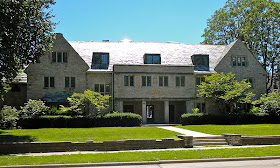
Note the odd, gray panels covering the exterior (to the right, there's an observation tower clad in green, but it's hard to see in the photo). Then there are windows that don't quite seem to relate to probable interior spaces; their placement seems designed from an exterior point of view. Even sillier are those light blue faux half-shutters.

The close-up shot of the entry area shows the metal posts and chain-link fence decor around the tiny porch.

The homeowner of course bears ultimate responsibility for the result because he had to okay the project. But did the architect (I'm assuming there was one if the owner didn't do the design work himself) convince the owner to accept a line of trendy archi-blather filled with terms such as "integrity to materials," "eco-friendly," "in synch with industrial-chic" and whatever other nonsense architectural theoreticians are throwing around these days?

Regardless of its architectural pedigree, I consider the house an unfortunate intrusion to its neighborhood.

Thursday, July 21, 2011

Sic Transit Borders


I'm drafting this on 20 July while contemplating this morning's Wall Street Journal report that the Borders bookstore chain is to be liquidated.

My thoughts and emotions regarding this are mixed. On the one hand, the marketplace is a cruel place that benefits us enormously, the price of those benefits being the loss of some businesses or even industries or fields that we truly liked. Now, I love bookstores. So I don't like it when one folds and like it even less when the loss is of an entire chain.

Borders and I go back a long ways. I used to consult for General Motors and would fly to Detroit a couple of times a year to meet with its Economics Staff. Since there was plenty of dead time during those visits, I'd drive around the metropolitan area to amuse myself. One of the places I'd go was Ann Arbor, home to the University of Michigan. Michigan is a rare university that doesn't have its own student bookstore, relying instead on stores located near campus. And sometime in the mid-1980s I discovered the original, pre-chain, Borders store on State Street near the top of Liberty Street.

At the time, Borders occupied what seemed to be two stores with the adjoining wall knocked out (though I might easily be mis-remembering). Not a lot of sales space by later big-box store standards, but large for the time. Best of all was the selection. Many books that I hadn't seen before even in bookstore-rich Seattle.

Naturally, I was pleased when Borders was transformed into a chain of large bookstores; there was even a Borders on Charing Cross Road in London. And for ten years or so I preferred Borders to its main competitor, Barnes & Noble, though that might have been due to the Tacoma store that had a fine collection of history and military books that attracted customers from the major military facilities in the area.

Eventually Borders began to slip in my esteem. The process was gradual, so it's hard to put a finger on this or that reason why. The cumulative result was that Borders stores seemed to have skimpier book collections than nearby Barnes & Noble outlets serving the same community. (Savvy bookstore chains make allowance for local preferences. I noted the military factor for the Tacoma Borders and I'll mention that the B&N in Seattle near the University of Washington and some highly upscale neighborhoods has a selection of art book surpassing most other B&N stores -- though their store in Santa Monica has a comparable art section.)

Eventually Borders stores seemed to be devoting half their floor space for non-book items, so I'd find myself in a Borders if there was no other bookstore to browse or if I wanted a Seattle's Best coffee rather than a Starbucks. (Yes, I know Starbucks owns Seattle's Best and will take a hit with Borders' demise, but I like its coffee better than Starbucks.)

Now that Borders is essentially gone, I can't say that I really miss it in the concrete even though I do miss it in the abstract.

Wednesday, July 20, 2011

Review: Masters of American Illustration


Amazon says it won't be out until mid-August, but my copy arrived a few days ago. That's Fred Taraba's book "Masters of American Illustration: 41 Illustrators & How They Worked" from the publisher of Illustration Magazine (link here).


I'm pretty cheap, but bought the book directly from the publisher instead of Amazon because I want them to stay in the business of providing junkies such as me biographies of illustrators and examples of their work; direct orders provide a better profit cut.

In his introduction Taraba tells us that the book originated as 41 articles in a magazine called "Step-by-Step-Graphics" in the 1990s. At the time he was working at the Society of Illustrators, so had access to both written material and people who could supply information and insights regarding the artists, all of whom were dead by 1989 when the project started.

The book contains the text of those articles with the minor changes that 20 years of new information and author insights inevitably bring. Also new were "more than 50" images.

Taraba's magazine articles did not cover Norman Rockwell, Howard Pyle, N.C. Wyeth and a few other titans of the field because accounts of their lives and work had been the subject articles and books and therefore not worth repeating.

I'm pleased that Taraba did include some of my favorites such as Mead Schaeffer, Saul Tepper and John LaGatta. Also in the book are some illustrators I'm not familiar with such as F.O.C. Darley. Then there a few whose inclusion I question such as Margaret Brundage whose ability to depict human anatomy was well under par for a professional illustrator of her era. But she did sci-fi/horror magazine covers, and the quality her work met the lower expectations for that genre in those days.

The illustrations in the book are nicely reproduced. Each artist's section begins with a two-page spread where one page is devoted to a single illustration, and there are other large illustrations that help the reader get a feeling for the artist's technique.

Speaking of technique (a factor of the book's "How They Worked" subtitle), depth of information varies from artist to artist. No doubt this was largely driven by material available to Taraba, so I can't fault him. Still, there were cases when the topic was barely touched on. Others such as Harry Beckhoff's writeup had significant detail.

There were informational gems including the fact that several illustrators made frequent use of mixed media. Given my woeful art training in college, I had blithely assumed that oil was oil, watercolor was watercolor, casein was casein, gouache was gouache and so on. It is only recently that I've been discovering (poor, ignorant me!) that illustrators would use whatever tool it took to get the job done, be it a touch of pastel in a highlight or some pencil on bits requiring detailed work. After all, their work was reproduced, so discrepancy between original art and what magazine readers saw was both expected and exploited by a canny illustrator.

Biographical information is also patchy depending on the subject, so there were cases where I wished there was a little more detail regarding an artist's training and personal life. But detailed information is where Illustration magazine steps in; much or all of an issue can be devoted a single illustrator.

Despite the small criticisms presented above, my reaction to the book is very favorable. It's far better than the generally shallow, chatty (but by no means useless) 1951 "Illustrating for the Saturday Evening Post" by Ashley Halsey, Jr. which covers 62 artists who contributed to the magazine during the late 1940s. Taraba's text is indeed informative as are the illustrations. The book takes a proud place on the shelf I reserve for illustration.

Monday, July 18, 2011

In the Beginning: Franz Kline


If asked who is my favorite Abstract Expressionist painter, I'd probably usually answer Franz Kline (1910-1962). That's because he was bold rather than subtle, and I seem to retain a child-like preference for boldness over subtlety (I make exceptions, of course).

Poor Kline didn't quite make it to his 52nd birthday thanks to his bad heart. But from a strictly artistic-legacy point of view, his personal tragedy was possibly beneficial. That is, I'm not sure that he would have continued what he had been doing decades after Abstract Expressionism began running out of steam and fashion around the time of his death. What would he have done that would have been as aesthetically and commercially successful?

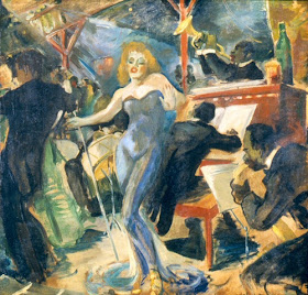
I'm not sure Kline's earlier painting would offer any clues, but I present some below as food for thought. They were grabbed off the Internet from here and there and I can't be absolutely certain that all of them were actually done by Kline. It's possible that there were misleading captions or misattributions, but this is hard to judge because Kline's early work is neither distinctive nor well-known.

Gallery

Hot Jazz - 1940

Palmerton, Pa. - 1941

Untitled circus scene - 1941

Entrance to Studio - 1947

Black on Green Red and Yellow - 1948

Friday, July 15, 2011

Greek-Letter Mansions


At first glance, they might remind one of an English country home or perhaps an exurban estate in America. In actuality they are a kind of college dormitory with enhanced social areas that can assume any number of architectural guises from Georgian to Greek Revival to Tudor to Modernist, depending on location and when the structure was built.

The subject is American college fraternity and sorority houses. The Wikipedia entry on the so-called "Greek" system is here, but I'll present my own overview before turning you over to the photos.

College secret societies began appearing in America during the second quarter of the 19th century. Secret societies featuring initiation rites and rituals were nothing new even then, but became a fad to the point where one fraternity (Delta Upsilon) was founded using the Old Switcheroo marketing principle of being non-secretive.

Another feature of college fraternities was the use of Greek words as names. Since those names were part of the society's secrets, they were publicly known only by the Greek initials of those names.

The first fraternities were for male students. In the second half of the 1800s, female Greek-letter societies emerged; they are called sororities, though some of the earliest ones (such as my wife's Kappa Kappa Gamma) still officially refer to themselves as fraternities.

With the advent of sororities and the socially more relaxed 20th century, the secretive aspect of Greek-letter societies waned and the emphasis shifted to making student life more fun through partying and other activities. This is reflected in the architecture of the buildings that housed these societies. Originally, the societies existed only in ordinary student living quarters, but this soon shifted to wood-frame rooming-house style buildings or converted row-houses for colleges in large cities such as Boston, New York or Philadelphia.

As membership grew from fewer than 20 initiates around 1910 to 30 and more by 1920, more and more purpose-built houses appeared. The typical layout was study rooms and sleeping porches in floors above street level. A basement might include a recreation room, a furnace and utility room, and perhaps a room where the secret chapter meetings were held. The ground floor would contain the kitchen, dining room, a large living room useful for social events such as dances and receptions, and perhaps a small library or auxiliary living room.

Membership in Greek societies grew rapidly through the 1920s with chapter membership averaging 35-45 at major colleges. The Great Depression slowed growth and weeded out weak chapters on most campuses. World War 2 resulted in the temporary shutting down of many fraternity chapters, though sororities thrived. Fraternities experienced a postwar boom fueled by GI Bill money and the lack of alternative housing as the nation shifted from wartime scarcity to a peacetime economy. Once the postwar surge ebbed, average memberships dropped to 50s and 60s. The late 1950s and much of the 60s was another expansion period where many chapters built new houses or, more typically, expanded existing structures.

Greek systems at most campuses cratered in the late 60s and 1975s, weaker chapters again being forced to close. By the 1980s, membership roles increased, reaching upwards of 200 for some sororities on West Coast campuses -- though 100 members is more typical maximum. Fraternity membership tends to be more variable. At the University of Washington, for example, fraternity chapters range from 20 to 100 members, the average being around 55.

So that's the overview. Let's turn to the architecture.

Gallery

Zeta Psi fraternity, University of Michigan - before 1900?
This building from (perhaps) the 1890s seems to be an early example of a purpose-built house with fancy touches that take it a step beyond the rooming-house type of facility common on most campuses until the 1920s.

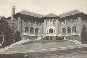
Phi Gamma Delta fraternity, University of California - 1928
Berkeley is on the northern fringe of California's Mediterranean climate zone, so the Fijis went for an Italianate style.

Phi Gamma Delta fraternity, University of Oklahoma
I don't know when this house was built, but the staging of the photo makes it look a lot like a motel.

Delta Delta Delta sorority, University of Georgia
This calm, colonial style house is appropriate for its Georgia location.

Delta Upsilon fraternity, University of Illinois - 1926
The University of Illinois has an interesting collection of Greek houses. Here is a Tudor style example with plenty of half-timbering.

Kappa Sigma fraternity, University of Michigan
An old photo; I don't know if the Kappa Sigs still use it. But it's a nice version of French Chateau architecture that would be more at home near the Loire than in Ann Arbor.

Phi Delta Theta fraternity, University of Illinois - 1922
Tudor style, but symmetrical, this Phi Delt house looks impressive in the photo.

Theta Xi fraternity, UCLA
Many fraternity and sorority houses at UCLA were constructed in the 1930s and featured a clean version of Spanish Colonial architecture appropriate to the Los Angeles area setting. Theta Xi is one of the first houses one encounters walking west from campus to Greek Row.

Sigma Kappa sorority, University of Washington
This Norman style building was where my daughter lived while at Washington.

Psi Upsilon fraternity, University of Washington
For some reason I always liked this Psi U house despite the half-timbering being on the verge of overdone.

Sigma Nu fraternity, University of Washington
This building dates back to around 1914, a surprisingly non-traditional style for its time.

Theta Chi fraternity, University of Washington
From the same architectural firm that did the Sigma Kappa house above.

Theta Xi fraternity, University of Washington
Built in 1926, this is where I lived as an undergraduate.

Thursday, July 14, 2011

Aha! So It Was Actually A Copy


Last winter I wrote about Disneyland and featured the national park lodge style Grand Californian Hotel.

Besides the decor, I included some photos of paintings that I assumed were done by Disney artists to enhance the early 20th century atmosphere of the place. This is one of the photos:


It turns out that the painting actually is a copy of this:

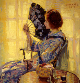
The Idle Hour - John Hubbard Rich - 1917

You can tell it's a (nicely done) copy because the patterns on the wall and Kimono don't exactly match and, more important, the copy doesn't have the artist's signature in the upper right hand corner.

Too bad the Disney folks didn't credit the source using a plaque or other device.

On the other hand, the Disney version is slightly stronger and less impressionistic. To me, this makes it a better painting than the original. (I know this was probably heretical to mention, but I can't help myself.)

Wednesday, July 13, 2011

Mackintosh Watercolors


Charles Rennie Mackintosh (1868-1928) the famed Art Nouveau era architect was better appreciated in Vienna and elsewhere in central Europe than he was in his native Scotland. The coming of the Great War which snuffed out contact with his admirers, along with the rise of what became known as International Style architecture, led to the collapse of his career, such as it had been.

He and his wife, the designer Margaret MacDonald, scraped by during the war and then, thanks to an inheritance from her mother, explored places to live that would be less expensive than London and better for dealing with her asthma. So they began an exploratory trip in 1923 that resulted in a move to the South of France.

From 1924 to 1927, when Mackintosh's cancer became evident, they lived on the Mediterranean coast in Port-Vendres which is about 10 miles (16 km) north of the Spanish border and not all that far from Salvador DalĂ­'s stomping ground.

By this time Mackintosh had become a full-time watercolorist. Besides the coast, he frequented the nearby eastern tail of the Pyrenees with its combination or terrain and picturesque villages whose buildings must have appealed to his architectural sense.

Below are examples of this work.

Gallery

The Boulders

Mont Alba

Port-Vendres, La Ville

The Little Bay, Port-Vendres

La Llagonne

I've only seen reproductions and not originals. But what I see is pleasing. It pleases me because of the hard, faceted, structured look and the strong compositions (Mackintosh was an architect, after all). Not what one thinks of when the concept "watercolor" comes up.

Monday, July 11, 2011

Sir William Beechey: Forgotten Portrait Painter


I can't find him indexed at The Athenaeum or Art Renewal Center. In fact, I had never heard of him until I was browsing galleries in the Portland [Oregon] Art Museum and came across a portrait by him.

My ignorance nothwithstanding, Sir William Beechey (1752-1839) was highly successful in his day though overshadowed in history by his flashier contemporaries Sir Henry Raeburn (1756-1823) and Sir Thomas Lawrence (1769-1830).

The Wikipedia entry for Beechey linked at his name above notes that he had 18(!!) children over a period of about 30 years by his second wife. As a demographer, I find this statistic fascinating: that approaches the maximum possible, even with two children perhaps having been twins. It has been years since I researched this, but as I recall, some women reportedly have had more than 20 births -- including some multiples per pregnancy.

As for his art, Beechey was certainly competent at portraiture, as the images below indicate. Had it not been for Raeburn and Lawrence with their greater painting flair, he probably would have been better known today.

Gallery

King George III

Lord Nelson

Miss Abernathy

Kitty Packe

Lady Beechey and Her baby