Last winter I wrote about Disneyland and featured the national park lodge style Grand Californian Hotel.
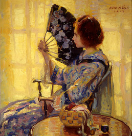
Besides the decor, I included some photos of paintings that I assumed were done by Disney artists to enhance the early 20th century atmosphere of the place. This is one of the photos:
It turns out that the painting actually is a copy of this:
The Idle Hour - John Hubbard Rich - 1917
You can tell it's a (nicely done) copy because the patterns on the wall and Kimono don't exactly match and, more important, the copy doesn't have the artist's signature in the upper right hand corner.
Too bad the Disney folks didn't credit the source using a plaque or other device.
On the other hand, the Disney version is slightly stronger and less impressionistic. To me, this makes it a better painting than the original. (I know this was probably heretical to mention, but I can't help myself.)


Hello Donald,
ReplyDeleteI have to say you have a nice blog and I've enjoyed it greatly! For some years time now, first in the Blowhards and then here. I also most of the time agree on what you have in mind and on top of that I've learned quite a lot of American art which, for natural reasons (being a Finn) I've been mostly unawear of. To be honest I didn't have too high an opinion it at the beginning but I've learned better!
Here is a case where I disagree though. Not for your herecy but for the handling of light in the picture. For me the original is more powerful in both the graduation of contrasts in valour( I'm not shure of the word?) and colour. Understandably it is more spontanuos as well.
So, I find the copy a bit dull when side by side.
But then may be it's different kinds of photos?
:)
But as I said I've enjoyed!
Have a nice evening,
Hannu
Hannu -- I'm wishing that the photo I took last December was better, but I suspect it was the best I could manage under the circumstances. It makes a direct comparison difficult because brushwork on it is harder to see than on the reproduction of the original. And, being taken in an artificial light setting, the colors in the photo are probably shifted from what the eye would see. (It's been 7 months since I saw it and forget exactly how it looked to me.)
ReplyDeleteStill, we shouldn't ignore that fact that, in most respects, the paintings are the same and the other fact that viewers' tastes vary.
To me, Rich's brushwork has a tinge of dithering whereas the Disney version's color areas are more coherent. And truth be told, that's why I respect -- but don't care for -- a number of paintings by Monet, Pissarro and some of the other small-brush-stroke Impressionists. As noted, it's a taste thing.
Thank you for following the blog; I greatly appreciate you and every other reader.