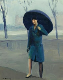
Guy Pène du Bois (1884-1958) studied art 1903-04 at the New York School of Art with Edward Hopper and Rockwell Kent, among others, under Robert Henri.
Hopper gained the most permanent fame from today's perspective whereas Kent and Pène du Bois were fated (again from today's perspective) to respectively become archetypical 1930s and 1920s representatives of American painting. Which is slightly ironic in Pène du Bois' case, because he spent much of the 20s in France.
A short Wikipedia entry is here, but for useful depth regarding Pène du Bois, read this article.
I find his paintings frustrating to look at. That's largely because of his simplification of facial detail -- eyes are sometimes depicted by a small slash of black paint -- and the sad fact (for Pène du Bois) is that most viewers tend to focus on a face if one is present in a painting.
What was going on, I think, is that he was caught up with the challenge of modernism, as was true for many of his contemporaries. There were several approaches taken in those days, but Pène du Bois opted for depicting people by means of simplified, solid images. This was in contrast to striving for flattened images in supposed conformity to the picture plane, an alternative favored by artists of a more theoretical temperament. My take is that Pène du Bois pushed the simplification option a little too far.
Here are examples of his work.
Gallery
The Arrivals - c.1918
Dining Out - 1919
Woman with Cigarette - 1929
Country Wedding - 1926
Opera Box - 1926
Carnival - 1927
Woman in Brooklyn - after 1929
Blue Armchair - 1923
Pène du Bois was quite capable of making representational depictions, but examples are hard to find on the Web; the image immediately above is one of the few I found that go in that direction. Examples I've seen off-line suggest that he tended to set modernism aside when painting family and friends.


These du Bois paintings are hard to look at, they are so awkward! You can see his technical abilty in the way he treats light and composition but it's obvious that he was pushing himself stylistically toward something that he had no inate feeling for. I appreciate this post for it's diadactic value; one should beware of trends!
ReplyDelete