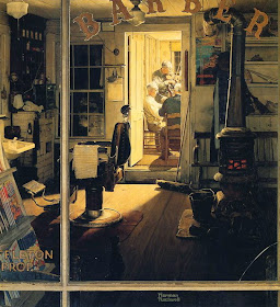
I should have noted the source at the time, and didn't. But I did read someplace that Norman Rockwell (1894-1978, Wikipedia entry here) lighted his subjects from the direction of the viewer, this minimizing use of shadows. I hadn't thought of that before.
And that's true. Though not entirely.
Many of Rockwell's cover illustrations for the Saturday Evening Post were indeed front-lighted, and I'm not sure why. Perhaps he explained somewhere, but I don't recall having seen an explanation. (Let us know in Comments if there is one.)
Perhaps it had to do with the tastes of the editor and art director, though this is unlikely because Rockwell used this lighting scheme before and following major changes in senior editorial positions at the Post in the years around 1940.
Another possibility is that Rockwell thought he could complete his work faster if he didn't have to spend time working out shadow patterns and their coloring. Or maybe he figured that even a little chiaroscuro (light-shade treatment) would detract from the story he was trying to tell in his illustration.
That said, he was willing and able to use lighting from other angles. Below are examples of both cases.
Saturday Evening Post cover illustration - 19 November, 1938
Saturday Evening Post cover illustration - 26 July, 1941
Saturday Evening Post cover illustration - 25 December, 1950
These three illustrations show Rockwell's use of front lighting; all happen to be for Saturday Evening Post covers. The bottom illustration includes images of Rockwell himself (with a pipe in his mouth) along with friends and neighbors.
Alcott's Jo - Woman's Home Companion - December, 1937
This is probably a story illustration. Note that Rockwell chose to have a window with bright, though from overcast, exterior light behind his subject. At the same time, he had to fudge real-world lighting by painting Jo's face as though light was shining directly upon it even though it should have been shaded from the comparatively strong light coming through the window. Perhaps there is also an interior light source, say from an oil lamp, though that is not clear from details in the image.
The Lineman - illustration for AT&T advertisement - 1947
Plenty of shading here.
Saturday Evening Post cover illustration - 29 April, 1950
This illustration has been cited (alas, once again I forget where) as an instance where Rockwell introduced a complicated lighting scheme. And it was for a Post cover, of all things.


No comments:
Post a Comment