Modernist design purists during the first half of the twentieth century made avoiding decoration a central part of their design religion: Thou Shalt Not Decorate!
Easier said than done, once one moves away from architecture and perhaps furniture and dining-wear design. That's because it's possible to take functional elements of the object and arrange them in a pleasing and, yes, decorative manner ("function" was another religious tenet, especially for architects and industrial designers). Actually, one can do that for architectural objects as well.
During the mid-1920s, once automobiles became reliable to operate, it began to dawn on manufacturers that a car's appearance could become a selling point if customers no longer felt it necessary to shop with reliability in mind. So styling operations began to emerge in the larger companies as well as in firms specializing in providing car bodies.
Speaking of "function," an important function for any consumer-goods product is saleability, and a good designer needs to keep this in mind. Even if car stylists were of the modernist-purist school of thought, design proposals for production cars had to face approval by corporate officers whose fields included engineering and sales as well as general management. Which is why automobiles have almost always included styling elements that might be considered decorative.
The 1930s were years when automobile styling was becoming established along with the new field of industrial design. Those years also marked the transition in decorative fashion from what we now call Art Deco to "Moderne," a simpler style incorporating elements related to streamlining.
Below are some examples of front-end or "face" styling elements from that period. I took those photos during visits to various automobile museums over the past few years.
Pierce-Arrow Silver Arrow - 1933
Phil Wright's sensational (for its time) Silver Arrow is noted for his predictive design for the main body of the car: it includes a number of features that did not appear on mass-production cars until around the 1948 model year. The front end is not heavily decorated, this in keeping with early 1930s practices on the luxury end of the automobile spectrum.
Studebaker - 1933
Studebaker (which at the time owned Pierce-Arrow) presented a transitional front end, also typical of 1933. Decorative elements include the radiator cap "mascot," the crest on the grille V-divider and those curious, sad-looking oval headlamps.
Chrysler Airflow - 1934
Chrysler's radical, but ill-fated (sales-wise) Airflow used several Deco/Moderne elements. The front seats featured chromed tubing as frames. Above the radiator intake opening are extensions of the vertical grille-bars over the hood's sheet metal as a decorative element that are shown here. Also note the winged mascot coupled with the Chrysler blue ribbon symbol.
Hudson - 1936
Hudson came out with a completely new body for 1936 and for a reason I cannot fathom, Frank Spring's styling crew planted a bizarre grille design on it. "Fencer's mask" (noticeably convex) grilles were the rage across the industry that year, but they took the form of uniform bar or mesh patterns. Instead, Hudson opted for a central section featuring vertical bars that was flanked by areas of thick mesh created by perforating some sheet metal. Note the baroque curve along the top end of the grillework that transitions to the centerline of the hood. The oddest detail is that winged, aerodynamically-shaped amber-like plastic mascot. It resembles a winged cigar. Hudson used a different mascot for its 1937 cars for some strange reason.
Hispano-Suiza - 1937
Shown is one of the last of the famed Hispano-Suiza line of luxury cars built in France. Very conservative in terms of decoration, though the shapes of the hood, grille and headlamp-fender ensemble has a decorative cast. Pseudo-streamlining was the rage by the mid-30s, so we see teardrop-shaped front fenders and blended headlamp housings offsetting a hood-grille combination more appropriate for 1931.
Lagonda - 1939
lagonda was a British luxury automobile, and British styling at all price levels was conservative well beyond World War 2. The Lagonda grille-hood grouping is rounded as a bow to aerodynamics, as are the fenders. But the headlamps, fog lights and exterior-mounted horns make for an interesting older-fashion decorative counterpoint.
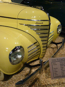
Plymouth - 1939
The 1939 Plymouth's front end is in line with American Streamlined Moderne styling of that year. Note that the headlamps are buried in the front fenders and the grille in in the process of transitioning from a vertical to a horizontal shape. The mascot is a streamlined version of the good ship Mayflower that deposited the Pilgrim Fathers and their families at Plymouth Rock in Massachusetts in 1620; Plymouth used similar mascot designs for many years. The most decorative bits are the thin chromed strips that define the grille openings -- flutings, speed lines and similar touches being the height of fashion in those days.


By your post, I get the privilege to see an ancient car. I also, like the color and functions of these car, as well. They all really fascinated me.
ReplyDelete