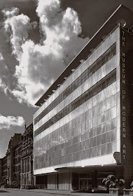
Stone first made his mark designing modernist houses during the Depression years. His reputation was enhanced due to his work on the new headquarters of New York's Museum of Modern Art (since replaced). Modernism having become the official religion of professional architecture, Stone was riding high professionally.
Then came the mid-1950s when he began covering some of his buildings with geometrically pattered screens and even (gasp!!) adding such ornamental detail on the actual exteriors. The Architecture establishment was shocked at such regression, but by then Stone was famous enough that commissions kept coming.
By the 1970s his firm was back to designing more acceptably modernistic buildings.
Conger-Goodyear House, Old Westbury Long Island - 1938
This Ezra Stoller photo shows one of his modernist houses.
Museum of Modern Art, New York City - 1939
Designed in association with Philip Goodwin, the MoMA building had a few curved details (the entry overhang and piercings in the roof), faint echoes of some of Frank Lloyd Wright's thoughts.
Stone House Façade, New York City - 1956
Stone's East Sixties house fronted by one of his new screens.
U.S. Embassy, New Delhi - 1954-59
This was the screened building that caught the world's attention and helped make Stone known to the public at large.
Home Savings / Perpetual Savings, Los Angeles - 1962
Photo of the architectural model.
2 Columbus Circle (Gallery of Modern Art), New York - 1964
Commissioned by Huntington Hartford, this was a museum featuring representational art that failed to compete agains the modernist art tide. The exterior was unusual, being largely blank with decorative openings around the edges. The non-rectangular openings towards the top were unconventional, but the decorative posts at the bottom were in synch with what Minoru Yamasaki was doing in Seattle at that time. I was in the building once, now dimly recalling that the interior layout seemed cramped and confusing. The building has been drastically renovated for other uses.
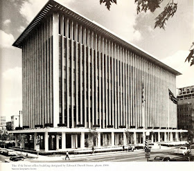
National Geographic Society, Washington D.C. - 1964
Here Stone reverted to classic Greek column elements: base, middle and cap (in the form of a bold cornice).
State University of New York, Albany - 1964-64
Here Stone and his design team ignored human factors. I spent more the four years in the Albany area in the early 1970s and visited the SUNY campus fairly often to use the library. In those days (and perhaps still) doors were opened by grasping squared metal bars -- an unpleasant experience if you weren't wearing gloves. I also recall that it was an inconvenient grouping to navigate, something related to the fact that most of the buildings were linked at ground level. That was to provide shelter during the frigid part of the school year, a worthy aim not well carried out. I rate the SUNY project a failure.
Standard Oil Building, Chicago - 1970-74
Finally back to a more purely modernist style late in Stone's career.


The Conger-Goodyear House was perfect for its era (1938), with flat roof, curved porch, white (I am assuming) concrete walls and large expanses of glass. As the house is on Long Island, I hope the windows open onto a beach view or green acreage.
ReplyDeleteHels - Perhaps that's an example of why Stone was considered "acceptable" for the MoMA project.
ReplyDelete