As this Wikipedia biography notes, Bama graduated to illustrating covers for paperback books, including more than 60 for the Doc Savage series, perhaps the commercial work he is best known for.
But during the 1970s he had left New York City for a small town near Cody, Wyoming and successfully transitioned to painting Western scenes.
Bama always painted in a realistic style, though his style varied from hard-edge to slightly softened, depending on his needs.
Below are some examples of illustrations from the years he was getting established. Most are a far cry from what he produced later.
The painting for his first Doc Savage cover, I believe.
Joe DiMaggio, for the Baseball Hall of Fame: 1955.
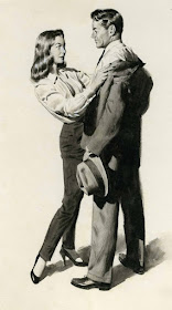
A 1957 illustration.
Above are spreads from men's magazines with Bama illustrations.
Another men's magazine illustration.
And yet another.


I'm very much enjoying your posts, esp these golden age illustrators.
ReplyDeleteHello,
ReplyDeleteThe Joe DiMaggio illustration was not painted by James Bama.
It was painted by Mayo Olmstead.
ReplyDeleteThe Doc Savage painting above (reprinted in poster format by GraphittiDesigns.com) was a study for the cover of the Bantam MAN OF BRONZE paperback, but a different version was used. This painting looks more like Bama's model, Steve Holland, than the ultimate version used for the paperbacks. The hair, especially, looks combed across compared to the published version, which looks more closely cropped: https://i.pinimg.com/564x/4e/47/d1/4e47d1982b36fc635a8dbf1fc4efa4d0.jpg
ReplyDelete