Not all planned cities consisted of pure street grids. Philadelphia's plan included some squares for parks, and Savanna, Georgia has many such squares. At some point, vistas, focal points, circles and other details became fashionable concepts for planners slaving over their drawing boards. I suspect that there were times that a plan was proposed and accepted simply because it looked attractive as a graphic layout -- an extension of the plan-based studies 19th century architectural students had to produce.
Such street patterns might have seemed nice when displayed on a wall, but often were somewhat defective when implemented. Let's take a look.
Brasilia
This image and the following one are from this collection of space views of planned cities. Brasilia features a sort of arrow or wing motif. I've never been there so can't offer an opinion, through I've read that inhabitants were not fully pleased with its layout.
Canberra
I've never been to Canberra, either. Its designer, Walter Burley Griffin, was influenced by Frank Lloyd Wright, so the plan has an "organic" feeling to it.
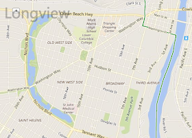
Longview, Washington
Longview is a small city planned in the late 1920s. The lake on the left side of this image from Bing is artificial, part of the plan. There are a few diagonal streets, holdovers from the thinking shown in the following images.
Chicago, Burnham Plan of 1909
Little of the Burnham Plan was implemented as designed. The grid-layout central area (the Loop) was too well established to be altered. (It's the area the river bends around in this view where the top of the image faces west, away from Lake Michigan.) In addition to some formal layouts by the lake, the street plan features diagonal avenues, circles, focal points and a civic center square from which many of the diagonals radiate. None of that was built.
Washington Plan of 1800
One such plan that largely came to be is the L'Enfant-Ellicot Plan for Washington, D.C., capital of the USA.
Washington, D.C.
Here is how the street layout looks today viewed from above. Perhaps those angled streets bouncing off various circles and small squares handled horse-and-buggy traffic adequately in the early days.
But when I was in the army stationed nearby in the early 1960s I found it a hassle to work my way to the Mall on those diagonal avenues even on a quiet Sunday morning. (Though there were plenty of parking spots on the Mall when I got there.) A pure grid pattern might have been better for traffic flow. Furthermore, despite all those diagonals, squares and circles, there are few impressive vistas once one leaves the Mall and Pennsylvania Avenue (running from the Capitol to near the White House).
Paris: central area
Paris with its boulevards by Baron Haussmann and others works better than Washington. That's because Paris' street layout is essentially unplanned, having grown from pre-Roman days through the Dark and Middle ages to the point where creating boulevards was necessary for traffic circulation. Note how irregular is the "background" to the dark boulevard pattern in this view from above.


No comments:
Post a Comment