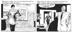
Before his time -- the late 1940s and the 1950s -- the quality of comic book art was generally mediocre. Perhaps some of that was due to the large number of separate images required for, say, a six-page story. Production speed was and is an important economic concern in that field. But during the 1930s there emerged examples of well done art in newspaper comic strips. Examples include "Tarzan" by Hal Foster and Burne Hogarth, "Terry and the Pirates" by Milton Caniff, and Alex Raymond's "Flash Gordon."
Krigstein and some others upped comic book artistic quality as well as experimented with the means of presentation of sequential events.
His training and inclinations along with clashes with comic book editors and publishers caused him to drift into general illustration and then to teaching art while doing painting on the side.
In comic book / sequential graphic novel world, his work is highly regarded and honored for its quality, innovation and versatility. Some examples are presented below.
An illustration from around late 1942 or early 1943 featuring Bell P-39 Airacobras.
Page segment featuring tight, crisp drawing and use of solid black areas.
Lead page of a comics story where Krigstein makes used of bold inking. (He generally did his own inking, usual for comic books. I do not know for sure if he inked the images above, however.) Update: Bill Peckmann informs me that Krigstein did do the inking.
Part of the final page of his epic "Master Race" story. Here he makes use of a kind of stop-motion, slow motion effect that was used in some 1970s movies and seen fairly frequently in recent years in graphic novels.
This is sheer opinion on my part, but I think all those little pictures slow down the reality of what he is depicting. A possible alternative would be, following the first image, to have a panel something like my doodle above showing the man slipping and starting to fall onto the subway tracks, and then cutting to the final panel above. It would be quick, as in reality, and readers could easily fill in the details via imagination.
Krigstein also illustrated a book dealing with baseball. Here it is necessary to break action down into significant steps.
The first and second pages of "The Flying Machine," set in Japan. Here Krigstein makes use of simple penwork and designs suggestive of classical Japanese prints. Note that the uncolored version is much more appealing than the colored appearance found in the comic book. Innovative for its time, as usual.
Moving on from his comics career, here is a Krigstein pen and wash drawing.
Self-portrait.


No comments:
Post a Comment