As suggested in this post's title, his illustrations do not interest me, let alone excite my imagination. They are hard-edge, have detailed depictions of subjects and settings, but lack a distinctive personal style. Competent, generic illustrations typical of their period.
Take a look at some examples:
Peace on Earth
From the early-to-mid 1930s. The woman is interesting, the man in the background isn't, so far as I am concerned.
Hockey player - 1935
Nice pose, but I doubt that he will lower his stick in time to strike the puck.
Woman resting - 1935
Her arms seem too small, or maybe her head is too large.
Beer advertisement illustration
Stroh's was a Detroit-based beer.
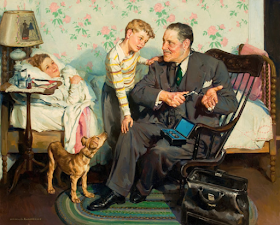
Doctor's house call
The Nurse's Escorts
A World War 2 image showing a nurse with enlisted men from the navy and army. The swabby has higher rank for some reason. (I'm an ex-Army E-5, so I note such details.)
Home from the Army
One web site says this was a 1951 illustration, but the uniform seems to be from the very early 1940s.
Home from the War
The young man was a tech sergeant in the 5th Army that fought in North Africa and Italy.
Recital scene
This apparently early illustration is the most interesting one I that I could find. I like the composition and brushwork (aside from the rough treatment of the faces and arms).


The Woman Resting has outsize sleeves, making her figure look funny in that posture she is done in.
ReplyDelete