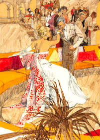
I last wrote about Peak nearly ten years ago. His brief Wikipedia entry is here. Some information regarding his later years' technique when he was doing a good deal of airbrush work is here.
In 2009 illustration maven David Apatoff wrote about Peak here, mentioning:
"But in the 1960s, Peak caught fire and began turning out radically different work. His line work had roots in the Viennese Secessionist movement (particularly Schiele and Klimt) and in the great Rene Bouche, but Peak's hot, fluorescent color combinations were unprecedented; his extreme angles, cinematic style, and space age dynamism were blazingly original....
"Peak's salad days in the 1960s were a remarkable, vibrant period, but he was too hot not to cool down. As Peak matured, he remained commercially successful but his innovations came fewer and farther between. He had a lucrative career making movie posters that seem to me to be repetitive and uninspired, the type of art that might be sold on vacation cruise ships."
I'm not as negative as Apatoff with respect to Peak's movie poster era because much of what he did was striking. But it was repetitive due perhaps to a need to preserve a stylistic image helpful to his career and perhaps because film company publicity departments expected him to use his signature poster style.
And I agree with Apatoff that Peak's best work was done during the pre- movie poster years. Examples from around that time are presented below.
Dobbs Hat advertisement illustration. The most interesting part is the background. Note the colors Peak used on the woman's face.
TWA airline illustration. This is the illustration style that emerged in the years around 1960 that impressed me so much when I was a student.
A spread from a Sports Illustrated magazine article of a hunting excursion by the Shah of Iran. Click on the image to enlarge.
Detail from another TWA advertisement. That's Paris' Alexandre III bridge.
I don't know the source, but it's a fine example of his work from that era.
Story illustration from Cosmopolitan magazine, February 1964 issue.
Interesting use of color juxtaposed with linear elements.
Very strong colors here, but details are a little fuzzy because this image I found on the Web was probably enlarged from a smaller one.
Some Coles Phillips type of color merging.
Finally a Time magazine cover portrait illustration. Plenty of drawing lines plus watercolor or maybe colored inks or other media.


DP— this is an excellent post featuring an illustrator who was the pace setter during a most of his career. The 60s and 70s were a time of drastic change in print design and illustration. I believe Peak’s work will receive even more attention in future years. You divided the body of his work, casting your attention on the “pre-movie poster” years. I agree. This is the correct way to view Peak’s outstanding career.
ReplyDeleteThe first time I saw a Peak illustration it was part of a small Dobbs hat newspaper ad. I remember seeing his famous series for Puritan shirts and they were real show stoppers. Those ads were done over 55 years ago. That series of ads could be run again and they would look just as new and powerful today,
You deserve a good word about your excellent comments on this post. I was in studying illustration at about the same time you were and can testify to the ground breaking, new look of Peak’s work at that time.—Paul