Below are examples of his commercial, non-instructional art. The first images are from the 1920s. then from the '30s and a little later. Many were made for advertisements, some are story illustrations and a few might have been made for his own purposes.
Birthday scene, probably ad art.
Coca-Cola ad from around 1920, or maybe a little earlier to judge by the clothing of the woman in the background.
Advertising art for Kellogg's cereals. Note his use of light.
Another light-intensive work, this from 1928. The green on her hair is interesting, reflecting the color of the window curtains. Click to enlarge.
Art for a Chevrolet automobile advertisement, 1929.
Vignette format illustration from the 1930s.
Dramatic scene in a magazine story illustration.
"The Accused" story illustration. Again note Loomis' use of lighting.
"The Fall." His portrayal of the lady's legs is convincing (though they seem a little short): I feel sorry for his model doing this pose.
Romantic story scene.
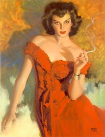
Sultry smoker.
I think this a very nicely made. If possible, I urge you to click on it to enlarge it so that you can study Loomis' technique here.


I love 1920s paintings and posters, especially of women who were dressing up, modernising, driving cars and being employed. The women in Loomis' Coca-Cola ad from c1920 and the Chevrolet automobile ad from 1929 looked sooo smart.
ReplyDeleteThanks for the link
Hels
Art and Architecture, mainly
https://melbourneblogger.blogspot.com/2021/02/the-wonderful-decade-of-american.html