Two biographical sources (that differ in a few details) are here and here.
Much of Phillips' work was not in the fadeaway style. The present post presents examples. One consistent feature is that Phillips' subjects were almost always attractive young women.
Had he lived longer, I think it's quite likely that he would have abandoned fadeaway during the 1930s.
Below are examples of his work in chronological order. Click on them to enlarge.
Good Housekeeping cover - August 1913
An example of his fadeaway style.
Overland automobile advertisement - 1912
An early non-fadeaway illustration.
McCall's magazine cover - June 1918
A wartime cover including an Army officer.
Saturday Evening Post cover - 23 September 1922
The Post was the biggest of the big-time illustration holy grails for many years.
Life magazine cover - December 1923
By the 1920s even some Life covers were not fadeaway.
MoToR magazine, annual car show issue - January 1924
Life cover - December 1926
Phillips' style is now changing to fit the Roaring Twenties and hinting of Deco and Moderne.
National Lamp Company advertisement - 1927
This illustration is less poster-like than usual for him at that time. The client's art director wanted this, and Phillips was versatile enough to deliver.
Life cover - 14 July 1927
This appeared one month after Phillips' death. Publication lead times were such that the printing date was locked in before he died.
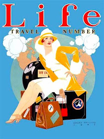
Life cover - 1927
Also made not many months before he died. I think this was a preview of a style he might had used had he lived longer.


No comments:
Post a Comment