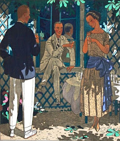
That body of work mostly appeared in the publication Gazette du Bon Ton (1912-1925). Its color illustrations were produced using an elaborate stencil procedure called Pochoir where each color required its own stencil and perhaps special attention in deployment sequencing.
This suggests that results might appear somewhat rigid. But Brissaud and other Bon Ton artists did a pretty good job of avoiding that effect.
Below are examples of Brissaud's illustrations. Click on the images to enlarge slightly.
"On aurait pu nous inviter aussi ..." - Gazette du Bon Ton - 1914
It looks like Brissaud first prepared a drawing in ink establishing lines and black areas. Then the stencils were outlined and cut. I can't explain how subtle effects such as the pink cheeks of the women at the left were created because I know little about printmaking.
"Vive Saint-Cyr!" - Gazette du Bon Ton - 1914
Another example, this with outstanding color-and-shading features. Hard to see the background details, but there are French soldiers with shouldered arms marching by. Saint-Cyr is where France's military academy is located.
"Rentrons" - Gazette du Bon Ton - May 1920
A breezy, postwar day where stripes are worn.
"L'entrée en scène" - 1920
"Que c'est bon!" - Gazette du Bon Ton - 1921
Another sun-shade tour de force.
"Tu vas trop vite, Maman" - Gazette du Bon Ton - 1922
"You're walking too fast, Mother." I'm not sure what the smoke is doing there unless the setting is near the Gare St.Lazare's tracks.
Vogue cover - 15 June 1923
Not a pochoir.
Vogue cover - 15 May 1925
That said, the effect remains similar to his pochoir work.
Wedding reception - 1930
Probably the media were pen-and-ink and either colored inks or watercolor washes. Though I can't totally rule out Brissaud doing a pochoir original as the basis for conventional reproduction.


The smoke is from a funnel, perhaps a tug on the Seine.
ReplyDeleteHis sense and use of colour is well above the average, as you noticed.