Thursday, September 5, 2019

Keith Ferris: Disciplined Aviation Artist


If you have visited the Air and Space Museum on the Washington DC mall, you probably viewed the huge mural (above) of U.S. Army B-17 bombers under attack. It was painted by acclaimed aviation artist Keith Ferris (1929 - ). His Wikipedia entry is here. A series of images of his studio begins here.

There are three basic approaches to depicting the shape of an aircraft. One is to copy a photograph or use a photo as the basis and make slight adjustments to compensate for camera lens distortion of the subject. The second approach is to "eyeball" the subject, either by observing it in person or making use of reference photos so as to understand the subject's shape from differing viewpoints. This runs the greatest risk of creating an unrealistic depiction. Finally, the artist can make use of descriptive geometry to construct an image derived from two or more scaled profile of plan views of the subject airplane. Absent computer imaging software, description geometry is time-consuming, but yields proportionally accurate results (given the degree of perspective forcing used).

Keith Ferris preferred to use descriptive geometry, combining that with a good sense of composition and scene-setting.

Gallery

Dawn of a New Era - No. 504 Squadron Meteor IIIs over central London - by Frank Wootton - 1945
First, I contrast Ferris' work with that of another famous aviation artist, Frank Wootton (1911-1998). I might be wrong, but I think Wootton either never used that approach or else did so seldomly. The Gloster Meteor jet fighters in the image above do not quite seem realistic to me. This might be due to a lack of photos of them at the time he made the painting not long after the war had ended.

First of the Few - test flight of first production Spitfire - by Frank Wootton - 1980
Wootton painted this scene many years later. I need to note that most of his images were realistic views of the subject aircraft. But this Spitfire's wings seem out of proportion -- granting that "Spits" are difficult to draw properly. This is clearly a "freehand" job by Wootton.

Spitfire - by Keith Ferris
Now a Spitfire depiction by Ferris.

Spitfire workup - by Keith Ferris
It seem much more realistic because he did this workup before creating the final image.

Descriptive geometry detail of F-4 Phantom - by Wade Meyers
I include this as another example of a descriptive geometry based illustration in process.

Keith Ferris doing a workup at his drawing board
Photo from Farris' Web site showing him at work during an early stage of a project.

Farmer's Nightmare - Curtiss P-3A from Kelly Field, Texas
Ferris was the son of an Army Air Corps pilot who was stationed at Kelly Field (the main AAC training base during the 1930s). Keith would have been very young when P-3s were flown there, so this painting and the one below are more a tribute to that era than any distinct childhood memory of such planes.

Curtiss P-3As over Kelley Field

Real Trouble - Luftwaffe Focke-Wulf Fw 190 interceptors
One of many World War 2 images painted by Ferris.

Test of Courage - Fw 190 attacking a B-17
The same squadron attacking B-17s. The Fw 190 was firing at the bomber and the B-17 was spitting back 30 caliber machine gun fire from two positions, each using two such weapons. In such a situation the German fighter might have been shot down instead of the bomber.

To Little, Too Late - showing one of the few Army P-40s that got airborne during the Japanese attack on Pearl Harbor.

Russell J. Brown shooting down a MiG-15 in the first jet-to-jet air combat, 8 November, 1950

Battle of Bien How Air Base - F-100 scramble

Monday, September 2, 2019

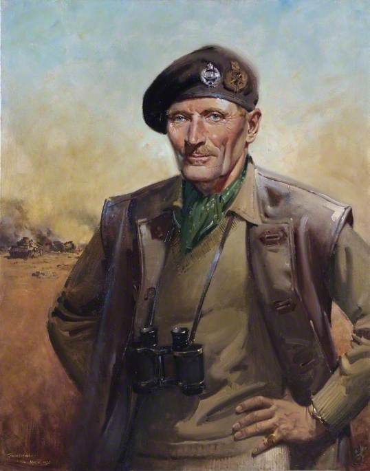
Molti Ritratti: Bernard Montgomery

Field Marshal Bernard Law Montgomery, 1st Viscount Montgomery of Alamein (1887-1976) is famous for winning the battle of El Alamein where he defeated the Axis forces led by Rommel, the Desert Fox, and for leading Allied ground forces in the 1944 D-Day invasion of Europe. His Wikipedia entry is here.

Montgomery was photographed countless times, as any on-line image search reveals. But given his fame and status, he was occasionally portrayed in oils. Most of the ones I found on the Web are shown below. As best I can tell, several -- perhaps most -- used photographic references rather than having been done from life. This was because most were painted during World War 2 when he was extremely busy on campaigns or involved in D-Day preparations. Also, they all depict Monty 1943-1945 -- at essentially the same age.

Gallery

By Yousuf Karsh - 1946
Reference photo by the famed Karsh of Ottawa.

By Emanuel Cremona - c. 1943
Montgomery was known for having piercing blue eyes, but this portrait ignores that feature.

By Edwin Swan - c. 1944
More of a sketch than a formal portrait.

By Harold Forster - c. 1943
An Impressionist-style portrait.

By Boris Artzybasheff (Time magazine cover illustration) - 1944
Here his eyes dominate.

By Augustus John - 1944
Another sketchy portrait, but by a famous artist. John had enough in the way of reputation and connections that it's possible Monty might have sat for him.

By James Gunn - 1944
Gunn was another well-known artist, and Montgomery might have sat for him as well. Generals in the British and American armies were allowed to deviate from regulation attire, and Monty notoriously wore sweaters and corduroy trousers. Here his attire is different from that, but still informal. I cannot positively identify the medal ribbon on his chest.

By Frank Salisbury - 1945
This pleasing portrait might have been painted after the German surrender in May of that year.

By Terence Cuneo - 1972
Painted before Monty died, but based on photos by the skilled painter-illustrator Cuneo. This was commissioned for the UK Defense Academy.

Thursday, August 29, 2019

Amédée Ozenfant's Intellectualized Art

Amédée Ozenfant (1886-1966) seems to be best-known for creating the Purism movement of the early 1920s. His Wikipedia entry is here.

I was made aware of Ozenfant many years ago during my year-long college art history class. And I have heard little about him since. I suppose that's my fault. Maybe my reading about art isn't as widely cast as it should be.

Regardless of whether or not Ozenfant's fame and influence has persisted to the present, I think it is worthwhile considering his approach to art. And that approach, not surprisingly, was a product of his times -- the first two decades of the 20th century when "ism" art movements appeared every couple of years. Some of those movements, including Purism, were based on theories having to do with what art should be in pretty narrow senses.

This post's title uses my term "Intellectualized Art," which I think is a reasonable description. For what it might be worth, I do not think that art is simply any old thing someone calls art -- that's so broad a definition that it's worthless. The other extreme of manifesto-based art is too exclusionary.

In any case, Ozenfant tended to follow the Purist ideal of focusing on unadorned shapes over much of his career. There were some exceptions, however, as can be seen below. Also of interest is that most of the canvasses had nearly the same 4x5 proportion.

Gallery

Bouquet - 1909
A pre-Purist painting.

Nature morte - 1920-21
Ozenfant painted many still lifes of this sort.

Glasses and Bottles - 1922-26

Verres et bouteilles en bleu - 1926

Baigneuses au promontoire - 1931
Then for a while he depicted distorted human figures having surface detailing -- quite unlike his basic Purist images.

Pacifique III - 1945
He was dealing with the human figure as late as this.

Black Mountain - 1945
That same year Ozenfant was still toying with Purist concepts.

Three Yachts - 1959
Now he has returned to a form of Purism.

Shadow - 1966
One of his last paintings, also Purist in spirit.

Monday, August 26, 2019

Michelotti's Grossly Exaggerated Presentation Drawings

Giovanni Michelotti (1921-1980) was one of the leading Italian automobile stylists of his day. But he is perhaps less well-known than others because his career was largely that of a free-lancer -- designing bodies that were built by established carrozzeria, both famous and less-so. The name of the coach building firm would be associated with the design, not Michelotti. His production car designs for Standard-Triumph also did not have his name or a carrozzeria crest attached to them.

His Wikipedia entry lists many of his designs.

This post deals with his presentation drawings, an important part of the marketing effort by a freelancer and even a carrozzeria. The idea was to show clients what a proposed design might look like. Other such tools might have included detailed side/front/rear drawings or even small scale models. But a comparatively quickly-done drawing or two might be good enough for the potential client to ask for more work on the design theme presented.

What I find interesting is that many of Michelotti's drawings, especially those form the early 1950s, were so highly distorted/exaggerated that they did a poor job of showing what a completed car would actually look like.

Gallery

Bill Mitchell sketch of a possible 1938 Buick - c. 1936
Exaggerated concept drawings were common practice before Michelotti began his career. Bill Mitchell soon became head of Cadillac styling and eventually was General Motors' Design Vice-President.

Michelotti drawing of the Cunningham C3 - 1952-53
Michelotti was providing the Vignale firm many designs such as this one at that time. The actual car's shape was much shorter and taller, but the general layout and details such as the grille are indicated here.

Fiat 1400 proposals for Balbo Carrozzeria - 1950
More examples of exaggerated perspective.

Fiat 1400 proposals for Viotti Carrozzeria - 1952
And another with the same distortion scheme as for the Cunningham shown above.  The front wheel is much too large.

Maserati proposal for Ghia-Aigle carrozzeria - 1956
A distorted-perspective rendering from five years later.

Daimler proposal for Ghia-Aigle - 1955
Another distorted view of a proposed design.

Another Daimler proposal for Ghia-Aigle - 1955
Made about the same time for the same brand and coachbuilder, this side view of a four-door sedan shows that Michelotti did work out buildable designs. But which came first? -- the perspective sketch or the measured drawing?

Triumph proposals - c. 1962
Side views of proposed designs indicating practical considerations such as the seating layout.

Triumph perspective sketch - c. 1962
Another stretched-perspective drawing. This is of essentially the lower design seen in the previous image. Note the Citroën DS-19 type light mounted on the C-pillar. It is shown clearly in the side view and some sort of light is crudely indicated in the perspective. The matter is debatable, but I wonder if in this case a side-view with a pillar-mounted light was done before the perspective drawing. Otherwise, it's a detail that could safely be omitted from a preliminary sketch from this low viewpoint.

Rendering of Triumph GT6 - mid-1960s
By the mid-60s Michelotti was making more accurate perspective drawing of his design proposals.

Cross-posted at Car Style Critic

Thursday, August 22, 2019

A Small, Very Nice Saint-Gaudens Sculpture

Augustus Saint-Gaudens (1848-1907) was one of America's best sculptors -- regardless of era. His Wikipedia entry is here.

The Seattle Art Museum is woefully lacking in art of any kind from the 1800s and early 1900s. But it does have one small work by Saint-Gaudens. Its title is "Amor Caritas" (Love, Charity) -- bronze, lost wax cast.  It form can be classed as "high relief" where the subject is significantly rounded, yet still attached to its background.

For your viewing pleasure are a few photos I took of it recently.

Gallery


Monday, August 19, 2019

Saul Tepper Vignette Illustrations

Saul Tepper (1899-1987) is one of my favorite illustrators who worked in thick oil paints during the 1920s and early '30s. A number of illustrators used that style -- two of the best known being Dean Cornwell and Mead Schaffer, both of whom I've written about here.

I wrote about Tepper here and also mentioned him in other posts: use the search item on the right side to find them.

One way to classify illustrations has to do with whether or not they completely fill a square or rectangular framed space. Those that do not are call "vignettes." They include the subject people or objects often with a bit of environmental detailing. But there is much blank "white space" that sometimes would be filed with text when published.

Tepper made a number of vignette style illustrations. Some can be found in the link above. Others are presented below.

Gallery