The present post presents examples of Coll's work in color including some illustrations where linework is largely abandoned while colored ink washes or watercolors are used to model his subject matter. This suggests that he could have maintained his career, though perhaps at the price of losing some individuality compared to other illustrators using the same media.
Jim Vadeboncoeur Jr. offers some background on Coll here.
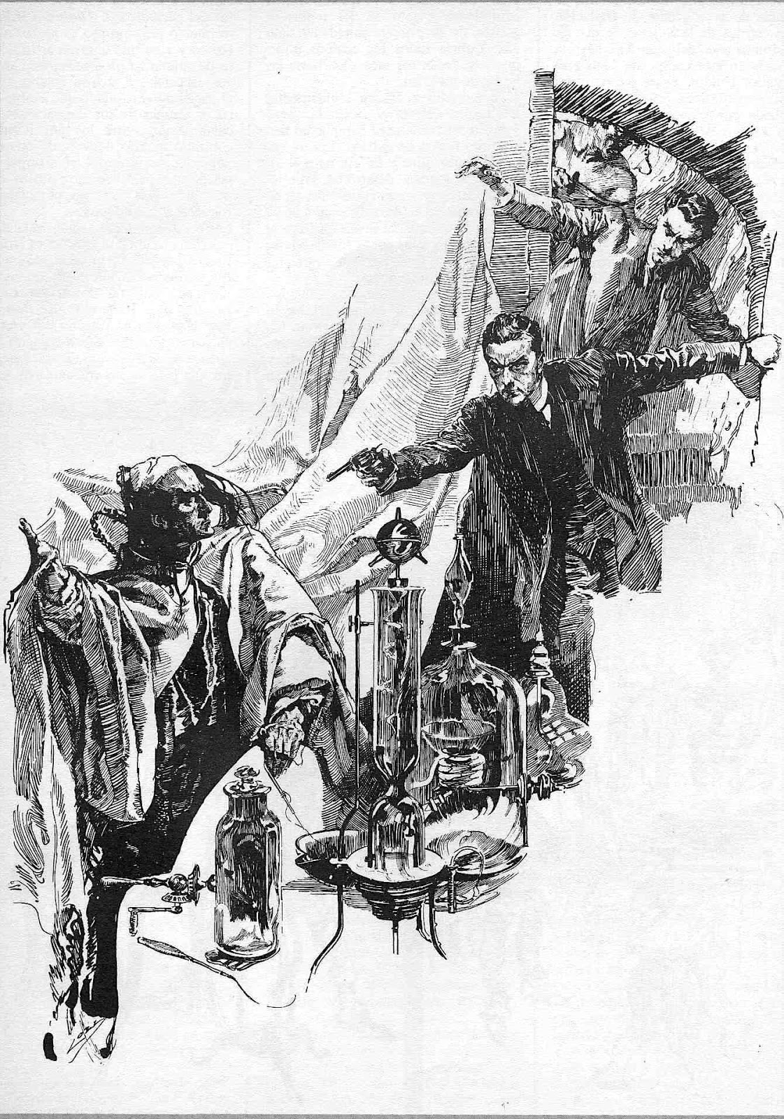
This is an example of Coll's regular pen-and-ink style.
Above are three covers of a Sunday supplement magazine distributed to various American newspapers. They are promoting a serialized Arthur Conan Doyle book.
Artwork for the first cover shown above. Note that in this instance Coll was not using line plus color fills, but instead is using color to help model surfaces of the subject matter.
Detail of "Astro the Seer and Valeska." Another example where linework is minimized.
Probably an interior illustration for Sir Nigel. This uses line and color fill.
No information about this detail of a study. This demonstrates that Coll wouldn't have had much trouble migrating to 1920s illustration style fashions had he lived longer.


No comments:
Post a Comment