Thursday, June 6, 2019

Some Picasso Landscapes

Pablo Picasso (1881-1973) dabbled in many art media, but his subject matter was mostly people. The next rung down included still lifes and bulls. Bringing up the rear of traditional painting subjects was landscapes, the topic of this post. He painted few of these, and apparently most might be classed as townscapes because he included or even featured buildings.

Below are some examples I found on the Internet during a Google search.

Gallery

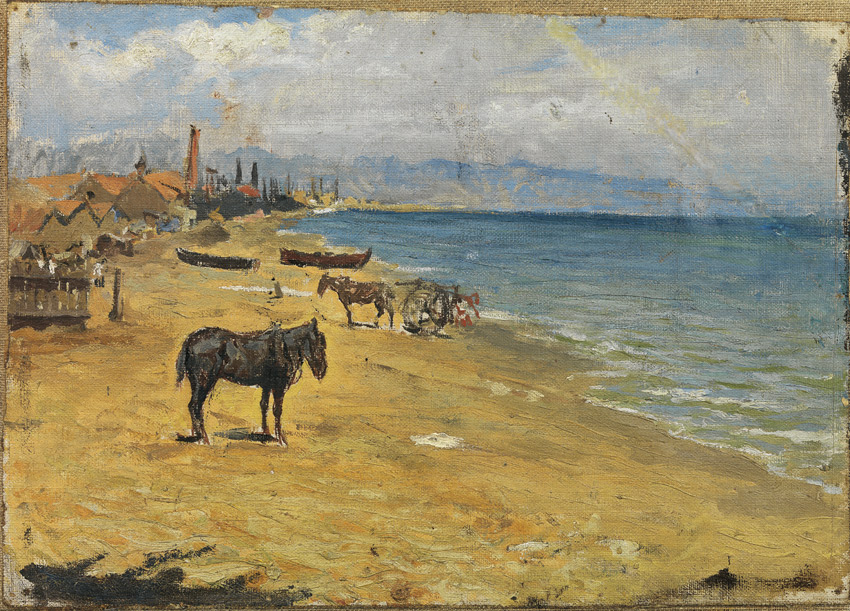
Barcelona Beach - 1896
Painted when he was about 15 years old and perhaps still being coached by his father. Its relevance to his future styles is minimal.

Barcelona Rooftops - 1902
Yes, this was painted during his 1901-1904 Blue Period.

Paysage aux deux figures - 1908
An early Cubist-type work showing people, but no buildings such as are found in all the other images here.

The Reservoir, Horta de Ebro - 1909.
More solidly Cubist.  Fellow Cubist Georges Braque painted quite a few subjects like this around the same time.

Landscape - 1933
Now we reach the point where Picasso was starting to run out of new ideas. Compare this to the image below that was painted 25 yers later.

Landscape - 1958
More Cubism here than in the previous image, and some of the subject surfaces are dappled. It retains the harsh look that Picasso began to practice in the late 1930s.

Monday, June 3, 2019

John Smart, Miniaturist

Sir Henry Clinton - 1777

I normally pay no attention to miniatures. But the above portrait of British General Henry Clinton that I noticed in a book about America's War of Independence caught my eye. It's actually less than two inches (50cm) high, and painted by ace 18th century miniaturist John Smart (1739/40–1811).

What struck me was how persuasive a likeness it seems to be -- as compared to most portraits of any kind from that era. That Smart fellow knew his stuff and occasionally pulled off a truly exceptional job such as seen above.

Background regards Smart can be found here, here, and here. The last link mentions paper and vellum as supports, though their example is on ivory, as is the case for some of the miniatures shown below.

Gallery

Sir William Hood - 1766
The earliest example I could find.

Young woman
Not dated.  Smart either had a tendency to depict subjects with small chins -- or maybe that's the way they actually appeared.

Miss Byron

Member of the Talyer Family - 1787
Here Smart for some reason chose not to flatter.

Portrait of "ER"
He spend a number of years in India, so this might be front that period.

Self-Portrait - 1797
Watercolor on Ivory.

Thursday, May 30, 2019

Fred Cole's Suggestively Incomplete Car Illustrations

Fred Cole (1893-1983) was an illustrator who seems to have specialized in automobile advertising. I could find little about him on the internet and nothing in my own reference library. Fortunately, the Web did have this link which provides useful information regarding his work and personality.

Among other things, Cole provided the illustration for what many in the advertising trade consider one of the greatest and most influential ads of all time: the Jordan Motor Car Company's "Somewhere West of Laramie."

The are two somewhat opposing advertising content strategies. One is to make a rational case for the product being advertised by dealing with its features. The other is the Jordan approach, eliciting positive emotion regarding a product or the company that makes the product. In practice, most advertisements offer some of each, though in recent decades the tendency is towards emotion, rather than rationality. A case in point are the TV commercials aired during the annual Super Bowl football game.

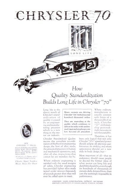
As for Cole, his car illustrations were unusual in that he left out parts of cars rather than being conventional and depicting the whole thing. That is, cars were suggested rather than portrayed. Even more interesting is that Cole did similar illustration for several carmakers, even during the same model year. One would expect that advertising managers and sales directors would want ads looking distinct from those of competitors. But that was 90 or so years ago, so perhaps the game was played differently then.

Gallery

The famous advertisement from 1923.

Cole illustrated advertisements for the luxury Lincoln brand, this example from 1925. Here most of the car is shown, but not all. This approach works well with the vignette style of the advertisement where incompleteness is expected.

Another Jordan ad, this for a not-sporty 1926 Victoria sedan. Note that Cole entirely omitted the rear wheel.

Chrysler ad from the same year. Here Cole shows only a fragment of the subject.

Yet another 1926 advertisement, this for Oldsmobile, a Chrysler and Jordan competitor.

Artwork for a 1932 Dodge ad that nicely evokes speed..

Most Cole car illustrations imply speed. In this instance he does this by fading out the aft part of the 1935 LaSalle.

LaSalle publicity for 1940. A more solid looking car as Cole makes use of the airbrush rendering style popular around that time.

Dodge truck ad from 1947. Trucks are not flashy, speedy cars, so here Cole's illustration is conventional.

Cross-posted at Car Style Critic.
Monday, May 27, 2019

Jules Guérin, Illustrator and Muralist

Jules Vallée Guérin (1866-1946) illustrated books, delineated architecture and painted murals. He is best-known (to me, anyway) for his renderings of the 1909 Burnham Plan for Chicago and for his book illustrations of architectural subjects. As an iconic American delineator, Guérin ruled the early 1900s much as Hugh Ferriss did in the 1920s and early '30s.

Guérin's Wikipedia entry is here, covering the main points of his career but lacking in personal information, including his place of death.

Below are examples of his work. Click on images to enlarge.

Gallery

Aerial view of Burnham Plan showing how it would fit into the city's street grid and topographic features. The Civic Center part of it is at the lower center of the rendering.

The Civic Center and its setting as view on high from the direction of the lakefront.

Focal building of the Civic Center.


Two images of the Château de Chenonceau  in France's Loire Valley.

Lake and ruins, Karnak, Egypt.

Faneuil Hall, Boston.

Madison Square, New York City.

Washington Arch, in Washington Square, New York City.

Panoramic view of the 1915 Panama-Pacific Exhibition, San Francisco.


Lincoln Memorial murals. Color is probably not accurate.

Thursday, May 23, 2019

Charles Edward Chambers, Highly Competent Illustrator


Charles Edward Chambers (1883-1941) was a highly skilled and successful illustrator, though not as famous as some others active 1915-1940 who had more distinctive styles. His Wikipedia entry is here and Society of Illustrators 2010 Hall of Fame induction statement is here.

The Chesterfield billboard illustration above shows Chambers doing some of his best work for an important client. More examples of his illustrations are below. Given the length of his career, I wish that more of the Internet image sources had dates for them. They didn't, so I do a lot of guesswork in the captions.

Gallery

Story illustration from around 1915, to judge by the woman's clothing.

Original art shown here. My guess is it was painted near 1920.

Color illustration from around 1915.

This is called "Fire Dancer" on the Internet and was given c. 1920 as its date.

Man Playing Guitar, from the Kelly Collection. The painterly style suggests influence from early 1920s Dean Cornwell illustrations.

Woman receiving a gift neckless. More smoothly painted, and her dress and hairstyle suggest early 1930s.  It's suggestive of J.C. Leyendecker's style, but without the hashing.

Illustration for Pearl Buck's "The Good Earth."

1932 Red Cross poster.  The model is PaulineTrue, who became Chambers' second wife.

This story illustration is titled "She Answers the Question." I'm a bit puzzled because the officer's uniform is Great War vintage while the woman's clothing and hairdo are hard for me to date -- somehow seem more modern than 1918. (Though such uniforms were used in post-war years for a while.) The illustration was probably made in the 1930s, based on other examples of Chambers' work

Monday, May 20, 2019

Umberto Boccioni, Futurist

Umberto Boccioni (1882-1916) was a leading painter and sculptor associated with the Futurism movement initiated by Filippo Tommaso Marinetti in 1909, around the time when other modernist literary and artistic movements were bubbling up.

His Wikipedia entry is of sufficient length to provide a reasonable sense of his life and career. Some of the paintings shown below are discussed, along with two of his early, largely representational paintings.

Boccioni was serving in the Italian army when he died as the result of an accident. As the Wikipedia entry notes, this was when he seemed to be drifting away from Futurism. From the images shown there, it seems he was beginning to experiment with styles being used in Paris. How he might have developed had he survived the Great War is unknowable, of course.

Gallery

A 1912 photograph of Boccioni (at left) and Marinetti: two well-dressed aesthetic revolutionaries.

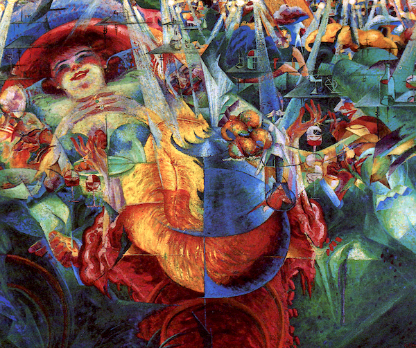
La risata (The Laugh) - 1911
This painting is partly shown at the left of the photo above.

The City Rises - 1910
An early Futurist painting by Boccioni.

Visioni simultanee - 1912

Horizontal Volumes - 1912
The Wikipedia entry has this dated 1915 and cited as a sign that Boccioni was drifting from Futurism. However, most items relating to this work found via Google have its date as 1912. This seems to make sense because this is clearly a Cubist-style portrait similar to what Picasso and some others were painting around that time. Boccioni must have been experimenting here.

Elasticità (Elasticity) - 1912
An important element of Futurist painting was attempting to depict motion.

Testa + luce + ambiente - 1912

Dinamismo di un giocatore di calcio (Dynamism of a football kicker) - 1913
More motion.

Dinamismo di un ciclista (Dynamism of a Cyclist) - 1913
Again, motion.

Carica di lanceri (Charge of the Lancers) - collage - 1915
Futurism was in favor of warfare.