Monday, July 30, 2018

Poster: Stadtbahnstation Karlsplatz, Vienna

Otto Koloman Wagner (1841-1918) was one of the first architects to move away from Classicism towards Modernism. His mature style was something of a geometrical version of the Art Nouveau style or Jugendstil, as it was known in German speaking countries. A brief biography is here.

One of his noteworthy creations was the 1899 Karlsplatz Stadtbahn Station in Vienna -- the Stadtbahn being the municipal railway system.

Ten years or so ago when I was visiting Vienna, I noticed a poster dealing with the Karlsplatz station building in a display window. I continued walking for a short distance, but then turned back to the shop because I felt I had to have that poster (and I almost never buy posters).

I know nothing about the poster's origin. It incorporates elements of architectural presentations, but might possibly be a presentation in itself created by Wagner's firm.

Here it is: click on the images to enlarge.

Gallery

A slightly cropped photo I took of my poster.

I find these women charmingly depicted. Whoever drew them knew what he was doing artistically.  When I was taking first-year architectural design, most renderings on display showed people as blobs with legs.

Thursday, July 26, 2018

Late 1920s Early '30s Cigarette Advertisement Illustration

Cigarette makers haven't been allowed to advertise in publications or broadcast media in the United States for a long time now. Before that, cigarettes were heavily advertised and a number of well-known illustrators helped put food on their tables by working on those ads.

The glory years for this lasted from the mid-1920s into the early 1930s. After that, though some cigarette advertising was illustrated, photography had largely taken over in an effort to have readers relate better to celebrity or glamorous smokers featured in those ads.

Although some variation in taste was possible via blending tobaccos from different sources (Egypt, Turkey, the American South), cigarettes are to a considerable extent a commodity. Therefore, most advertising themes in those days featured distinguished, older, rich-appearing people and, more often, attractive, youthful smokers in sophisticated settings. Earlier ads often used illustrations of exotic scenes from tobacco growing countries, while later ads sometimes used photos or illustrations of supposed physicians stressing that cigarettes had health benefits. Still, lifestyle themes predominated until the end.

Here are some cigarette ads from that era.

Gallery


These first two examples are unsigned, but clearly illustrated by J.C. Leyendecker.

Art signed by Adolph Treidler.

Army-Navy football game theme, signed by McClelland Barclay.

By John La Gatta.

This is unsigned. The lady is nicely done ... not so much the man, who seems a bit strange but supposedly sophisticated.

Now for some early 1930s ads. This is by ace fashion illustrator Eric (Carl Erickson).

Art by Howard Chandler Christy, another case of a nicely done woman and a strange man.

By Bradshaw Crandell who specialized in depicting pretty faces.

A wedding theme painted by Neysa McMein.

Another illustration by John La Gatta. Note the theme. The slogan was repeated in a series of ads.

Monday, July 23, 2018

Example of New Apple Store Architecture

A mental game I sometimes play is trying to guess how a highway interchange or building under construction will look when completed. Yes, in many cases I could get on the Internet to find out. But that would take the fun out of it.

A recent example is the new Apple Store in Seattle's University Village shopping center. It's less than three miles from where I live and I visit the Village at least once a day to walk around and go to a Starbucks. So I watched the construction at every stage of development. Playing my little game, I had no clue as to what store or stores the building might contain.

Construction lasted for about a year, the foundation work being done during Seattle's summer dry season. Such timing is almost always a good idea because building a foundation in mud and glop might lead to trouble. In Apple's case, foundation construction risks were heightened by the fact that 100 years earlier the site was on low-lying, possibly marshy land a few hundred feet from the shore of Lake Washington. In 1917 the ship canal system from the lake to Puget Sound was opened and water level of the lake dropped by around nine feet, putting the shopping center safely above lake level.

The above-ground part of the building eventually appeared and it was evident that it was not coming close to occupying the entire site. This, and the large wall areas devoted to what might be windows, became the focus of my mental game. Would there be more than one shop there? What would happen if the tenant left and the structure had to be modified for a new one? -- it didn't look easy to modify. All this contradicted conventional design practices for open-air shopping centers, of which University Village is a highly successful example.

Two or three days before the store opened it became evident that it would be a new Apple Store, replacing the existing one a few feet away. Then it all made sense. Apple stores have very high levels of sales income to square-footage of floor space, so there was no necessity for the building to fill out the entire site. Plus, given Apple's huge amount of liquid assets, the company is unlikely to abandon the store for a long time, so the matter of renovating it for a new tenant is unlikely to happen for many years.

Some background regarding the new Apple Store is here. It mentions that there is a basement. The basement is used for storage of inventory. And it's in that zone of low, possibly somewhat formerly waterlogged land of a century and more ago. It hope the storage area is highly waterproofed.


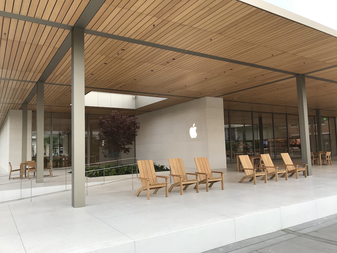
Now for the architecture: two iPhone photos I took on a Sunday morning before the store opened for the day. It seems that for the last few years Apple has been building some new stores using classical modernist style, though these store are not identical. This building sits on a platform of about the same extent as the overhanging roof. Although the overall design differs, its details gives me the feeling of Mies van der Rohe's famous 1929 Barcelona Pavilion.

Here is a photo I took of part of the rebuilt pavilion in 2010. Note the thin, square, pillar, the platform, the overhanging roof, and the floor-to-ceiling windows. All are found on the Apple Store.

The solid projection at the left in the Pavilion photo is echoed by the projecting slab with the Apple logo at the center of this photo.

Very elegant.  Better yet, it is unlike the nearby connected-storefronts of the Village.  I am of the opinion that International Style architecture works well only when it is contrasted by its setting -- concentrations of International are visually lethal.

Thursday, July 19, 2018

Jacob Elshin: From Czarist Army to Seattle Murals

As regular Art Contrarian readers probably sense, I am perhaps more interested than I should be with paintings made in the 1920s and 1930s.

This post is yet another in that vein. But I can justify it! How? It happened that Jacob Alexander Elshin (1892-1976) lived only about two miles away when I was growing up, and down the street from where one of my high school buddies lived. So how can I not write this post?

His Wikipedia entry is little more than a placeholder. There are a few other snippets about him on the Internet such as here, where it mentions that "Jacob Elshin was born in Russia in 1892 and received his education and art training there. He fled the Bolshevik Revolution in 1917. Following the Revolution, he went to Shanghai where he worked as a newspaper cartoonist for three years before moving to Seattle in 1923. From then on, Elshin maintained a long and active painting career in the Pacific Northwest and became one of the region's most noted painters and teachers. He had four solo exhibitions at the Seattle Art Museum in 1934, 1943, 1956 and 1965."

Wikipedia mentions that he was an officer in the Imperial army. So was his father, as is reported here that General Alexander Jacob Elshin (1865-1951) during the First World War commanded the XX Army Corps of the Russian Imperial Army. The link suggests Elshin was a 4-star general, but in Western armies, a corps commander would normally be a Lieutenant General (three stars in the US Army). Jacob was probably at most a captain, given his age. I also speculate that the Elshins' escape from Russia was later than 1917, given that the Bolshevik Revolution didn't happen until towards the end of that year. They probably went to eastern Siberia which was controlled by White Russian forces and then moved on to China around 1920, as many anti-Red Russians did when White resistance collapsed.

Your Humble Blogger could probably clear up such matters by reading a 1965 transcript of an Elshin interview held by the Smithsonian. But that would involve obtaining a microfilm copy, and I'm not willing to go to that much trouble researching him. The transcript is said to deal with the following: "Elshin speaks of his background in Russia and China; moving to Seattle in 1923; his work as a free-lance commercial artist and working as a greeting card artist; painting for the Public Works of Art Project; working on murals for the WPA Federal Art Project; political problems with the WPA; the destruction of some of the work that was produced by the project; some of the injustices he suffered during his years with the WPA. He recalls Robert Bruce Inverarity, Edward Rowan and Mark Tobey."

Below are examples of Elshin's paintings.

Gallery

General Alexander Elshin and Jacob Elshin

Marusia - 1933
Russian scene ... from memory? ... invented?

Grand Coulee Dam Construction Triptych
The huge dam being built in eastern Washington State in the late 1930s.

Mural study for the University District Post Office, Seattle - 1939
Located less than a block from the University of Washington campus, hence the subject matter.

Alamo Mural study for Dallas Post Office competition - 1937
Pretty static for what one would expect to be an action scene, which might have been why Elshin didn't win the competition.

Sawmill on Puget Sound

Smith Cove, Seattle
During World War 2 and many years later this was a U.S. navy terminal. Now Smith Cove is a cruise ship port.

Mt. Baker Beach, Seattle
On Seattle's Lake Washington. Now the site for annual hydroplane races.

Gates to Nowhere - 1948
Postwar, Elshin must have decided to move from a conservative version of Social Realism to a more fashionable form of Modernism.

Flight into Egypt - 1959
More of the same a few years later.

Based on the images above plus some that I didn't post, my conclusion is that Elshin never came close to creating a masterpiece. At best he was a journeyman painter who managed to make a living at his trade in difficult economic times.

Monday, July 16, 2018

Edmund Dulac Book Illustrations

Edmund Dulac (1882-1953) was yet another artist who abandoned a professional career track (law, in his case) for art. He also left his native country (France) for another (England) where he became a noted book illustrator. His Wikipedia entry is here, but a much more useful source for art fans is this post by Jim Vadeboncoeur that offers insights regarding how changes in printing technology worked to Dulac's advantage.

It seems that Dulac's book illustration heyday was between 1905 and the start of the Great War -- a relatively short span. His career continued with moderate success until his death.

Those heyday illustrations were mostly for classical fantasies, often Orientalist subjects. They are charmingly done, though today's Politically Correct crowd would probably find their usual reasons to hate them.

Take a look at some of them below, if you dare.

Gallery

Circe the Enchantress

The Emperor's New Clothes

From the Rubaiyat of Omar Khayyam

"Open, Sesame!"

The Fisherman and the Genie

Princess Scheherazade

Thursday, July 12, 2018

One-Eyed Stockton Mulford's One Really Fine Illustration

Stockton Mulford (1886-1960) lost his right eye in an accident when he was seven years old, yet became an illustrator. The best source of information regarding Mulford is David Saunders' Pulp Artists blog. It mentions that it took a while for him to work into becoming a full-time illustrator: he was active from around 1920 to 1946 when he was able to retire. During the Depression he seems to have mostly produced cover art for pulp magazines of various kinds.

Examples of Mulford's art are below. They vary in quality, the pulp art being the lowest. Perhaps because the pay was poor he put less time into those pieces. Judging from the examples below, he seems to have done his best work during the mid-1920s.

There is one outstanding illustration that he never came close to equaling, so far as I can tell at present. Sort of like the novelist who has only one great book. You'll find it at the bottom of the scroll.

Gallery

Delineator cover - July, 1924

Argosy cover - 2 February 1924

Interior story illustration, American Magazine - February 1928

The plain area at the top suggests this is cover art for a magazine or perhaps a book (it provides room for a title, etc.).

Liberty Magazine cover - 3 June 1933

Black Mask cover - April 1937
An example of Mulford's pulp magazine cover art.

Adventure Magazine cover - May 1942
Probably painted a couple months after the Pearl Harbor attack. At that time, the only major encounter between the American and Japanese armies was in the Philippines, on Bataan Peninsula.

The Long Call - Everybody's Magazine cover art - April 1924
This is a fine illustration. In my opinion, only the Delineator cover art and the American story illustration come close -- but not very close. I wonder why Mulford wasn't able to consistently do this well.

Thursday, July 5, 2018

Alden McWilliams' Tom Corbett, Space Cadet Comic Books

Alden McWilliams (1916-1993) was one of those comparatively rare comics artists of his generation who could draw people convincingly. I wrote about his work on the Twin Earths comic strip here. Some biographical information can be found here and here.

One of McWilliams' projects was creating content for Tom Corbett, Space Cadet comic books. For detailed information about those comic books, click here.

McWilliams did cover art for eleven of those comic books, but interior art for only the first three. Those were issued February, May and August of 1952, which suggests that he did his work from the late summer of 1951 into the winter of 1952 (considering production lead-times). His Twin Earths daily comic strip debuted 16 June 1952, so he probably began working on it no later than early April of that year. Therefore, if there was any overlap for those projects aside from creating covers, it was minimal, so McWilliams could maintain the high quality of his work.  A strong possibility is that he chose to drop doing Space Cadet interior content when he got the Twin Earths gig: otherwise, he might have contunued Space Cadet.

Tom Corbett, Space Cadet started as a television show that began airing in 1950 and later bounced around several TV networks. This meant that the comic books had to portray the characters as personified by the show's actors. That is, McWilliams was doing portrait art as part of comic book art.

Below are some scans I made of the second and third issues of the comic book. They include the cover, one interior colored page and one page without color (the latter was always on the inside cover). Click on the images to enlarge.

Gallery

Inside cover of the August 1952 issue. It shows the leading cast members of the TV show who McWilliams had to depict convincingly in the comic books to satisfy fans.

Cover of the May 1952 issue.

Color page from May 1952.

Black & white page from May 1952.

Cover of August 1952 issue.

August 1952 color page.

Black & white page, August 1952.

Monday, July 2, 2018

Up Close: Moreau's "Salome Dancing before Herod"

Gustave Moreau (1826-1878) was something of a Symbolist whose later painting style is a taste I can't seem to acquire. Your reactions to him might well differ.

Background on him and his career is here.

The Hammer Museum in the Westwood district of Los Angeles and affiliated with nearby UCLA holds one of his most important works,"Salome Dancing to Herod." This subject, and the closely related one of John the Baptist's head, have been grist for many artists over the centuries. It can be interesting to compare their interpretations, but for the purposes of this post, the focus is Moreau's version of the dance.

The museum had an exhibit in 2012 related to the painting, and here is the Los Angeles Times' art critic's reaction to it.

I visited the Hammer in 2010 and took a few photos of the painting.

Gallery

This is the museum's image of the painting, I think.

Here is my establishment shot showing how my camera captured it given the lighting conditions at the time.

Detail view showing the main characters. Salome's dance seems pretty static, according to Moreau. Click on the image to enlarge.

Close-up of Salome. Her headdress is oddly shaped and makes her face seem somewhat flat. I'm no expert on ancient costumes, so I don't know whether or not this was Moreau's invention. Note that the woman to the other side of the king also has a high headdress.

My photo was slightly out of focus, as often happens when in museums using automatic mode. I tried to sharpen things, but it's not worth enlarging this because it's still a bit blurred.