Monday, January 30, 2012

Example: Wrong-Era Hairstyle


My impression is that the practice of fashion conformity unraveled around 40 years ago. While it's possible to identify characteristics that peaked in usage at various times (bold patterns on men's sport jackets in the early 1970s, padded shoulders on women's garments about ten years later), these styles weren't nearly as dominant as those of previous decades. A good example is women's skirt lengths -- short in the mid-1920s, long in the mid-30s, knee-length in the early 40s, mid-calf during the 50s, etc.

Of course fashion following was never entirely lockstep. Older women tend to shy from wearing short skirts, for instance. And I tend to maintain a preppy look when my wife insists that I have to abandon my beloved blue jeans for some occasion or another.

Then there is the matter of transitions between dominant styles. Women's bobbed hairstyles of the 1920s were anticipated around 1910 when some avant-garde gals got their long tresses chopped. That bobbed style apparently became boring to some women even before 1930 and they began to let their hair grow out. Consider the photo below.


This publicity photo (which I cropped a bit) is of a 1929 Auburn model 120 with girls from a physical culture club of some sort providing a lot of added interest.

Note the girl on the left and compare her hairdo to those of the others. The girls on the right have the typical tight-wave permanents of the 20s, the one on the left has much longer hair that strikes me as being more "natural" and perhaps "timeless." She also lacks the boyish, curveless figure that was the height of female body fashion during the flapper era. Compared to the other two, she looks terrific, not to mention out of place given the rest of the setting.

Friday, January 27, 2012

Lexus Goes for Baroque


Among the many technical advances over the years related to automobiles has been the capability of stamping sheet steel into increasingly elaborate shapes. Effects that are common today were only remotely possible, say, 60 years ago, and then only for car bodies created by hand at coachbuilding shops such as those thriving in Italy.

Once it is possible to do something, it also becomes possible to over-do it. Such is the case for the Lexus CT Hybrid, a luxury take on the Toyota gas-electric hybrid Prius (Lexus, in case you aren't aware, is a part of the Toyota empire). For more information about the car, here is the official Web site.

From what I glean from the automobile press, Lexus management has been concerned about styling in recent years. Early Lexuses featured smooth, rather bland styling and the brand quickly achieved success thanks to its luxury touches and excellent build-quality, not to mention the then-legendary Toyota reliability. Lexus styling remained bland for a long time while failing to include enough design cues to give the make strong visual identity as compared to rivals Cadillac, Mercedes and BMW.

This styling failure finally began catching up, so in recent years we have seen new Lexus cars sporting more aggressive looks, though nothing yet has emerged that strongly states "Lexus!" when one spies one on the street. The current sedan front end theme, for instance, has a grille with a V'd look and there's a sports model with inward-facing double-Vs on either side of the grille (think >--<). (Hmm. Perhaps those Vs are actually variations on the pinched L-for-Lexus logo found on different parts of its cars. Whatever.)

When Lexus introduced its luxury compact hybrid, as a cure for blandness the poor car got seriously Baroque sheet metal treatment. Baroque enough that the result is a confusing mishmash of curves, angles and planes. Dare we take a look?


It's the rear of the car that bothers me the most.

Working from top to bottom, we find dog-leg curve-reversals for the rear side-windows and for the wrap-around parts of the back window ensemble. Nothing wrong with this in theory, but on the Lexus the two reversals are not well linked and therefore clash. Plus, there an odd little crease from the inflection point of the side window curves running to and then along the lip of the back window's overhanging roofline terminus. This feature is cramped and fussy.

The rear face below the windows is little more than an incoherent set of smallish surfaces forming projections, recesses, lips, voids and Lord knows what other visual chaos. It reminds me of the visual clutter found on early post-World War 2 Japanese cars. The solution to this mess would be a large, controlling form supported by details related to function (the opening for the trunk-lid/5th door, for instance) and visual linkage to shapes and design elements on the adjoining sides.

Finally, there is that bulbous-yet-creased part of the rear bumper's plastic sheathing at the rear corners of the car. At the top is a faint echo of the shape of the wheel well opening that is broken into a drop conforming to the main surface of the bumper sheathing's impact plane. Admittedly a car's corners presents tricky situations for stylist to deal with, but the Lexus staff should have been able to come up with a better resolution. They didn't because, I suspect, they were expected to do some wild and crazy things as part of the scheme to jazz up Lexus styling.

And as for creating a strong styling theme for Lexus? Back to that drawing board, gang.

Wednesday, January 25, 2012

Muddy Colors: An Illustration Group-Blog


I only recently stumbled across Muddy Colors, a group-blog written by some leading figures in the science-fiction and fantasy (SFF) genres, one illustration field where representational art (even if the subject is non-existent) still rules. It's a highly worthwhile blog, so I immediately added it to my Links list on the sidebar.

I'm not fully "into" art created by computer programs such as Adobe Photoshop or Corel Painter, so I appreciate the fact that the Muddy Colors crew use traditional handwork media as much as possible for their illustrations. Moreover, they have a keen sense of historical representational art and classical illustration which informs their professional efforts.

Blog subjects include multiple views of works as they progress from thumbnail sketch to final art, tips regarding techniques, insider views of the business side of illustration, occasional interviews with artists not part of the group, news of upcoming events such as conventions and master-classes, and even something called Crit-Submit whereby aspiring illustrators send in works to be evaluated and (often) digitally modified or corrected by a group member.

Go to the blog for a full list of contributors on the sidebar. I'll mention four of them here and toss in a few images for good measure. The instigator of Muddy Colors is Dan Dos Santos an articulate art-book junkie who specializes in book cover art. Donato Giancola (who professionally goes by the name "Donato"), considered a leader in the field despite the fact that he must deal with the consequences of an eye injury "which destroyed the macular region of my right eye (the part that lets you see detail, and yes it was permanently destroyed)." Greg Manchess who does not restrict himself to SFF. He painted a mural for the Abraham Lincoln Presidential Library in Illinois, created images for postage stamps and did illustrations for publications such as National Geographic. Arnie Fenner, who along with his wife Cathy, created and continued Spectrum, an annual publication featuring jury-selected SFF art.

Gallery

Dos Santos illustration

Book cover by Dos Santos

Illustration by Donato

Manchess self-portrait

Cover of recent Spectrum, punk Wizard of Oz illustration by Manchess

Monday, January 23, 2012

Leonor Fini: Image Unsafe for Work!!


You have been warned! Scroll down a ways on this post and you'll encounter an image that isn't something you necessarily want your office mates to notice. And if at home, you might have to do some splainin' to your spouse or kids.

For those viewers remaining after the mad dash for the exit ...

An artist can't be expected to be as aesthetically pleasing as his subjects; many are not, but some lucky few are. Four years ago I wrote in the 2Blowhards blog about attractive female artists. Included in the write-up were Angelica Kauffmann, Élisabeth Vigée-Lebrun, Berthe Morisot, Elin Danielson, Suzanne Valadon, Elaine de Kooning and Dorothea Tanning. In the present post, I add surrealist Leonor Fini (1907-1996) to the list.

When I was in high school, I checked out a number of 1930s and 1940s vintage library books about Surrealism. But if Fini was ever mentioned or images of her paintings shown, I missed it all. She first came to my attention about two years ago when I noticed this book about her in bookstore art sections.

Fini led a decidedly interesting and unusual life, as the above link associated with her name indicates. As an artist, she strikes me as being competent and imaginative, but not as wild as were leading surrealists such as Dalí or Max Ernst. Like the semi-surrealistic and (in my humble judgment) highly over-rated Frida Kahlo, she included images of herself in many paintings, though not to the extent Kahlo did.

As for her appearance revealed by photographs, I find Fini a very attractive women who wasn't quite classically or even everyday beautiful. The "flaws" were a slightly too-short nose and a slightly too-long distance between her nose and mouth along with a slightly small chin. Altogether, trivial "defects" that, as part of the overall package, gave her a distinctive look that could trigger the hormones of plenty of men, me included.

So let's take a look at some self-images she painted along with a number of photos of her; click on images to enlarge.

Gallery

Redhead with glasses
This seems to be a self-image by Fini.

Autoportrait au turban rouge - 1938

Autoritratto - 1968

Photo of Fini, possibly by Man Ray - 1936
The web site I grabbed this from claimed the photographer was Man Ray, but the image lacks his expected flair.

Photo of Fini by Dora Maar - 1936
Maar famously was a squeeze of Picasso's. She took in-progress photos of his Guernica.

Photo of Fini by Horst P. Horst - 1946
Horst was a leading fashion photographer of the 1930s.

Fini with a basket as hat

Fini in peasant blouse

Fini at the Museum of Modern Art, New York

Photo of Fini by Georges Platt Lynes - 1936
Sensational image.

Friday, January 20, 2012

Gil Spear and the 1942 Chrysler


The son of parents who worked as illustrators, Gil Spear, Jr. made a career as a car stylist; a summary of his career can be found here.

Whenever I think of Spear what comes to mind are a few renderings he made of what many people around 1940 considered to be the shape of cars of the (possibly near) future. Spear was working for Chrysler at the time, and the above link mentions that he might have had a hand in designing the grille for Chrysler's 1942 models.

Obviously, one doesn't see a lot of 70 year-old cars on the road, but 1942 American cars are an especially rare breed from the circa-1940 era. That's because the 7 December 1941 attack on Pearl Harbor and the county's entry into World War 2 resulted in an order from the government that production of civilian automobiles be curtailed and then should cease by 22 February 1942. Chrysler brand sales for 1941 models were 161,703, but only 36,586 1942 model cars were produced and sold, most of these in the first months after their Fall 1941 introduction.

Below are examples of 1942 Chryslers, the first from an advertisement or a sales brochure, the others are restored vehicles.


So where does Spear come into play? Below is an image I grabbed from the link above that pairs a Spear concept rendering with a photo of the front end of a '42 Chrysler (click on the image to enlarge).


Indeed, the front of the concept car looks pretty similar to that of the production job aside from its hooded headlights and its prow that juts ahead on the main frontal plane. But this rendering was in no way a prediction of the 1942 theme because it is dated September 22, 1941 -- near the time when 1942 Chryslers were appearing in dealers' showrooms.

What I find most interesting are other features of the concept. It has a double-wrapped (horizontally and vertically) windshield not greatly different from windshields on some Chrysler models of the late 1950s. The roof over the passenger compartment seems to be transparent, a not-so-practical styling obsession that has persisted until present times on concept cars built for automobile shows.

But note the general shape that is also shown at a different angle in the car in the background. What we see is a "aerodynamically streamlined teardrop" shape beloved by car-of-the-future forecasters of the 1930s done up in a nicely stylish manner. It's not a pure teardrop because the motor is at the front, so a hood is required as is that windshield. Otherwise it fills the streamline styling bill of those days right down to the parallel chrome strips and the lack of open wheel wells. Note how the trunk lid is a double-opening type. Of course, a functioning version of the concept drawing would probably be more ungainly looking if it were to function at all; as pictured by Spear, the front wheels have no room to turn for steering and this would have to be fixed. Also, the design seems to allow for only one seat; the top slopes too radically for a rear seat. And what about a back window for rearward vision?: I see none.

By the way, those fighter planes look pretty nifty too. Too bad they're nose-heavy (the wings are mounted too far aft) and that the wing area is too small. But this is concept art after all, so why not let a stylist have even more fun than the cars offer?


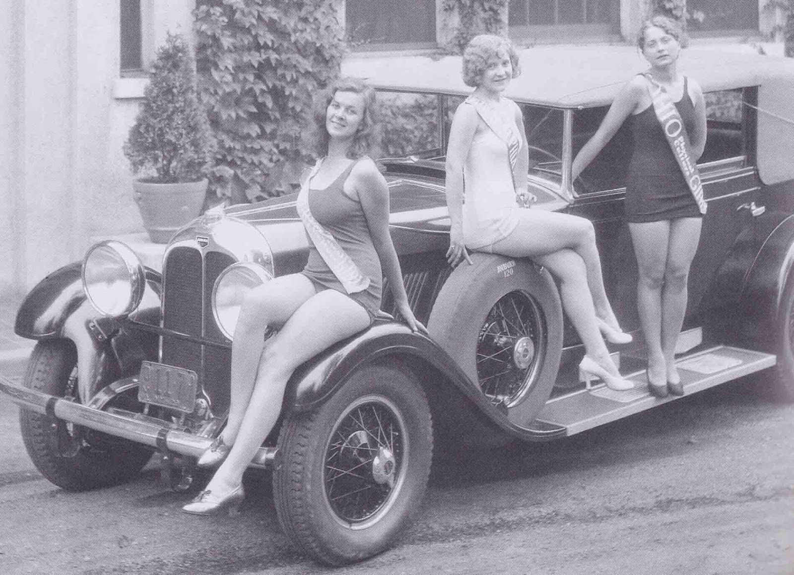
Here are two more Spear concept renderings from the same period (once again, click to enlarge the images). These designs are variations of the one shown earlier. The cars have the same basic shape and clearly have no rear seat, though headlights are exposed rather than lurking behind doors and there is no top over the passenger compartment for either car. The car in the lower image seems to sport a small tail fin, a style item that would become the rage in the later 1950s, especially for Chrysler Corporation's brands. The diagram below the ladies indicates the position of grille openings and the radiator, so it seems that Spear was paying some attention to practical matters and not going totally blue-sky.

Once again, the aircraft designs are stylish and interesting. The upper image shows four-motor bombers with pusher, rather than tractor, propellers. This arrangement appeared in a number of actual aircraft design studies in those days, but the only American production bomber with pusher props was the B-36 which appeared following the war and served well into the 1950s. Spear's bomber has potent, though perhaps impractical, defensive armament; those guns appear to be something on the order of 37 mm or even larger.

The image immediately above features what appears to be a fighter and includes some interesting features. First, the pilot is in a prone position. This serves to reduce the cross-section of the aircraft and thus should lower drag and increase top speed. It also would lessen the likelihood of a pilot "blacking out" from blood loss to the brain during extreme maneuvering. This arrangement was tried out after the war, but proved impractical in a number of areas including rearward visibility, something important in combat situations. Spear places the propeller amidships in a rotating cylinder faired into the fuselage contour. I don't recall if this was ever actually tried, but defects include mechanical complexity and potentially reduced propeller surface for a given radius. But the propeller arc as shown in the airborne craft is so great that the propeller would scrape the ground on takeoff or landing rotation.

Nevertheless, a lot of fun for both Gil Spear at the time and for us 70 years later.

Wednesday, January 18, 2012

Kees Did Fashion Art Too


I wrote about Fauvist-turned-society-artist Kees van Dongen here. Recently I came across a piece of fashion illustration by him and thought I'd present it along with a few other works that are fashion illustrations or items looking a lot like they were.


To set the scene, above is a fairly typical van Dongen painting that might have been done in the early 1900s. Note the large, darkly painted eyes and the intense, Fauvist color scheme.

Now consider some works he did in the late 1920s or the 1930s in the fashion illustration genre:

Gallery

This is from perhaps the British edition of Harper's Bazaar magazine.

From a French publication.


The two items above might not be fashion-related illustrations, though they give every appearance of being so.

Van Dongen retained his characteristic rendition of eyes, likely with the strong approval of the art director who commissioned the piece; the whole point being that the image was done by van Dongen himself, a well-known artist at the time.

What is missing is the Fauvist coloring, but Kees no doubt was willing to sacrifice that feature of his work for some francs that he needed to support his lifestyle.

I suppose there are many who consider van Dongen a sellout because he made a lot of money doing portraits of fashionable ladies and because of the commercial work shown here. Me? I figure that people need to make a living. Even artists.

Monday, January 16, 2012

Molti Ritratti: Andrew Jackson


Andrew Jackson (1767-1845), seventh president of the United States (1829-1837), lived just long enough to have had a few photographic portraits taken. For most of his life his image had to be recorded by various artists, which is the point of this continuing Molti Ritratti (many portraits) series.

Let's begin at the end with a couple of those late-in-life photographs.

From 1844-45

From 1845

The second image appears to be retouched, assuming that the top image and another I found via Google are representative of the quality of the time.

Now let's have the painters have their say:

Gallery

By Samuel Lovett Waldo - 1817; black & white image of a painting
This strikes me as one of the better images of Jackson. Note to self: find some information on Waldo.

By Ralph E.W. Earl - 1817
Apparently Earl and Jackson were friends, and he did several portraits of his subject over the years.

By Thomas Sully - 1824
Thomas Sully, perhaps the best portrait painter in America in his day, also did several paintings of Jackson. The color on this image was altered digitally by someone who didn't seem to like an equally oddly colored version on a Wikipedia site.

By Asher Durand - 1835
Durand was another competent portraitist of the first half of the 19th century in America.

By Ralph E.W. Earl - 1837
Another version of Jackson by Earl, who wasn't in the same league as Sully and Durand. This portrait strikes me as being too abstracted from what the painter actually saw; could it have been done from memory?

By Thomas Sully - 1845
This Sully painting was done shortly after Jackson's death. It might be strictly from memory or perhaps the artist relied on his earlier sketches and paintings of the former president. Regardless, this is the image of Jackson most familiar to Americans because it served as the basis for the engraved portrait on ten dollars bills.

Friday, January 13, 2012

One Body, Multiple Car Brands: GM 1949


Let's pretend you are the president of a major automobile manufacturer with several brand divisions in your stable. The marketing folks and divisional managers insist that each brand be distinct in order to spur sales. But the dreaded guys wearing those green eye shades are equally insistent that it's too costly for each brand to be totally different from the others; sharing parts among brands will save lots of money and help profits.

By the 1930s the accepted solution was to generally side with the bean counters, but attempt to retain a degree of brand uniqueness. Before the 1960s when multiple sizes of cars became the prevailing mode, General Motors had five car brands and built them using two or three different bodies that were trimmed differently for each brand. In those days GM divisions designed and built their own engines, which helped to distinguish brands in a meaningful way.

I'll probably return to this subject again because I find it interesting. For now, let's take a peek at the brands using GM's 1949 "A" bodies that were intended for the least-expensive cars.

The 1949 A body was all-new, the first of its rank since before World War 2. A new post-war "C" body for GM's expensive cars was launched for the 1948 Oldsmobiles and Cadillacs and, months later, for senior-range 1949 Buicks. A-bodies were used by Chevrolet and Pontiac for all their production and for junior-range Oldmobiles.

Gallery

1949 Chevrolet 2-door sedan

1949 Pontiac
As noted, all Chevrolets and Pontiacs used the A body. The brands had distinctive chrome trim that visually distinguished them, though from today's perspective the differences were surprisingly minor. Each make featured a rock guard on the lower leading edge of the rear fender, a functional necessity. Side chrome strips varied in placement and detail and the grilles differed. Pontiac also had its then-distinctive "Silver Streak" chrome stripes on the top centerlines of its hood and trunk. It also sported a short horizontal crease on the front fenders just aft of the headlights. The Pontiac shown is longer between the front door and wheelwell because it has an inline 8 cylinder motor and not a "straight six" as in the Chev.

1949 advertisement illustration showing Oldsmobile 76 and 88 models
These Oldsmobile series also used the A body. This artist's interpretation is slightly distorted, as was the norm in those days, but it serves to show the grille and trim used by Olds. Again, differences from Chevrolets and Pontiacs are not great.

1950 Oldsmobile 88 coupe
1950 A-bodied Oldsmobiles were almost identical to the 49s, the main difference being a chrome strip on the front fenders. Compare the body to the Chevy in the top image and note the overall similarity.

From brochure for 1949 Oldsmobile 98
This illustration depicts Oldsmobile's top-of-the-line 98 series that used the GM C body. The fender treatment is similar, but not identical, to that on the A body. And the upper part of the body differs even more. Oldsmobile stylists had the task of preserving brand identity across the two bodies, so grilles and other chrome trim details are similar. This assured buyers of 76s and 88s that they indeed were driving Oldsmobiles, a prestige step or two above Pontiacs and Chevrolets.

2011 Chevrolet Cruze

2012 Buick Verano
Today GM makes a greater effort to distinguish models from different brands such as the Cruze and Verano shown above. This effort includes different sheet metal on the fronts and sides, though the basic body structure is shared (note the doors and windows).

Wednesday, January 11, 2012

Herb Kane on Art Training and Portrait Subjects


In the previous post I presented some works by Herb Kane, master illustrator of Hawaiian history.

The present post is devoted to some of Kane's views on art training, illustration and dealing with portrait subjects, as presented in his book Voyagers. Kane attended the school at Chicago's Art Institute and pursued a career in illustration in that city for several years before moving to Hawaii and taking up the depiction of Hawaii's past. I'm presenting his views because I agree with them and thought readers might be interested in hearing them from a different source.

In high school, storytelling through painting became my great interest. I was inspired by the work of American regionalists Thomas Hart Benton and Grant Wood. After serving in the Navy, I enrolled at the Art Institute of Chicago, but discovered that representational art which conveyed a mood or message was no longer labeled as real 'Art,' but as 'mere illustration.'

With the death of regionalism, art faced the new requirement of being 'universal.' Craving acceptance from my peers, like any twenty year old, I applied myself to learning formulas for what then passed as advanced theories of painting; that year it was abstract expressionism.

Of all possible subjects, Homo Sapiens has always held the most interest for Homo Sapiens. Artists who represent the human figure with skill and sensitivity will find larger and more interested audiences than artists who do not.

There have been great painters of landscape, still life, and natural history subjects to be sure, and in the last century some outstanding painters of non-representational art; but the history of art is largely the family album of humanity. Ironically, of all subjects, it is the human figure, the one subject with which viewers are most familiar and critical, that proves the most difficult. Learning to draw this figure with authority has allowed competent figure painters to surmount this difficulty, but then competent figure painters have always been a minority.

That minority is smaller today than it has been for centuries. Learning to draw, which is learning to see clearly, requires a laborious effort in which there is no instant gratification. Drawing classes have always been unpopular with art students, which may be why they are no longer required by art schools or university art departments, where the primary concern seems to be keeping up enrollments. The assumption is that drawing is not fundamental to to current art theory.

Kane goes on to mention that the Art Institute in his day had a few hard-nosed traditionalists who provided the training he needed. When he went to work in an illustration studio, he found that "Here, alive and well, was the ancient master-apprentice system, only superficially different from the way it had operated since the Middle Ages" -- another good thing for his development.

I'll finish with some of Kane's views regarding portrait painting that you might find entertaining:

Women of middle age are the most difficult portrait clients if they have not yet become resigned to their years. In her mirror, each still sees the girl in her twenties that she once was. No honest likeness will please them, and they can easily find others who will agree that the artist has missed his mark.

Most men will not object to features of age that may add character to their faces. They are usually less interested in handsome appearance, but more interested in portraiture which conveys some impression of their status. Everyone who has passed forty seems to think of himself as a young person. Nobody can know how he or she is seen by others. This is why the portrait painter is often frightening to his sitter; and why each may find the other so difficult and sometimes so impossible to forgive....

I think it was Sir Joshua Reynolds who said that when faced with a difficult female subject, he always painted the most beautiful face he could imagine; then added only those adjustments necessary to make it resemble the sitter.

Quotes are from the third (2006) printing, pages 12-17 and 142.

Monday, January 9, 2012

Herb Kane, Illustrator of Hawaiian History


Herbert "Herb" Kawainui Kane (1928-2011, last name pronounced KAH-nay) was an illustrator of Hawaiian-Danish descent who abandoned a career in commercial art in Chicago to return to Hawaii and create paintings illustrating Hawaiian history. Plus, he instigated the building of replica catamarans that duplicated voyages by Hawaii's Polynesian settlers. For more details on his career, here is his Wikipedia entry.

I'll present some of his views on art and illustration in a follow-up post and focus here on the art he created.

Kane was basically an illustrator in the sense that he tried to convey the appearance details of people, man-made objects and nature as they were in times past. This required a good deal of research along with personal knowledge of sailing techniques and acquaintance with Hawaiian and Polynesian culture. Therefore, in his paintings tended to be "hard-edge" (not "painterly") in style so that he could present as much detailed information as possible. Exceptions were allegorical works dealing with Hawaiian gods and legends.

My own taste runs to adding a dash of the painterly. For example, I tend to be less fond of depictions of aircraft that include lots of little dots representing rivets than of pictures showing non-center-of-interest parts of an aircraft slightly out of focus (such as they would be seen in person).

Nevertheless, I find Kane's approach both suitable for his purposes and satisfying from a visual standpoint. Below are images of some of Kane's work. Original-size versions are much more impressive than what you see here; click images to enlarge for slightly better views.

Gallery

Wa'a
One of a series Kane painted of Polynesian sailing craft.

Ka'anapali 200 Years Ago
This beach on western Maui is now lined with resort hotels.

The Arrival of Keoua Below Pu'ukohola
The rival king to Kamehameha approaches the stone temple and soon will meet his death.

Kamehameha Landing
Kamehameha and his army landing on Oahu near Waikiki Beach. Note the swivel cannon on Kamehameha's craft and the Western style sailing ship in the background.

Kamehameha at Kamakahonu (detail)
The aged king at what is now Kailua-Kona.

Moment of Contact
Captain James Cook's ships meet native Hawaiians off Kauai, 1778.

Pele
The Hawaiian goddess of fire and vulcanism.

Hula Holoku
Multiple views of a hula dancer wearing a holoku gown. I find this image charming.