Monday, September 26, 2022

Giuseppi De Sanctis - Fairly Successful, but Limited Quality

Giuseppe De Sanctis (1858-1924), according to this, was a reasonably successful Neapolitan painter.   His work was in salons, some winning prizes.  He eventually taught etching and engraving at the Accademia di Belle Arti.

That said, his works that popped up in Internet searches were of decidedly mixed quality.  To my way of thinking, his portraits of women were his best, street scenes his worst.  Below are some examples.

Gallery

La preghiera della sera a Bisanzio - c.1885
"Byzantine Evening Prayer."  This won a silver medal at a Palermo salon and King Umberto bought it in 1886.

Teodora - 1887
Another Academic subject, also not fully with Academic finish.

Interno con figura
"Interior with Figure" -- one of his better paintings of pretty women.

Woman in profile

Ritratto della moglie del pittore Rossano
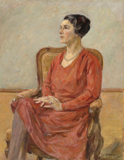
Portrait of the artist Federigo Rossano's wife.

Ritratto della moglie del pittore Rossano - study
Given its sketchy quality, I prefer it to the slightly less-sketchy final work.

Ritratto di donna - 1922
A fairly late painting.  Compare it to the final image below, painted at about the same time.

Paris scene by Café de la Paix
He spent time in Paris studying with Jean-Léon Gérôme and probably visited on later occasions.  This is undated, but the view might be from around 1890.

Strada Parigi
Paris Street.  It looks like the Boulevard Saint-Michel, the Pantheon in the distance.  Others, such as Édouard Cortès, did much better jobs of this kind.

Boulevard parigino - 1921
Paris Boulevard.  The date below De Sanctis' signature appears to be 1921.  But the traffic on the Champs-Élysées shown here is 1890 vintage.  My conclusion is that he cranked out a number of nostalgic Paris street scenes in order to earn some money.

Monday, September 19, 2022

Some MoToR Magazine Covers - 1920s and 1930s

The American version of MoToR magazine no longer uses print.  But in its heyday it was an important automobile trade publication.  Its highlight issue was its Annual Show Number that appeared after most carmakers had announced their new model year lines.

For a number of years, covers of that issue were illustrated by well-known (in the day) artists such as Coles Phillips and McClalland Barclay.  But by the mid-1930s MoToR relied on airbrush ace Arthur Radebaugh, who did the work exclusively for many years thereafter.

Below are some covers from the mid-1920s through the 1930s.  As cars became more "streamlined" starting in the early 1930s, so did the MoToR covers become sleeker, Moderne.

Gallery

January 1924 - by Coles Phillips
Phillips is known for his illustrations of women whose main clothing color is the same as the illustration's background color.

January 1925 - by Coles Phillips
But his MoToR covers did not use that style.

January 1927 - by McClelland Barclay
Barclay was known for his depictions of beautiful women.

January 1928 - by Hayden Hayden (Howard Crosby Renwick)
A lesser-known illustrator.

January 1930 - By Jules Gotlieb
Like the covers shown above, Gotlieb featured a beautiful woman and a miniature car.

January 1931 - By Jules Gotlieb
The woman is more sleek than the car.

January 1934 - unidentified artist
Colors and theme evoke the 1933-34 Chicago World's Fair architecture (Deco/Moderne).

November 1936 - by Arthur Radebaugh
This and the following Radebaugh covers feature airbrush art and a red-blue-gold color scheme.

November 1937 - by Arthur Radebaugh
Cars of the past (along the upper ring) flow to a car of the future ... I think.

November 1938 - by Arthur Radebaugh
Symbolism from the forthcoming 1939-40 New York World's Fair.

Monday, September 12, 2022

Max Liebermann, German Impressionist

Max Liebermann (1847-1935) was in the thick of German avant-garde art world circa- 1890-1910. He is considered a major German artist of that period. I do not care for his work because much of it seems too messy -- but I suppose that's my problem.

Wikipedia has a very long entry about him here, so please refer to it for information about him, including his spats with Lovis Corinth and other German Modernists of his day.

Below are examples of Liebermann's work in approximate chronological order.

Gallery

Gämsenrupfenninen (Women Plucking Geese) - c.1872
A fairly early painting reflecting Lieberman's training before French Impressionism took hold.

Herin - c.1873

Free Period in the Amsterdam Orphanage - c.1882
He spent some time in the Netherlands early in his career.  Although it seems he was interested in the effects of light, it's only Impressionism very-lite (if you will pardon the sorry pun).

Munich Beer Garden - 1884
Another transitional work.

Street in Amsterdam's Jewish Quarter
I don't have a date for this.  Liebermann is becoming Expressionist-Impressionist, abandoning strict representation.  (Though this might be more a sketch than a finished painting.)

Im Atelier des Künstlers (In the Artist's Studio)

Sommerabend an der Alster (Summer Evening on the Alster) - study - 1911

Sommerabend an der Alster - final - 1911
No broken colors to speak of, properly proportioned people and objects, but sketchy detailing.

Lola Leder
Perhaps from 1912.

Blumenstauden am Gärtnerhäuschen nach Nordwesten (Flowers by the Garden Shed, Towards the Northwest) - 1926
That's my very rough translation of the title.  This Impressionist work was auctioned for more than $200,000.

Olga Neuberg - 1928
He was about 81 when this was made.  His style of portraiture changed little in his artistically mature years.

Monday, September 5, 2022

Pierre Brissaud's Fashion Illustration

Pierre Brissaud (1885-1964) was a French fashion illustrator whose early 20th century work seems to be his best-known.  Some biographical information can be found here.

That body of work mostly appeared in the publication Gazette du Bon Ton (1912-1925).  Its color illustrations were produced using an elaborate stencil procedure called Pochoir where each color required its own stencil and perhaps special attention in deployment sequencing.

This suggests that results might appear somewhat rigid.  But Brissaud and other Bon Ton artists did a pretty good job of avoiding that effect.

Below are examples of Brissaud's illustrations.  Click on the images to enlarge slightly.

Gallery

"On aurait pu nous inviter aussi ..." - Gazette du Bon Ton - 1914
It looks like Brissaud first prepared a drawing in ink establishing lines and black areas.  Then the stencils were outlined and cut.  I can't explain how subtle effects such as the pink cheeks of the women at the left were created because I know little about printmaking.

"Vive Saint-Cyr!" - Gazette du Bon Ton - 1914
Another example, this with outstanding color-and-shading features.  Hard to see the background details, but there are French soldiers with shouldered arms marching by.  Saint-Cyr is where France's military academy is located.

"Rentrons" - Gazette du Bon Ton - May 1920
A breezy, postwar day where stripes are worn.

"L'entrée en scène" - 1920

"Que c'est bon!" - Gazette du Bon Ton - 1921
Another sun-shade tour de force.

"Tu vas trop vite, Maman" - Gazette du Bon Ton - 1922
"You're walking too fast, Mother."  I'm not sure what the smoke is doing there unless the setting is near the Gare St.Lazare's tracks.

Vogue cover - 15 June 1923
Not a pochoir.

Vogue cover - 15 May 1925
That said, the effect remains similar to his pochoir work.

Wedding reception - 1930
Probably the media were pen-and-ink and either colored inks or watercolor washes.  Though I can't totally rule out Brissaud doing a pochoir original as the basis for conventional reproduction.