Monday, October 31, 2022

Who was "Otis"?

Around 1930 there was an American advertising illustrator whose style was Moderne.  Aside from the featured product, the rest of the work was comprised of thin, simple lines and flat, lightly shaded areas.   Colors were black, white and grays.   These were signed "OTIS" with the signature partly hidden.

I found a number of such advertisements for Studebaker automobiles, and they are displayed below.   Interestingly, the same model year (1929), Studebaker also had more traditional-looking full color advertisements.  Perhaps placement of each style depended on the target magazine.

Unfortunately, I haven't been able to discover who Otis was.  Internet searches have turned up nothing useful so far.  One possible source is the New York Art Director Club annual for, say, 1930.   But copies are not convenient to where I live.

At this point, I can think of two possibilities.  One is Samual D. Otis (1888-1961) who did some commercial illustration.  Another is Otis Shepard (1894-1969), best known for his Wrigley's chewing gum advertising.  I wrote about him here.  Once upon a time I had a book about Shepard and his wife, but it was discarded during a downsizing a few years ago.  Sadly, it might have offered information on my Otis problem.

Perhaps a knowledgeable reader can provide an answer in Comments.

Click on images to enlarge.

Gallery

Here are seven 1929 Studebaker advertisements by Otis.


This ad is from 1930.

Monday, October 24, 2022

Scott Evans' Magazine Covers

Today's post features 1930s-vintage magazine covers illustrated by Scott Evans.

I know essentially nothing about him.

Part of the problem is that there was a 19th century painter with a similar name (De Scott Evans) who crowds out the illustrator Scott Evans on Web searches.  Also, he is missing from my hardcopy illustration sources.

Evans' heyday was the mid-to-late 1930s, though he is known to have been active in the late-1940s.  As illustrators from that era go, he was fairly successful, contributing cover art to Collier's and Liberty magazines.  Collier's was a major magazine in those days, but half a notch below the Saturday Evening Post, and I peg Liberty as a notch below Collier's.

Perhaps Evans' fame problem was due to the style he often used: a slightly cartoony one.  He was capable of more representational art, so I cannot rule out that magazine art directors had him "pigeonholed" stylistically.  Once his run of cover art was over, it's possible that he changed his style to the needs of clients.  And then dropped off the well-known-illustrator radar.

Below are a number his covers plus a postwar glamour image.  Click on images to enlarge.

Gallery

Collier's - 5 March 1932
Humorous subjects were popular in those Great Depression days.

Collier's - 3 June 1933
Representational, simplified, but not cartoony.

Collier's - 3 February 1934
Pretty girls in season-appropriate outfits.

Collier's - 9 March 1935
Another dog, but not a funny one.

Liberty - 26 September 1936
For some reason, artists often had trouble with "tin hat" helmets, though Evans probably simplified their shape on purpose here.

Liberty - 31 October 1936
This nice illustration has been credited to Evans on some Web sites, but I see no signature.  Perhaps it was covered by the blue circle.

Liberty - 7 November 1936
More cartoon-like than usual for Evans.

Liberty - 21 November 1936
Another nice illustration.  Both the woman and the car are attractive.

Liberty (Canada) - 10 April 1937
No message here, just a pretty girl.

Collier's - 17 May 1941
Perhaps his final Collier's cover.

Publication unknown - 1948
Evans was capable of conventional 1940s glamour illustration.

Monday, October 17, 2022

Coles Phillips' Non-Fadeaway Illustrations

Clarence Coles Phillips (1880-1927) lived a short, but highly productive life as an illustrator.  He was and is famed for his striking "fadeaway" compositions where areas of the subject's clothing color are identical to the flat background's color.  I wrote about his fadeaway art elsewhere.

Two biographical sources (that differ in a few details) are here and here.

Much of Phillips' work was not in the fadeaway style.  The present post presents examples.  One consistent feature is that Phillips' subjects were almost always attractive young women.

Had he lived longer, I think it's quite likely that he would have abandoned fadeaway during the 1930s.

Below are examples of his work in chronological order. Click on them to enlarge.

Gallery

Good Housekeeping cover - August 1913
An example of his fadeaway style.

Overland automobile advertisement - 1912
An early non-fadeaway illustration.

McCall's magazine cover - June 1918
A wartime cover including an Army officer.

Saturday Evening Post cover - 23 September 1922
The Post was the biggest of the big-time illustration holy grails for many years.

Life magazine cover - December 1923
By the 1920s even some Life covers were not fadeaway.

MoToR magazine, annual car show issue - January 1924

Life cover - December 1926
Phillips' style is now changing to fit the Roaring Twenties and hinting of Deco and Moderne.

National Lamp Company advertisement - 1927
This illustration is less poster-like than usual for him at that time.  The client's art director wanted this, and Phillips was versatile enough to deliver.

Life cover - 14 July 1927
This appeared one month after Phillips' death.  Publication lead times were such that the printing date was locked in before he died.

Life cover - 1927
Also made not many months before he died.   I think this was a preview of a style he might had used had he lived longer.

Monday, October 10, 2022

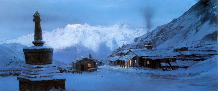
Matte Art by Michael Pangrazio


The image above is of a Nepalese village in the 1981 film Raiders of the Lost Ark, painted by matte artist Michael Pangrazio (1956- ).  It isn't really a matte, because there is no space on it reserved for live action.  Therefore, it might be called a painted establishment shot.  (Final qualification: the chimney smoke might be a special effects "gag.")

Pangrazio's brief Wikipedia entry is here.

Nowadays, movies' special effects backgrounds and related settings are digital art.  In the old days, they were painted by hand.  This required a great deal of technical artistic talent.  Not only did the artwork have to appear realistic during their (usually very) brief screen time, the light-shade and coloring had to match the live action segments when the images were combined.

It seems that Pangrazio essentially lacked formal art training and learned on-the-job.  Apparently not a bad thing, because his matte work was very good.

Gallery

Return of the Jedi - space ship
The live-action spot is the ramp at the front of the ship.

Return of the Jedi - hangar
Black areas are reserved for live action.

Return of the Jedi - Ewok village concept painting
Not strictly a matte painting, but similar.

Raiders of the Lost Ark - finale
This is considered a matte-shot "great" -- the government warehouse where the Ark of the Covenant was finally hidden.

Monday, October 3, 2022

Julius Engelhard: A Lot Like Hohlwein

Julius Ussy Engelhard (1883-1964) was born in Sumatra, Dutch East Indies, and made his poster art career in Munich.  Some biographical information is here.

Engelhard was influenced by Munich's leading poster artist Ludwig Hohlwein (1874-1949), who I wrote about here.  That influence seems to have been greatest before 1920.  Thereafter, Engelhard's style became more versatile.

Examples of his work are below, with caption translations by me.

Gallery


"Friemann Kaffee" - 1926 - by Ludwig Hohlwein
Compare to the next Engelhard posters below.

Für den elegante Dama, Handschuhe (Gloves for the Elegant Lady)
An Engelhard poster in Hohlwein's style.

Für den Wintersport (For Winter Sport)
Another.

Für Pelze u. Kleider, Adolf Rothschild (For Furs and Clothes at Adolf Rothschild)
And yet another.  Not exactly Hohlwein, by very nice.

Münchener Flieger Tag - 1918 (Munich Aviation Day, 1918)
Near the end of the Great War.  The airplane looks like a Fokker Eindecker of 1915 vintage.

Hermitage event poster - 1920
The style is no longer strongly Hohlwein's.

See-Restaurant Starnberg - 1924 (Lake-Restaurant Starnberg - 1924)
More of a conventional representational style.

Mode Ball - 1928 (Fashion Ball - 1928)
Here Engelhard does Art Deco, imitating French fashion illustration style.