Monday, February 27, 2023

Albert Dorne Drawings

I wrote about the successful, prolific illustrator Albert Dorne (1906-1965) here, featuring some of the many crowd scenes he depicted.  I got to thinking about Dorne again because a recent issue of Illustration Magazine was devoted to him.

Although I'm not usually enthusuastic about his illustrations, I greatly respect his ability to draw.   This ability is especially impressive because Dorne was self-taught, having to discover many aspects of art on his own.  David Apatoff posted about Dorne's sketchbooks here.   The present post also features some of his drawings.

Gallery

From an Art Directors Club of New York awards annual.  Dorne's style here is not typical of much of his work because the subjects are modeled, and not drawn in ink with colored ink washes added.  However, note his treatment of faces, hands and fabric folds -- the latter two are not easy for amateurs and many professionals to deal with.  Note the legs of the woman in the background; ankles are simplified, but the shapes are correctly defined by a few simple lines.

A typical Dorne illustration.  Ink lines and some shading as the basis for colored ink washes.  Dorne's characters often had a cartoon-like feeling that went a little too far in my judgment.

Now for some Famous Artists School instruction pages by Dorne.  This one deals with fabrics and folds.  The vignettes are clipped from illustrations he had made.

Here he deals with faces.

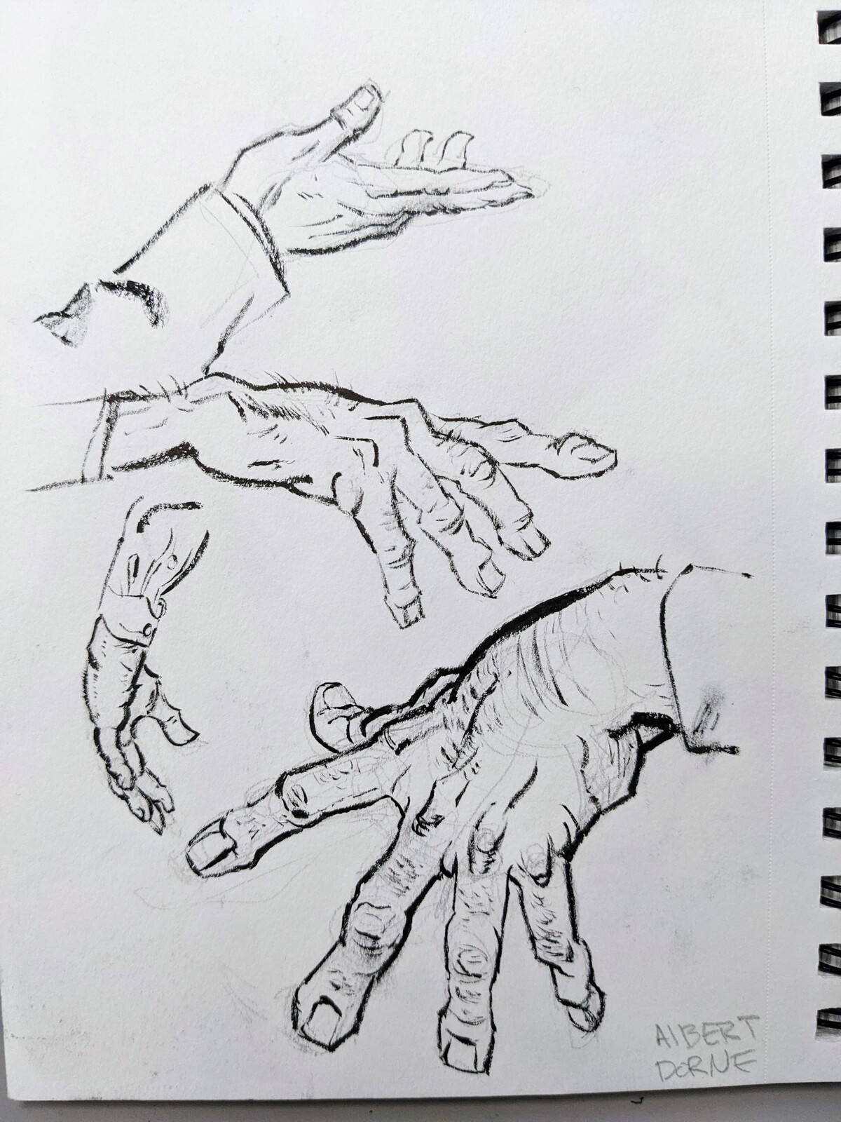
And hands -- so difficult to learn to draw for most of us.

Showing how to build faces from simple shapes.

A crowd-scene preliminary drawing.  Or maybe a partially completed illustration where the inking is done, but pencil work needs to be erased and coloring added.

Another example.  The two men at the right are included in the clothing lesson image above.

Monday, February 20, 2023

Frederic Mizen's Chevrolet Advertising Art

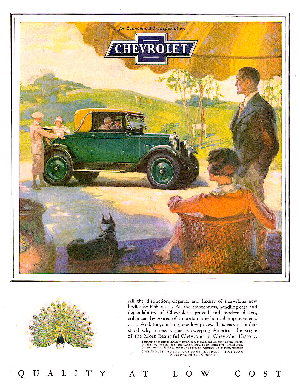
Frederic Kimball Mizen (1888-1964) was doing very well as an illustrator by the time he was 40, having created advertising art for leading brands such as Coca-Cola and the subject of this post, Chevrolet automobiles.

I could find little biographical information about Mizen, so this will have to do.

During the 1920s, much American automobile advertising used illustration rather than photography.  This was especially true for ads using color, as color photography technology didtn't yield good results back then.

Chevrolet was General Motors' entry-level brand, so Mizen (and the advertising agency) mostly associated the cars with upper-edge middle-class women, rather than the ritzy folks often depicted in car ads in those days.

Click on most images to enlarge.

Gallery

1927
That year's Chevrolet ads used framed paintings as artwork.  This country club setting is more upscale than most in the series.

1928
But for 1928, art was in the form of vignettes.

1928
The framed areas featuring an image of  Chevrolet included a wider-scope view or setting of the large vignette.  A cute idea.
1928
Not much facial detail, probably because it was thought that such would focus attention on her, rather than features of the car.  After all, humans tend to pay more attention to other humans than to objects in images.

1928
Here the lady's face is turned partly away from us.  As with the image above, these interior views are not detailed vignettes of the images in the frames.

1928
Back to the earlier concept here.

1929
This 1929 ad art is technically a vignette, but features considerable framing.  Mizen was a fan of the American southwest, so he must have enjoyed making this illustration.

1929
Now art in rectangular format.  The scene here is a college football game day.

Monday, February 13, 2023

Mystic-Symbolist-Moderne Nicholas Roerich

Nicholas Roerich (1874-1947), also Nikolai Konstantinovich Rerikh (in Russia), was, according to this lengthy Wikipedia entry, a "painter, writer, archaeologist, theosophist, philosopher, and public figure."

In today's post, I'll deal with some of his paintings, ignoring the rest as best I can. That's because his philosophical/spiritual beliefs are not on my conceptual radar.

He toured central Asia 1925-29, getting as far as Tibet, which later became a prime subject of his paintings.  He spent time in India during World War 2, and later died there.

Roerich's style was predominately simplified-representational, his later Himalayan-based scenes reminding me of the arctic paintings of Rockwell Kent.  Earlier work was less so, in part because his style was evolving, as it usually is for painters.  Many of his works were in tempera, rather than oil.

Gallery

Overseas Visitors - 1901
Painted about four years after completing his art training (and earning a degree in law).  Shown are Swedes invading what is now Russia.

Battle in the Heavens - 1912
1930s American-style solidities, but painted 20 years before.  If you look closely, some of the cloud forms are of humans.  I think that detracts a bit from an otherwise interesting work.

Putivl - 1914
It seems he was trying out a different style here.

Repentence - 1917
Heavy, simple, solid subject matter with a dash of symbolism added.

St Mercurius of Smolensk - 1918
This has more than a whiff of Russian icons, but the subject called for that.

Sacred Caves - 1932
Very symbolic, very 1932.

Stronghold of the Spirit (Path to Kailas Monestery) - 1932
Most of the image has simple shapes.  A few figures appear in the foreground to express the path idea.  

Kuan-Yin - 1933
The bcakground reminds me of Caspar David Friedrich's 1824 Eismeer.

Tibet Himalayas - 1933
The mountains have a strong Rockwell Kent feeling.  The structures offer a nice counterpoint.

Lhasa - 1942

Shekar-Dzong
No date on this, but it's nice to see no snow and ice for once.  (Many of Roerich's paintings found via Internet image searches are of icy Himalayan peaks.)

Monday, February 6, 2023

Ronald McLeod's Moderne-Poster Style Illustration

I don't have much background information on Ronald McLeod (1897-1977).  He attended the University of Chicago for two years, served in the Canadian army during the Great War, and then began his career in illustration.  It seems he was largely self-taught, but influenced by the style of Ludwig Hohlwein.  His preferred medium was watercolor, perhaps supplemented by gouache.

And I don't have examples of his earliest work.  Nor his latest: most images found on the Web are Collier's magazine covers.  His style was simple, strong, poster-like.  He was successful enough by 1930 to illustrate the cover of Fortune magazine and advertisements by Chevrolet.

Walt Reed credits McLeod as being prolific and successful, doing much advertising work as well as the better known magazine covers.  As mentioned, images of his work available on the Internet provide only a limited picture of what he did, especially in the years after World War 2.

Gallery

Illustration for Chevrolet advertisement - 1930.  As I said above, "simple, strong, poster-like."

Fortune Magazine Cover - December 1930.  Time, Inc.'s new, prestige business magazine.

1931 Chevrolet illustration.

Collier's Magazine cover - 8 August 1931.  Interesting composition.  Simplified figures.  Very Moderne.

October 1934 cover for The Elks Magazine.  He did many football illustrations, his work apparently influencing artwork on college football program publications.

Collier's Magazine cover - 11 April 1936.  He also had baseball as a subject.

Collier's Magazine cover - 10 January 1939.  The King and Queen of England visited North America in 1939.

Collier's Magazine cover - 18 February 1939.  Anticipating the opening of the 1939 San Francisco fair.

Saturday Evening Post cover - 6 May 1939.  This is credited to McLeod, and does seem to be his work.  But it is unsigned.  I suspect that was because he contributed considerably to Collier's, the Post's main rival, and some discretion was required.

Collier's Magazine cover - 11 April 1942.  An example of wartime "Loose Lips Sink Ships" publicity.

Collier's Magazine cover - 19 January 1943.  McLeod used this First Sergeant on several wartime Collier's covers.  Norman Rockwell did the same with an army private earlier in the war.

Advertisement by New England Mutual Life - 1958.  One of the few examples of McLeod's postwar work I could locate.