Monday, December 26, 2022

1949 Frazer's Unusual Advertising Art

America's only major new post- World War 2 automobile maker was Kaiser-Frazer Corporation.  There were two brands: Kaiser, a lower mid-range car, and Frazer, an upper mid-range car.  Kaisers competed with the likes of Pontiac and Frazers with upper-range Oldsmobiles.

Frazer advertising was usually conventional.   But for the 1949 model year, it was given a set of unusual ads -- visually unusual for the times.

Rather than using photographs or representational illustrations of cars, this campaign featured sketchy watercolors that only hinted at actual appearance.  Apparently this approach did not work because Frazer did not repeat that theme, and it was not used by any other American car ad campaign in that era that I am aware of.  I should add that some Chrysler advertisements in 1948 featured paintings, but no car image -- just small depictions of parts of a car.

Click on images below to enlarge somewhat.

Gallery

Here is a conventionally illustrated (for 1949) car advertisement.  The artist was the respected and prolific Melbourne Brindle.

And here is a Frazer campaign style watercolor illustration, this for the corporation as a whole.  It is unsigned.

This a illustration is signed, though I can't make out all the letters in the signature.

Another by the same artist.  I don't know if he was an illustrator comfortable with watercolor or was a watercolorist hired to provide an impression of Frazers.

Another unsigned image.  Frazer ads did include small representational views of cars so that viewers might get a better idea of what was being advertised.

This comes close to depicting a Frazer realistically.

Slightly distorted, but such was common for illustrated car ads for many years.  The artist was Tom Warwick.  I could find nothing about his on Internet searches because his name is common, also relating to a place in England.  So again I don't know if he was an illustrator or a fine-art watercolorist.

Monday, December 19, 2022

More Raymond Hood Buildings

Raymond Hood (1881-1934), Wikipedia entry here, designed many important buildings in the years leading into the Great Depression of the 1930s.

I wrote about him here in a post titled "Raymond Hood: America's Most Competent Architect?"  I began by contrasting him with Frank Lloyd Wright, contending that while Wright was more creative, Hood was more versatile.  I remarked:

"I base my contention on Hood's ability to do outstanding work in several styles: traditional, Deco and modernist.  Besides his skyscrapers, Hood also designed a resort and houses -- including his own traditionally-designed place in Stamford, Connecticut...

"Hood's career was short but brilliant, lasting about a dozen years up to his early death at age 53 when he was associated with the Rockefeller Center project.  It's difficult to predict how he might have evolved had he lived another 20 or so years.  Certainly the Depression would have curtailed his output, yet he would have been around in time for the start of the post- World War 2 building boom.  My best guess, given the flexibility he exhibited in the 1920s and early 30s, is that he might well have out-Miesed Mies van der Rohe in the 50s."

Today's post includes additional views of his best-known works along with some lesser-known designs.  I should note that Hood frequently collaborated with other architects, including the major team effort involved in the Rockefeller Center project.  That said, Hood's influence was likely primary in such cases.

Some of the images below can be enlarged by clicking on them.

Gallery

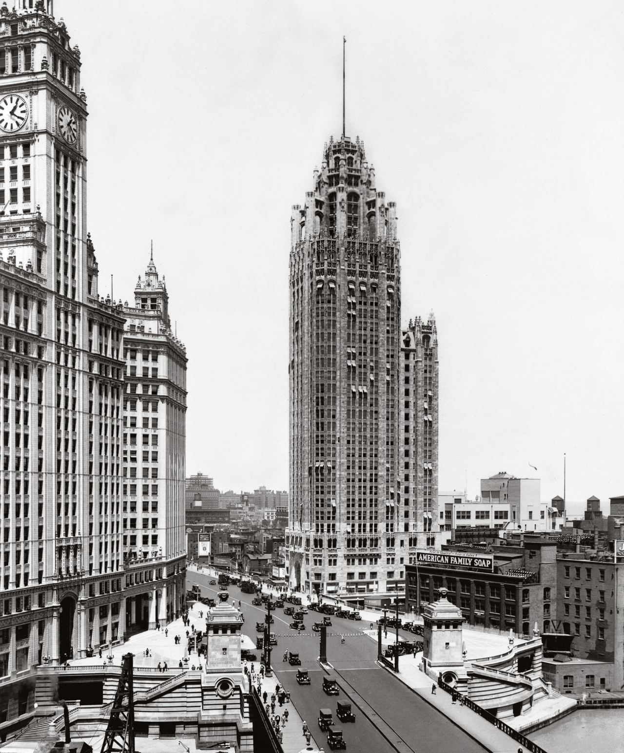
Tribune Tower - Chicago, 1924
This skyscraper with Gothic trim helped launch Hood's brief career.

American Radiator Building - New York City, 1924
The exterior décor here is still pre-Deco, pre-Moderne, but edging in that direction.

New York Daily News Building - New York City, 1930
A Moderne style skyscraper with setbacks helping make the structure more interesting than post- World War 2 slab-style buildings.  Behind its top is Tudor City, an interesting set of apartment buildings built a few years earlier and not designed by Hood.

McGraw-Hill Building - New York City, 1931
Whereas the Daily News Building had vertical cladding, the McGraw-Hill's theme is horizontal.  Perhaps Hood thought this was more "functional," but it made the building seem more squat, less attractive than it might have been.

Rockefeller Center - New York City, 1939 photograph
By the time this photo was taken, the initial project was essentially completed.  Since then, there have been additions and modifications.

Lesser-known Raymond Hood projects

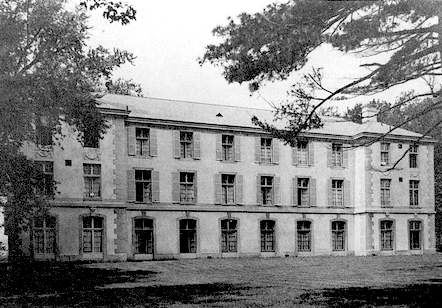
St. Vincent de Paul Asylum - Tarrytown, New York, 1924
Likely built on a tight budget, exterior décor is in the form of window shutters and what seems to be flat stonework.

Masonic Temple - Scranton, Pennsylvania, 1929
A tradutional style design, probably at the insistence of the client.

Ideal House - London, England, 1929
A Moderne slab with Deco trim.

William R. Morris residence - Greenwich, Connecticut, 1927
Traditional, with a Scottish feeling.

Joseph Patterson residence - Ossining, New York, 1930
Patterson was publisher of the New York Daily News.  This is an International style exercise.

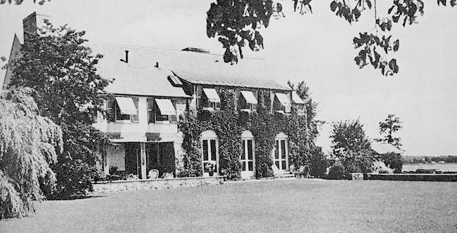
Raymond M. Hood residence - Stamford Connecticut, 1924
Hood's own house was traditional.  Perhaps he might have gone Moderne or International had it been built a few years later.  Or maybe he had enough sense to prefer a comfortable, place to live, and not an architectural statement.  By that time his career was launched, and he didn't need to make his house a marketing tool.

Monday, December 12, 2022

George Giguere, Illustrator

George Giguere was an American illustrator about whom I have little information.  I could find no biographical facts on the Internet.  Walt Reed's indispensibe book "The Illustrator in America: 1970-2000" only mentioned that he had a long, sucecssful career, listing some publications that carried his work.  No dates for birth and death, though it seems he was most active during the period 1910-1940.

That said, he was good at his trade but not outstanding.  Below are some images of his work.  I have almost no information as to their dates.  For example, I cannot tell if the Western scenes were early works or were made for Pulp magazines during the Great Depression later in his career.

Gallery

Anthony Visiting Cleopatra - 1924
It seems this was a self-promotion painting: click to greatly enlarge.

Home From the War
Probably made in 1919.

Cowboy fight scene

Quick Triggers

Runaway horse

Protecting the Derricks
Giguere's style varied considerably: compare to the two previous and two following illustrations.

Confederate Soldiers at Rest

The Garden Dance, Evening Fete
The background and its figure remind me of the work of Thomas Wilmer Dewing.

Monday, December 5, 2022

Bernd Reuters' Non-Automobile Illustration

Bernd Reuters (1901-1958), Germen Wikipedia entry here, was the leading German automobile advertising illustrator from the mid-1920s until his death.  I wrote about his Volkswagen work here.  And I find it interesting that, between the wars, he made illustrations for most German car companies -- apparently it didn't bother their advertising managers that competing brands used him.

Early in his career, Reuters made some excellent non-automotive illustrations. Unfortunately, few survived both the effect of time and the massive destruction in Germany during World War 2.

Most of the images below are taken from a new book devoted to him ("Bernd Reuters - Wegbereiter der modernen Automobil-Werbegrafik" by Werner Schollenberger, Karren Publishing, 2021).

His automobile illustrations usually were made using airbrush, but his early non-car work seems to be ink wash or watercolor.

Gallery

Reuters is probably best known for his postwar work for Volkswagen.  Above is a 1958 brochure page.

1928 magazine cover featuring a woman, the car is in the background.

Illustration in Sport im Bild (Sport in Pictures) magazine, the car again subordinate.

So far as Reuters' non-automotive illustration is concerned, here are pages from a 1926 issue of Scherl's Magazin for the story "Das Glück von Syrakus" (Happiness from Syracuse) by Joachim Friedenthal.

Closer view of the lead vignette illustration.

Closer view of pages 2-3 and 10-11.  The illustration on page 10 is particularly striking.  I wish I could find a larger version of it.

Monday, November 28, 2022

In the Beginning: Ernest Hamlin Baker

Ernest Hamlin Baker (1889-1975) is best known for the many cover illustration he made for Time Magazine 1940-1957.   I first wrote about him here.

A fairly lengthy biographical article about Baker is here.  Among other things, it mentions his time as a student at Colgate University, where he was a Big Man on Campus.

I know it's usually unfair to present artist's early work, but I'll do so now because I happened to come across some illustrations Baker made for the 1912 edition of Salmagundi, the school's yearbook.   Moreover, Baker entered college a few years older than normal, so he was more mature than the usual yearbook's student artist.

(The link has him entering Colgate at age 21, but that does not seem to jibe with the yearbook, whose content suggests he might have been 19 or 20.)

Gallery

An example of Baker's Time cover portraits.

His yearbook entry.  The first set of Greek letters indicates that he was a member of Phi Gamma Delta fraternity.

Introductory art for the yearbook's Freshman (entry) class section.   Following are illustrations for other classes and some college activities. 


Although Baker's cartoon style in in line with the fashion of the day, hints of his carefully-drawn later work can be seen here.


Monday, November 21, 2022

Zdeněk Burian: More Than Dinosaurs

Zdeněk Burian (1905-1981) was a Czechoslovak illlustrator best known for his depictions of prehistoric subjects.  His Englifh language Wikipedia entry is here.

The link does not mention his training, though it can be found in the French version.  He studied for a while at Prague's fine arts academy, but was mostly self-taught.  Since his father was an architect, he was exposed to illustration techniques while young.  That said, his technique changed little over his long career.

He was a very good illustrator with a feeling for action and atmosphere.  Wikipedia notes that once his work became known outside Czechoslovakia, it became influential in the field of paleontology illustration.

The images below show that his versatility extended beyond dinosaurs.

Gallery

A representative Burian dinosaur illustration.

A Pterosaur in a science-fiction setting.

Cave bears and hunters.

Painting cave walls.

An illustration for "Tarzan of the Apes" Chapter VIII.

Shooting a leopard.  Excellent depiction of the hunter as well as that of the beast.

French army attacking during the Great War.

Desert warriors.

"Madonna 20th Century"- 1962 - was the caption on the Web.