Monday, October 30, 2017

Artists Versus the Landscape

I think I've mentioned that there are cases where the appearance of a landscape is so powerful that differences in artists' styles can get largely washed away. That is the case for many parts of California. Some artists currently active are making paintings that have their character similar to those of the California Impressionists of the early decades of the 20th century.

Then there are painters who impose their style on whatever landscape comes before them. This can be a bit difficult in a California environment, because California's visual character can get diminished in the process.

What got me to thinking about this again was a visit to Seattle's Woodside / Braseth Gallery where an opening party was being held for landscape artist Lisa Gilley. She represents the case of an artist imposing style upon subject matter. Her paintings are strongly done, oil-on-board. I note that the settings she chooses to depict have clear skies and little or no forestation. That is, even though she lives in western Washington, there was no painting showing lots of fir trees and gray, misty skies. Her style cannot easily accommodate that.

Gallery

Franz Bischoff - Evening Glory: Santa Barbara Mountains
First, some examples of California Impressionism.

Edgar Payne - Canyon Mission Viejo, Capistrano
Payne's coloring is not quite the same as Bischoff's, but the influence of Southern California mountains strongly affects both works.

Edgar Payne - Sierra Lake and Peaks
Here Payne deals with the rugged part of the Sierras.

William Wendt - Where nature's God hath Wrought - 1925
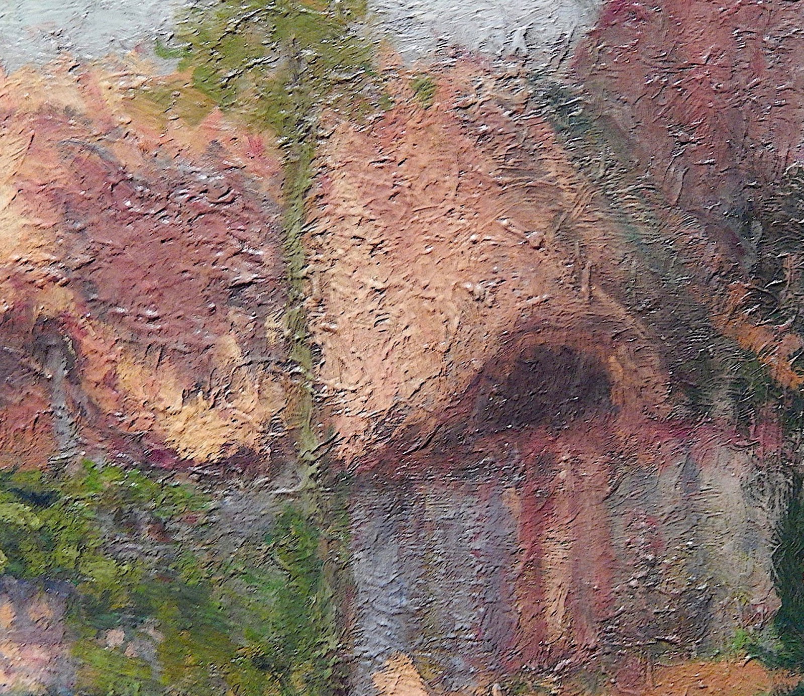
Wendt's take on California mountains showing bare rock.

Now for some Lisa Gilley paintings. This one's subject is the Chugash Range in Alaska.

A Grand Canyon scene.

Joseph Canyon,in Oregon

Yakima River, in Washington. In all four cases, her landscapes seem more designed than depicted.

Gilley's paintings are somewhat in the spirit of Lawren Harris, leader of the Group of Seven painters in Canada. This is a painting of Mt. Lefroy (1930), one of many in which he imposed his own style and concepts on nature.

Thursday, October 26, 2017

In the Beginning: William Cumming

William Cumming (1917-2000) was a Seattle area artist who knew the nationally acclaimed "Northwest Mystics" Mark Tobey, Morris Graves and the rest, but was not considered part of that group at the time. When I was in high school and college, Bill Cumming was mentioned so rarely by my mentor circles that I wasn't aware of him. Nowadays, his local reputation is much higher. My take on Cumming can be found here.

Recently I was at an opening at the Woodside / Braseth Gallery where, in addition to the featured painter, there was displayed a rediscovered WPA-era mural that Cumming painted in 1941 for the Burlington High School, some 60 miles north of Seattle.

Background regarding the mural can be found here and here.

I am not a fan of Cumming's art, though I respect him for not falling fully into the clutches of abstraction, as so many of his generation did. And even though the second mural-related link suggests the mural might be worth a six-digit sum (were it salable), it does not impress me.

What interests me about it is that it shows some Cumming traits that he still practiced almost 60 years later. One is the lumpy depiction of human forms. Another is Cumming's reluctance to include his subject's faces.

Here is the mural. Note that only one complete face is shown. Detail views are below.


This is a painting made in 1998, also displayed at the gallery. It is an example of the artist's late style.

Monday, October 23, 2017

Some Franklin Booth Color Illustrations

Franklin Booth (1874-1948) is best known for his highly skilled, distinctive, pen-and-ink illustrations. I posted his portrait of Theodore Roosevelt here. Some biographical information on Booth is here.

Even though he was largely type-cast as a pen-and-ink illustrator, Booth was able to do some work in color. One noteworthy example is illustrations for the 1913 edition of the rhymed play "Flying Islands of the Night" by James Whitcomb Riley. The publisher was Bobbs-Merrill of Indianapolis, the city where Riley lived for much of his adult life. Bobbs-Merrill had a 1892 edition (linked here) that apparently was not illustrated. In 1913 they published a new edition that incorporated illustrations by Booth (link here, but omits illustrations).

His illustrations appear to have pen-and-ink linework with little or none of his usual hashing. Color areas seem to be in watercolor or perhaps colored inks.

I find it interesting that Booth used a composition format that he frequently applied in his regular work: Subjects depicted small, towards the bottom of the panel, with tall background features occupying central and upper areas.

Gallery

Here is an example of Booth's pen-and-ink work. Note the composition.


Thursday, October 19, 2017

Up Close: Cornwell's LA Library Murals

Dean Cornwell (1892-1960) was one of the most important American illustrators from around the time of the Great War into the 1950s (short biography here). But, as I posted here, like Edwin Austin Abbey and John Singer Sargent, Cornwell was seduced by the concept that murals were the road to artistic immortality (think Michelangelo's Sistine Chapel ceiling).

So in the later 1920s Cornwell spent time studying mural painting under Frank Brangwyn. Some of this style rubbed off on his illustration work, as I pointed out here.

When the city of Los Angeles had a new Public Library built, part of the concept was to include a good deal of interior art, as mentioned here. Included was a set of murals by Cornwell. The library's web site has a page dealing with him and his murals, including mention of critical appraisals.

Not long ago I came across some photos I took of the murals back in 2010. I used some tools on my iMac to enhance what were images of dubious quality. The better results are presented below. Because I fiddled with brightness, contrast, sharpness and the colors themselves, I suggest you pay more attention to Cornwell's compositions and drawing than to colors.

Gallery

This is the setting I had to work with ... murals mounted high with bright sunlight nearby.


Monday, October 16, 2017

Henry Salem Hubbell: From Giverny to Miami Beach

Henry Salem Hubbell (1870-1949) is considered an American Impressionist even though many of his works were conventional in style -- especially portraits that necessarily had to satisfy their subjects. Although his reputation might be rising, as this lengthy article about him contends, he remains so obscure that Wikipedia has not received an entry on him as of the time this post was drafted (early June, 2017). A shorter take on Hubbell can be found here.

He had ability, and studied at Chicago's Art Institute and Paris' Académie Julian under Bouguereau, as well as under Whistler elsewhere. Time was spent with the American contingent in Giverny, where Monet was based. After returning to the USA, Hubbell practiced his trade in the Northeast, but eventually settled in Miami Beach, Florida -- an unlikely place for an artist in his day.

Like many artists he made much of his living doing portraits, but his favorite subject matter was attractive, elegant young women in genteel settings.

Gallery

The Orange Robe - 1908

Tea Time

By the Fireside - 1909

Ladies having tea

Luminous Reflection
Interesting thinly painted background contrasted with heavy brushwork on the costumes, but not the faces.

Girl in a Green Dress
This looks like a Giverny-era work in the spirit of Richard E. Miller and Frederick Frieseke.

Seated woman
From the subject's dress and hair, this might have been painted in 1920 (plus or minus five years).

Franklin D. Roosevelt - 1935
Hubbell painted more than one portrait of Roosevelt. Comparing the coloring of the face and hand, I question the quality of this image found on the web.

Thursday, October 12, 2017

More Early Duchamp Paintings

Henri-Robert-Marcel Duchamp (1887-1968) did a lot of damage to western culture and art. Or so I think. But if it hadn't been Duchamp, someone (or, more likely, several someones) would have done the same thing not long later. Biographical information on him can be found here.

Duchamp had a comparatively brief career as a painter before drifting over to other activities including his passion for chess. His most famous painting, "Nude Descending a Staircase" was a mix of Cubism and Futurism. I mention it and an early, more naturalistic painting here.

I revisited the Ringling Art Museum in Sarasota, Florida in May and found the portrait of his sister-in-law that I featured in the link above, and also found several other early Duchamp paintings. As often happens when photographing paintings in museums, images of two of those paintings were too blurred to post here. The others are presented below. Click on them to enlarge.

The point I make with these images is that while the early Duchamp painted in a modernist vein, it was a conservative variety of modernism.

Gallery

Sur la Falaise - 1905
Duchamp was about 18 years old when he did this landscape.

Portrait d'Yvonne Duchamp-Villon, née Bon - 1907
An establishment photo I took in 2012 that also can be found in my older Duchamp post.

Detail. He was about 20 when he did this. Although it is signed, the sketchy treatment of Yvonne's hand gives the painting an unfinished appearance. The rationalization for this probably would have something to do with the idea that the hand was an irrelevant detail.

An even closer view. I find it interesting that Duchamp essentially washes out the subject's mouth and to a lesser extent her eyes while emphasizing (comparatively) her nose. Note the limited color palette. Altogether, a nice pierce of work for one that age.

Maison Paysanne, Yport - 1907
A peasant's cottage painted the same year, but in quite a different style.

Detail of the above, showing how thickly Duchamp painted here.  Or perhaps this was an over-painting of a previous work that used thick paints: I'm not expert enough to be sure which possibility is correct.

Monday, October 9, 2017

Lucien Simon of the Bande Noire and Brittany

Lucien Joseph Simon (1861-1945) was not born in Brittany, though his artistic career was centered there. He was born into an upper-middle class family in the Saint-Sulpice quarter of the 6th arrondissement, probably not far from my favorite Paris hotel.

It seems that Simon was well known and well regarded in his day, and I am ashamed that he escaped my painter radar for so long. Another item I missed was that he was part of a small movement called le Bande noir (Black Band), a group also unknown to me.

A brief English Wikipedia entry on Simon is here, and a much longer one in French (that your computer should be able to translate) is here.

It seems that Simon acquired his interest in Brittany via his wife, also an artist, who had Breton roots.

Below are examples of Simon's work in approximate chronological order.

Gallery

Jeunes Bigoudènes assises vues de dos - c. 1898

Procession in Penmarch - 1901

Fin de repas à Kergaït - 1901

La mascarade - 1904

Le balcon de theatre

Le goûter - c. 1906

Place au Beurre, Quimper

Visit of Aman-Jean to Sémaphore - 1917
Sémaphore was the Simon house in Brittany, and Edmond Aman-Jean was an artist and contemporary of Simon.

The Music Lesson

Après la guerre - c. 1919

Famille à Sémaphore - 1923

Atelier aux champs, la gare de Chaville - 1930