Monday, March 27, 2023

Walter Schnackenberg Poster Art

Walter Schnackenberg (1880-1961) seems to be best known for his poster art.  His brief Wikipedia entry here mentions:

"He ... designed stage sets, theatre costumes and posters, including a signed one around 1920 for his father-in-law's Europäische Güter- und Reisegepäck-Versicherungs-AG travel insurance firm and examples for Munich's Deutsches Theater."

From this, I gather that Schnackenberg had few financial worries during his productive years.  The extent of those years is obscure to me, being based on the examples of his work found on Internet image searches.  The poster images I downloaded seem to range from 1910, or perhaps a few years before, into the early 1930s.

Other biographical sources on the Web are equally sparse regarding him -- especially his career after the early '30s, aside from one remarking that he "worked" in the town where he died.  Some photographic evidence suggests that he was making paintings rather than posters by then.

As for his style, it was more "arty" or "mannered" than the work of Ludwig Hohlwien, Munich's most famous poster artist.  I find his posters more interesting than likable, but you are free to disagree.

Gallery

First, four Odeon Casino posters, the one above dated 1911.

From 1922.

A 1912 poster for the Munch restaurant-bar.

Dated 1920.

From the woman's costume, this seems to be from the '30s.

Poster for a Swedish cabaret -- again from around 1930.


Appears to be dated 1932.

A 1918 poster warning against the evils of Bolshevism.  Communism brings war, unemployment and hunger, according to the caption.  There was serious danger of Communism taking over Germany at that time, and Schnackenberg lent his support to fighting it.  Note that the style is similar to left-wing political posters of the era, not like his work for cabarets.

Poster for his father-in-law's company.  The woman's neck and face are similar to the work of Jean Dupas.

By 1914 Schnackenberg was well enough known that there was an exhibit of his poster art.

Monday, March 20, 2023

Frank Quail, 1920s Automobile Advertising Illustrator

Frank Quail is another of those illustrators for whom information on the Internet is lacking.  One reason might be his name.  When surfing images, I usually get a large number of images of quails -- the birds.  Otherwise, the Frank Quail images that do pop up are of automobile ads he illustrated 1919-1928.

Did he do other kinds of illustration?  Probably, but for advertising of products besides cars.  Tracking down any such ads by Quail would involve more lengthy, tedious work than I'm willing to undertake.

In the mid-1920s when he did most of his important work, full-color advertisements in leading magazines used illustrations of cars rather than photographs.  That's because color photography technology was not up to the task (for example, Kodachrome film was not introduced until 1935).

Quail was fortunate to have Chrysler as a major client for the 1927 model year and slightly beyond.  By that time his skills for depicting cars and people in upscale settings yielded well-crafted illustrations.

That said, some of his work suggests he was influenced by Fred Cole, who I wrote about here in a post titled "Fred Cole's Suggestively Incomplete Car Illustrations."

After 1928, I don't know what became of Frank Quail.

Gallery


1919 Paige-Detroit
The earliest example I could find of Quail's work.

1924 Packard
Since he could do automobile renderings, it's possible Quail continued doing that anonymously for brochures and such.

1926 Cadillac
Packard and Cadillac were leading luxury brands, so ad agency art directors for those firms clearly thought highly enough of Quail's ability to hire him.

1927 Chrysler
A '27 Chrysler in a similar pose to that of the car in the previous image.

1927 Chrysler
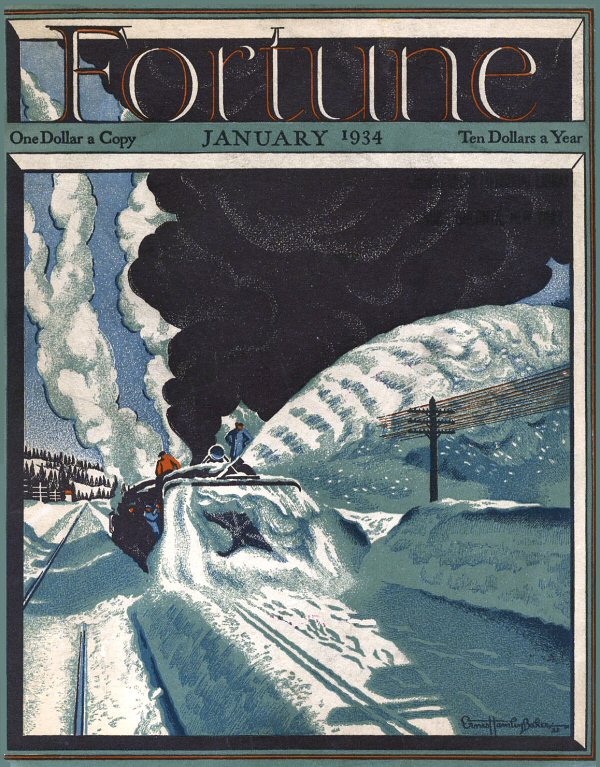
Okay, the tires disappear Fred Cole style due to snow.  But the effect is similar to Cole's deliberate incompletions.

1927 Chrysler
Luxury can in an upscale setting.

1927 Chrysler
Placing a passenger in the back seat makes this car looking cramped, though I suppose the idea was to tout its carrying capacity.

1927 Chrysler
Another incomplete car, this due to a handy railing.

1928 Chrysler
Painted in 1927, featuring the new 1928 Chrysler.

Monday, March 13, 2023

Gaspar Camps and His Women


Not long ago I was in London's Prince Edward Theatre.  It dates from 1930, having Art Deco and Moderne interior décor in places such as the lounge pictured above.

Note the framed print at the left  Here's my photo of it (excuse the reflections):


Very 1920s, I'd say.  And whose work was it?  Gaspar Camps i Junyet (1874-1942), about whom there seems to be virtually nothing on the Internet.  On the other hand, the Web has many images of his prints.

He was Catalan, but might have worked in Paris as well as Barcelona.  His circa-1900 style seems to have been influenced by Alphonse Mucha, later continuing to adjust to current illustration fashion.  Based on Web images, his subject matter was posters or prints of attractive women.  Below are some examples.

Gallery

This print was also found in the Prince Edward's lounge.  Striking, and very much of its time.

Perhaps from nearer to 1920.

Again, from the '20s.

An early 1900s print.

Ditto.

The hairstyle indicates mid-1930s.

An oil painting -- "Autumn" from around 1907.

Another 1930s example.

Monday, March 6, 2023

Ernest Hamlin Baker's Fortune Magazine Covers

Ernest Hamlin Baker (1889-1975) is probably best known for the many cover portraits he made for Time Magazine 1940-1955.   I wrote about him here, and background information is here.

Although Baker was building his career during the 1920s, some casual Internet image surfing failed to turn up anything from that decade by him.

So from our perspective, Baker doesn't really emerge until the 1930s.  And in the form of 14 or so cover illustrations he made for Henry Luce's new business-oriented Fortune Magazine that began publication in 1930.

In those Great Depression days, Fortune was expensive to buy.   In part that was due to its production values.  For example, covers were printed on heavy, non-glossy stock.  Below are images of Baker-illustrated covers.  Some can be clicked on to enlarge.

Gallery

Time Magazine 16 June 1944 cover portrait of Admiral Raymond Spruance
Spruance is regarded by me and others as the U.S. Navy's leading World War 2 combat admiral.  The style Baker used here is typical of his work for Time, and differs from what he did for Fortune.

April 1931
This seems to be Baker's first Fortune cover.  Its connection to the business world seems obscure.

July 1931
This is more like it, an ocean liner departing its New York City pier.

April 1932
A huge piece of road-building equipment.

June 1932
And let's not forget agriculture.

December 1932
Holiday season in the depths of the Depression.

January 1933
Next month, Baker offered a quite different style.

March 1933
Simplicity was found in many Fine Art painting of the time as well as this Baker illustration.

August 1933
Inter-city busses were popular means of transportation back then.

January 1934
Severe winters required snowplows for steam locomotives.

August 1934
A mining scene.

June 1935
More agriculture.

October 1935
And again.

November 1936
At this time, the U.S. automobile industry was making a recovery from the worst of the Depression.  The car on the hauler has one of those new, all-steel roofs.

April 1937
This seems to be Baker's final Fortune cover.  It deals with the new guidance systems for airliners.