Monday, July 30, 2012

Ilya Repin's Portrait Studies


The image above is of the painting "Formal Session of the State Council in Honor of Its Centenary on May 7th, 1901" painted in 1903 by the Russian master, Ilya Repin (1844-1930). Information on the nature of the Council can be found here.

The painting is huge, occupying much of a wall in the Russian Museum in St. Petersburg. The museum is well worth seeing if you are interested in Russian art and have any time or energy left after traipsing through the Hermitage.

According to David Jackson in this book (pp. 168-70):

* * * * *

Repin was given extraordinary permission to study council meetings, having insisted that everything be done from life. He worked on the enormous canvas between April 1901 and December 1903 with assistance of two pupils, Boris Kusodiev and Ivan Kulikov. It presented formidable technical problems, not least the perspective of the circular chamber, but also the complexity of arranging scores of figures of varying sizes whilst seeking to retain a harmonious colour scheme amongst a riot of official uniforms and sumptuous furnishings. In the event the Tsar was pushed to the background as Repin was forced to reduce the actual number of members to a more manageable figure.

Several artistic devices were employed to to solve these difficulties. The fore-figures are painted larger than life to forestall the portraits in the background dwindling to minisule proportions. To solve the difficulties of perspective the chamber is seen from a number of converging viewpoints, rather than any single one. All lines in the picture bend rather than travel straight, since a true rendition would create the illusion of concavity and collapse. To harmonise the colour scheme complementary tones were highlighted; black, red and yellow, punctuated with the sky-blue of members' sashes.

There is some doubt as to how much of the finished work is by Repin as there are discrepancies in quality between the figures, though this does not necessarily point to his assistants. From the late 1890s he began to suffer increasing pains in his right hand which had begun to atrophy due to a lifetime's overwork.... According to Repin he painted the entire canvas with only the use of his left hand, though he was still stubbornly trying to use his natural hand as late as 1917....

Natalya Nordman, Repin's companion at this time, used a Kodak camera to assist in the process of recording data, but Repin insisted upon personal sittings which he integrated into the overall composition and the work was finished in a surprisingly short time, less than three years.

* * * * *

Here are some of the portrait studies Repin made.

Gallery

Count Dmitry Martynovich Solsky - 1903

Unidentified

Konstantin Pobedonostsev - 1903

Prince Mikhail Sergeyevich Volkonsky - 1903

Sergei Witte - 1903

Count Aleksey Pavlovich Ignatiev - 1902

Friday, July 27, 2012

Colors Affect Automobile Styling


Many people choose white as the color for their automobile. Some simply prefer it for its own sake. Others who live in hot climates select white because it reflects the sun's rays and reduces the expense of operating the air conditioner.

But the way I see it, there's a major problem with white cars: it kills one's perception of the shapes of an automobile's surfaces.

To Illustrate my contention, let's take a look at some Mercedes Benz E350s.

Gallery


As you can see, darker colors show highlights that help visually define the metal sculpting that has become increasingly elaborate in recent years. Surrounding objects are also reflected much more strongly, which some people might find objectionable. Perhaps that's why silver is a popular color: it reflects sunlight while making the sculpting more visible than does white paint.


Wednesday, July 25, 2012

John Holmgren: Chameleon Illustrator?


When an artistic style becomes fashionable, wannabes swarm in. I'm not quite sure that I can truly label R. John Holmgren (1897-1963) a "wannabe" or "Chameleon" (as the title of this post has it). That's because there is little of Holmgren's work to be found on the Internet.

Yet Holmgren seems to have been a fairly well known illustrator in his day. Walt Reed in "The Illustrator in America, 1860-2000" notes: "His illustrations appeared in most of the national magazines and for many advertisers, including Chevrolet, Ford, Alcoa, White Rock and Cunard Lines. A long-time member of the Society of Illustrators, Holmgren was its president from 1941 to 1944."

The White Rock illustrations included the "Psyche" girl in various settings done in 1940s wash-style. But I want to focus here on the work he was producing in the late 1920s and into the mid-1930s. There were some illustrators in those days with strong styles that were popular with viewers. These included Norman Rockwell, J.C. Leyendecker, Mead Schaeffer, Henry Raleigh and Walter Biggs -- none of whose work could be confused with that of the others.

And then there were McClelland Barclay and John LaGatta, two other major illustrators back then. Barclay favored oil paints and used a form of Cloisonnism, outlining to emphasize his subjects. LaGatta usually drew images in charcoal and then applied oil washes to add color; he also favored outlining.

The point of this post is that Holmgren tended to mimic Barclay and, to a lesser extent, LaGatta in those days. I'm not sure what medium he painted in, though he seems to have made use of line and washes of some kind. Aside from seeming derivative, his illustrations were nicely done. Take a look:

Gallery

Life cover - 18 January, 1929

Life cover - 24 May, 1929

Judge cover - July, 1934

By McClelland Barclay: Fisher Body advertisement, 1928

By John LaGatta - 1930s

Monday, July 23, 2012

Walter Biggs: Impressionist Illustrator


During the 1920s and 1930s, American mass-circulation magazine and advertising illustration tended to be cautious where the matter of incorporating modernist techniques was concerned. This was probably in line with the tastes of the majority of readers, or at least of the perception of readers' tastes held by art directors and editors. Given the need by illustrators to produce results in a timely fashion, highly "finished" paintings of the nineteenth century academic variety were rare (a major exception was Maxfield Parrish). So "painterly" (featuring the brushwork) illustrations and simplified, poster-inspired illustrations with a modernist tinge were acceptable. Even a tame form of modernism, such as Impressionism was by 1920, was fairly rare. So I find it interesting that Walter Biggs (1886-1968), who usually painted in a free, brushy, somewhat Impressionist style, was an important illustrator during those decades.

Background information on Biggs can be found here and here. An interesting memoir by a man who knew Biggs is here.

Biggs was a courtly Virginian through and through even though, for professional reasons, he had to spend much of his time in what has been described as an incredibly messy New York City studio where Lincoln Center is now located.

Here are examples of his work.

Gallery

Advertisement Illustration - before 1920

From Woman's Home Companion magazine - 1922

From American Magazine - October, 1933

From Ladies Home Journal magazine - December, 1936

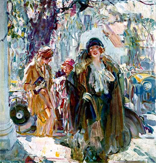
Illustration for International Silver Company advertisement - 1924 or 1925

I am in the process of writing what will likely be an e-book about modernism in painting and illustration with the focus on the period 1920-1940. I'm not quite done with the first draft, so haven't given the matter of how it might be illustrated much thought other than to opt for writing it as if there were no pictures in it at all. Below is an excerpt from a chapter draft dealing with non-avant-garde art in the 1920s. I attempt to describe and analyze the International Silver illustration shown immediately above. It's far more wordy than any other such item in the book, and I'd like to chop out most of it if I could include the image without copyright and fee hassles. Regardless, for what it's worth, here is the excerpt.

The following: Copyright Donald B. Pittenger 2012.

* * * * *

Walter Biggs (1886-1968) painted in a loose, busy manner wherein his subjects sometimes were portrayed almost as sketchily as their settings. These paintings were traditional only in the sense that they might have resembled quick color studies made by the Masters of centuries past, though in Biggs’ case they were completed works. Biggs mostly used watercolors, watercolors with a dash of white tempera added, or occasionally a combination of watercolor and gouache. He did paint in oils when necessary, though the final effect was similar to what he normally achieved with water-based media.

Consider an oil painting he made for an International Silver Company advertisement in the mid-1920s. The subject is three women walking towards us, apparently heading to a building featuring a round, white column visible at the left edge of the image. One woman is in the lead, having already climbed the few steps from the sidewalk. Behind her another woman is slightly turned, talking to yet another young woman slightly more to the rear whose image is also partly obscured by the first woman. Together, they combine as a compositional element. Behind them in profile is the car they apparently arrived in, but all we can see of it is the spare tire mounted on the front fender and a fragment of a rear tire and fender. To the right is another car heading towards us and, behind the middle woman, is the trunk of a tree. These are all sketchily painted, and are nearly all the objects in the busy image that can be positively identified, though there are hints of gabled roofs and a chimney in the background. Aside from the sketchy tree trunk and hints of houses, the background comes close to being an abstract painting filled with bits of pale colors and overlapping brushwork. The women are painted in the same manner, though their coats, cloche hats, purses, gloved hands and so forth can be distinguished though the busy brushwork. Biggs does give their faces slightly more attention so that features and expressions can be read by the viewer.

Modernism comes into play here in that the scene is only suggested rather than clearly defined. The overall feeling is Impressionistic even though the application of paint is not Divisionist, as in a Monet painting. Think of it as a very loose watercolor sketch, but done in oils.

Friday, July 20, 2012

Gil Cohen: Populating Aviation Art


I chanced upon the above book recently, for some reason never having heard of Gil Cohen even though I'm aware of quite a few other artists of the Aviation Art genre. That might be because Cohen normally doesn't paint aircraft that are airborne. Moreover, his focus is on people associated with aircraft, not the planes themselves. (The only other artist who quickly comes to mind for following the same path is James Dietz.)

The most detailed Internet biographical information that I could locate on Cohen is here. In brief, he was born and raised in Philadelphia (on South Street, for those of you who know the town). His art training was at the Philadelphia Museum of Art School, now the University of Arts, where he later taught part-time for 20 years while carrying on with his career as a professional illustrator. Much of his illustration work was for men's magazines, though he also did book covers for romance novels and some general-interest titles.

This is spelled out in the book, which I found interesting. Besides outlining his career and describing (and showing) the steps he takes when doing his aviation paintings, he discussed the origins of each of the paintings in the book along with accounts relating to his thought process when planning the depictions. My main gripe regarding the book is that, because his paintings tend to be panoramas, they are spread across the inter-page gutter and sometimes important details are lost.

Below are examples of Cohen's work; click to enlarge (some will and others won't).

Gallery

Magazine cover: Male - May 1967
Most of the male mag illustrations he did strike me as being rushed. But then the pay probably didn't justify all-out efforts. This one is more finished than many of the others.

Photo of Cohen and Robert Rosenthal with painting
The painting is titled "Rosie's Crew / Thorpe Abbotts, 1943" (2001), showing Rosenthal and his flight crew gathered just before a bombing mission over Germany. For more information on Rosenthal's outstanding Army Air Forces career, click here.

"Coming Home / England, 1943" - 1990
A surviving aircrew at the end of a mission.

"After the Mission" - 1993
Even though aircrews were exhausted and perhaps more then a little shaken after a bombing mission, they had to go through a debriefing process for the benefit of intelligence officers who were looking for any changes in German air defenses as well as potential flaws in Eighth Air Force practices.

"Requiem for Torpedo Eight" - 2004
The scene is the flight deck of the aircraft carrier Hornet (CV-8) on 4 June 1942, the crisis point of the Battle of Midway. The torpedo bombers of Squadron 8 attacked the Japanese fleet at low level and were all shot down. Only one man survived, Ensign George H. Gay shown piloting the TBD Devastator beginning its takeoff run.

Wednesday, July 18, 2012

Exploratory-Line Illustrators


This is an expansion of a topic I wrote about last year in this post about David Stone Martin. Martin is best known for a kind of scratchy, exploratory pen-stroke illustration style that was popular in the 1950s and for a while thereafter. Read the post linked above for my take on him.

But Martin wasn't the only one employing exploratory lines. Nor can it be said that he invented the style.

Take a look at some examples while I continue this narrative.

Gallery

By David Stone Martin
To set the stage, here is a drawing by Martin. He illustrated many covers for jazz albums, but I'm not sure whether or not this drawing was one that became part of a cover.

Ben Shahn - Scotts Run, West Virginia, 1937

Ben Shahn - illustration, 1957
Ben Shahn worked as a painter and illustrator during his career. The 1937 work is fairly typical of what he was doing at that time, combining paint with thinly drawn linework. It is likely that Martin was aware of Shahn's style while his own was evolving. The 1957 piece shows that Shahn was still using that style of line. And why not? It was trendy in 1957.

By Robert Weaver
Robert Weaver also made use of a Shahn-inspired technique during the 1950s and later. Like Shahn, he didn't mind putting a political twist in his choice of subject matter.

By Tracy Sugarman
I am not familiar with Tracy Sugarman, only having come across examples of his work while researching this post. Again, the style is similar.

Harvey Schmidt - book cover

By Harvey Schmidt (probably)
Harvey Schmidt is best known as the composer of the off-Broadway show "The Fantasticks" that ran for decades. However, Schmidt began his career as a commercial artist using a style similar to those of the men mentioned above. Unfortunately, I could find almost nothing of his on the Web other than what you see above. That might be because he mostly or entirely dropped commercial art once The Fantasticks became a big hit.

Monday, July 16, 2012

Molti Ritratti: Aline Masson by Madrazo


Raimundo de Madrazo y Garreta (1841-1920), son of the artist Frederico de Madrazo (1815-94), although a Spaniard, was born in Rome and spent much of his career in France. Biographical information about him on the Internet is sparse: his Wikipedia entry in English says almost nothing, though his Spanish entry is better.

Madrazo was no third-rater, so far as Spaniards are concerned; the Prado museum in Madrid has a room devoted to his work. I'll try to get around to showing more varied examples later, but for now I'll focus on paintings he made of what seems to have been of his favorite model, Aline Masson.

I find it somewhat interesting that we know Aline by name, because many models used by famous artists are anonymous, such as those I wrote about here.

Let's take a look Mlle. Masson as seen by Madrazo.

Gallery

La modelo Aline Masson

Aline Masson in Blue

Aline Masson in a White Mantilla

Aline fixing a hat

Aline Masson Leaning Against a Sofa

Woman in white and pink

The Love Letter

Friday, July 13, 2012

Upside-Down Bathtub Car Styling


For most of the 1930s and into the early 1940s automobile stylists assumed that the car of the future would feature teardrop streamlining.

It turns out that Harley Earl, General Motors' styling supremo from the late 1920s to the late 1950s, decided that the teardrop motif wouldn't do for his restyled 1948 and 1949 models. And in those days, GM styling ruled because the corporation claimed half the U.S. car market.

Due to either ignorance of Earl's plans or stubbornness, a few car makers went ahead with teardrop-inspired designs featuring "fastback" upper styling and fenders flush to the car's body and extending from headlamp to taillight. Some European car companies did the same thing.

Earl's styling judgment eventually failed him starting with the 1957 model year Buicks and Oldsmobiles. But he was on target in the late 1940s, deciding that teardrop styling resulted in cars with a distinctly bloated, awkward appearance; his 1948 and 1949 restyled lines were much more graceful and sold well. Competing lines that opted for the teardrop approach tended to look like bathtubs turned upside-down.

Gallery

Packard - 1948
The 1948 Packard was a major facelift of a fine 1942-vintage design. The most visible change was replacing distinct front and rear fenders with an awkward single fender bulge extending the length of the body. Sales were good the first year, but rapidly deteriorated thereafter.

Hudson - 1948
Hudson's postwar restyling was probably the most successful of the examples pictured here. That was partly because the cars really were low and partly because the crease along the side of the fender helped further lower the car's appearance.

Lincoln Cosmopolitan - 1949
The 1949 Lincolns used two different bodies. The one shown at the top of this advertisement was shared with Mercury. Its fender line stepped down from front to rear and counteracted the potential side bulk common to most cars of that period. The other car was the Cosmopolitan which had a larger, Lincoln-only body. Most Cosmos featured a "bustle back" style where the top stepped down to a distinct trunk at the rear. But for 1949 some Cosmos featured a "fastback" rear roofline in the teardrop fashion, and that's what's shown at the bottom. Fastback Cosmos sold poorly and the variant was scrapped.

Nash Airflyte - 1949-50
To me, the Nash was the archetypical upside-down bathtub design. Besides the heavy, rounded top, wheel openings were minimal and that made the sides look more ponderous than they otherwise might have been. But covered wheel wells were what streamlining was all about back around 1945 when the design was being worked up.

Ford (France) Vedette - 1952
The fenderline of the Vedette is a scaled down version of what is seen on the upper Lincoln in the ad shown above. But some Vedettes had a fastback roofline yielding the awkward appearance seen here.

Borgward Hansa 2400 Sport - 1952-59
Yet another bathtub design, though its heaviness is mitigated a bit thanks to the large windows.

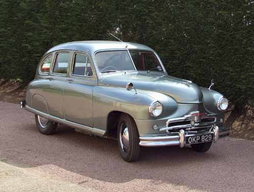
Standard Vanguard - 1952
The British were capable of making some attractive large sedans in the postwar years, but their small ones tended to be unfortunate designs. The Standard Vanguard shown here was truly an awkward, ugly little beast thanks to its short length combined with its roofline and fender styling. I never saw Vedettes or Hansas when I was young, but some Vanguards were sold in Canada and I viewed them in all their ugliness when visiting Vancouver.

Wednesday, July 11, 2012

Gallen-Kallela's Portrait Art


Akseli Gallen-Kallela (1865-1931) was a Finnish artist and nationalist who was deeply involved in the movement for independence from Russia. These activities as well as follow-on work after independence curtailed most of his artistic production in the last 15 or so years of his life. Biographical information can be found here.

Gallen was a talented painter who tried a variety of styles during his active career, and I might get around to featuring those in a later post. For now, I'd like to focus on his portrait and near-portrait work which was more limited in its variety.

His very earliest paintings were traditional, but his student sojourn to Paris exposed him to the modernist ideas that were bubbling up in the wake of Impressionism. Later on, he visited Germany and saw Expressionist works first-hand. Moreover, he hobnobbed with Expressionist and Symbolist painters such as the Norwegian Edvard Munch.

Here is a sampling of Gallen's portraiture.

Gallery

Boy and Crow - 1884
This isn't really a portrait, yet nevertheless is an astonishing piece of work for a 19-year-old. If you ever find yourself in Helsinki, run, don't walk, to the Ateneum and see for yourself how technically accomplished it is.

Ida Aalberg - actress - 1893
Now we skip to his post-student days.

Symposium - 1894
Pictured left-to-right: Gallen-Kallela, Oskar Merikanto, Robert Kajanus and Jean Sibelius.

Rodolf Rittner - German actor - 1895

Edvard Munch - 1895

Mary Gallen at the Lake of Lintula - 1904
Mary was his wife.

Maxim Gorki - 1906

Eino Leino - Finnish poet - 1917

Kirsti Playing the Cello - 1917
Kirsti was his daughter.