Thursday, October 29, 2015

Luigi Bonazza: Not Quite Traditional

Besides a major exhibition of Pierre Bonnard's paintings, the Musée d'Orsay was holding another exhibit when I dropped by 19 July, titled Dolce vita ? Du Liberty au design italien (1900-1940) "Dolce Vita? From the Liberty to Italian Design (1900-1940)" (running 14 April - 13 September 2015).

An item that caught my attention was this large triptych:


It's titled La leggenda di Orfeo (1905), painted by Luigi Bonazza (1877-1965). The image above does not have very good resolution. Otherwise, it would show that Bonazzo used a form of pointillism to fill areas of what otherwise appear to be solid, sharply painted subjects.

According to this Wikipedia entry (in Italian), he was born and grew up in Arco, just north of Lake Garda in Trentino, or Südtirol in the Austro-Hungarian Empire, which has been part of Italy since the Great War. Bonazzo was of the Italian-speaking community there and fled south when Italy declared war on the Central Powers, even though he had received his art training in Vienna.

Bonazzo seems to have spent much of his career in Trento, keeping his style almost traditional, yet with an air of modernism. More examples of his work are below.

Gallery

Trentino (Poster) - 1904
Bonazzo, like many artists of his time, also did commercial work.

Jovis Amores, Deione - ca. 1908-1912
From a series of mezzotint engravings.

Notte d'estate ca. 1912 or 1916 or 1920 or 1928
I can't find good, consistent information on this tempera-on-cardboard painting.

Gabriele D'Annunzio
Portrait of the poet, adventurer, aviator and politician.

Ritratto di Feliciana - 1939
A later work also adding a slight modernist touch to a traditional format.

Monday, October 26, 2015

Frank Brangwyn's Mural-Style Art

Sir Frank William Brangwyn (1867-1956) was largely self-taught, as this Wikipedia entry mentions. That supposed lack was no obstacle, because Brangwyn had a long, successful career. I wrote about his railroad poster work here.

He had a strong, interesting style suited to mural painting. An 1895 mural commission definitely launched the style featured below, but he was already heading in that direction. In the early 1890s he traveled to North Africa and Turkey, and the scenery there brightened his palette. He also began to paint in a flatter manner and introduce outlining, and important feature of murals that had to be seen and read from a distance.

Some of the images below are quite large, so click on them to view in even greater detail.

Gallery

Venetian Scene - 1906
An example of Brangwyn's signature painting style.

Buccaneers - 1892
This pre-1895 painting approaches his mural style, though stronger outlining is lacking.

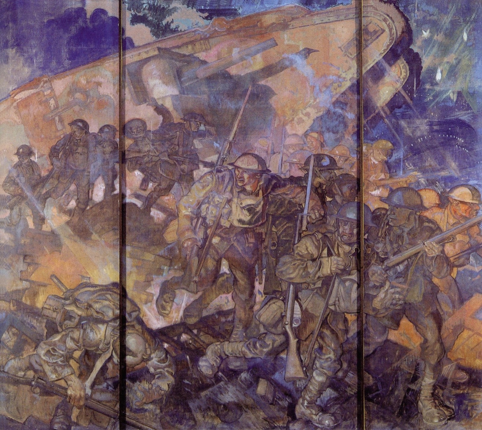
Tank in Action - 3 panels - 1925-26
A later work showing British troops and a tank in action during the Great War

The Wine Press

Venice: Santa Maria Through Rigging

Music - 1895
"Music" and "Dance," below, were panels in Siegfried Bing's famous Galeries l'Art Nouveau in Paris that gave the name to that stylistic movement.

Dance - 1895
The other Galeries l'Art Nouveau mural. This is one of my favorite Brangwyn works.

Dance - detail - 1895
I find Brangwyn's use of color and outlining fascinating because I'm not sure if he had a system for this or whether it was intuitive.

Thursday, October 22, 2015

William Penhallow Henderson's New Mexico Paintings

William Penhallow Henderson (1877-1943) was one of a number of artists who moved to the Taos - Santa Fe part of New Mexico around one hundred years ago. In Henderson's case, this was in part because his wife was tubercular and it was thought that the dry climate would be helpful (and she did live for 36 more years). Here is some biographical information on Henderson.

What I find interesting about Henderson, Ernest Blumenschein, Buck Dunton and others of that New Mexican migration cohort is that their painting styles had similarities. Could it have been the climate, topography and Indian subculture of north-central New Mexico that molded their paintings? To some degree I think this was so. But not to the degree that the California Impressionists' art was influenced by their subject matter. New Mexico painters also tended to be influenced by art style fashion, and one strong fashion prevalent from the late 'teens through the 1920s and well into the 1930s was what I've called Modernism-Light. That is, forms were simplified, often with a hint of reduction to geometric shapes, and certainly by elimination of some surface detailing. What I am not yet sure of is whether buyers of such paintings demanded that style or if there instead was subtle peer pressure or group-think going on.

Gallery

Little Sister (The Chaperone) - ca. 1916

Holy Week in New Mexico - 1919

La Tienda Rosa - ca. 1920

Noon - 1920

Feast Day, San Juan Pueblo - ca. 1921

Fiesta Brown Eyed Beauty - 1924

Cerro Gordo Before the Sangre de Christo Mountains - 1930

Monday, October 19, 2015

Pierre Bonnard's Big Show

On average, my timing regarding want-to-see art exhibits in places I'm visiting is usually bad. That should be expected, because the majority of art museum exhibitions don't interest me, which means that I'm unlikely to get to see the few I'd like if my travel dates are random relative to exhibition schedules. What frustrates me most is when I miss a must-see exhibit by only a few days or weeks.

That said, my luck was good in July because the morning after I arrived in Paris, the Musée d'Orsay's Pierre Bonnard exhibition (17 March - 19 July 2015 -- "Pierre Bonnard: Painting Arcadia") was starting its final day. (American Bonnard admirers will have the chance to visit a version of it at San Francisco's Legion of Honor from 6 February to 15 May 2016.)

I'm not actually a big fan of Pierre Bonnard (1867-1947) -- Wikipedia entry here. I don't dislike his work, but don't love it either. But I was pleased to be able to view so many Bonnard paintings at one time.

There were many, many items in room after room. Some were from the d'Orsay's collection, but others came from as far afield as Toledo, Ohio and Moscow's Pushkin.

Below are some examples of Bonnard's work, a few of which were in the display.

Gallery

Poster - 1891
This poster helped launch Bonnard's career. He did other commercial work, much of it related to books and publications such as Thadée Natanson's La Revue blanche.

Femme avec chien - 1891

Peignoir - 1892

Misia avec roses - 1908
Musician and muse to many artists, Misia, at the time of this portrait called Misia Edwards (she was previously married to Natanson and later married Spanish painter José-Maria Sert).

Nu à contre-jour - 1908
This well-known painting was in the exhibition.

La loge - 1908
Commentary on the people portrayed in the painting found here on the d'Orsay web page:

Dans leur loge à l'Opéra de Paris, sujet "moderne" que la fin du XIXe siècle a mis à l'honneur, sont représentés Gaston [Bernheim, the art dealer], debout au centre, avec, à sa droite, sa belle-soeur Mathilde, à sa gauche, son épouse Suzanne, et à l'arrière-plan, son frère aîné, Josse.

Google translation:
"In their box at the Opera of Paris, about "modern" as the late nineteenth century honored are represented Gaston, standing center, to his right, his brother's wife Mathilde, to his left, his wife Suzanne, and background, his elder brother, Josse."

Place Clichy - 1912
The square as seen from a brasserie.

Salle à manger à la campagne - 1913
A scene combining an interior, still life, plein-air and a portrait.

La Palme - 1926
Bonnard later spent much of his time on the Côte d'Azur.

Because there were so many paintings on display and my time was somewhat limited, I'll offer only the following impression Bonnard's work made on me. His painting style is usually patchy, with many small, uneven brush strokes.  He often places "warm" and "cool" colors close together using such strokes to cover an area. This sometimes is in the form of opposite, "vibrating" colors such as some Impressionists applied. More often, the colors are closer on the color wheel, but tending towards warm and cool directions.

Thursday, October 15, 2015

"Buck" Dunton's Evolving Style

W. Herbert Dunton (1878-1936), known as "Buck" Dunton, was an outdoors guy who happened to become a reasonably successful illustrator, then moved to arty Taos, New Mexico to take up Fine Arts painting. A useful biography can be found here.

Dunton wasn't the only illustrator-turned-Taos-painter. The link mentions that another Taos former illustrator, Ernest Blumenschein, influenced Dunton to follow his career/location-change lead.

What interests me most about Dunton was his change in style that followed his change in residence and shift in career. Dunton's illustrations were in the general mode of Frank Schoonover, N.C. Wyeth, and others who did a lot of Western scenes. In New Mexico, Dunton eased away from that into a more simplified style that was fashionable in America in the 1920s and 30s. What I don't know is how much this change was due to personal preference, any influence by other Taos artists (peer-pressure of a mild kind), or for marketing reasons (Modernism-Very-Light was selling well).

We are supposed to believe that true artists will follow their own path regardless of external factors. If that were always so, then why are there stylistic fashions in painting?

Gallery

"Crow Outlier" - cover story art, Literary Digest - April 1916
An example of Dunton's illustration work.

The Shower - 1914
Interesting, bold composition. I wonder if the original has different colors; the stormy sky should be gray, not a bright blue.

Texas of Old
This was auctioned for $881,000 at Christie's in 2003.

The Bob Cat Hunter
Auctioned at Christie's in 2010 for $662,500. I don't have dates for either of these paintings, but their style is similar, showing a hint of Modernist simplification.

The Rendezvous
No date for this one, either. I'm guessing that it was done before the two painting above it.

Cottonwood in the Indian Canyon
More Modernism. Besides simplification of forms, we now see that forms are being abstracted into somewhat geometric objects such as the Iowa trees Grant Wood was painting in the early 1930s.

My Children - 1920
This has a mural-like feel to it, yet also reminds me of the paintings of George W. Lambert.

Sunset in the Foothills
Another instance of simplification and geometry. Nice painting however, as is the one above it.

Monday, October 12, 2015

Joan Mitchell, Lousy Artist

I noticed that a Joan Mitchell (1925-1992) painting was auctioned for nearly twelve million dollars. Perhaps the buyer was simply speculating that Mitchell's works would appreciate in value in the future. Maybe it was an expensive gesture of solidarity with feminism. Possibly the buyer was dead drunk at the time.

A reasonably detailed Wikipedia biography of Mitchell is here. It notes that she spent two years at Smith, a Seven Sisters college (the Ivy League equivalent for women in times past), then studied at the Art Institute of Chicago where she earned BFA and MFA degrees. It also mentions that her health was poor for about ten years before she died. Not much touched-on was that she was very difficult to get along with, though that's irrelevant regarding her art which was Abstract Expressionist, having no intrinsic meaning or message.

Below are some images of Mitchell's paintings that I grabbed off the Internet. I'll use them to help explain why I think she was a lousy artist.

Gallery

Mitchell in her studio
She was of the "action painter" variety of Abstract Expressionism, where brushwork is the featured component of the painting. Seen here are several works that are large, have essentially white backgrounds, and use a similar set of other colors. I imagine that she could crank out an average of at least one of these a day.

Untitled - 1951
This was done the year after she got her MFA degree, It shows a bit of compositional structure, unlike most of her later work.

City Landscape - 1955
This too exhibits some structure -- in the form of pseudo-Cloisonnist (or Cubist?) light-colored segments offset by a tangle of other colors

Untitled - 1957
An "action" painting lacking the kind of purposeful or structured action paint strokes of, say,  Franz Kline. Mitchell is doing little more than simply smearing paint.

Sale neige - 1980
She spent much of her career in France, hence the "dirty snow" title.

Buckwheat - 1982
Like the previous painting, Mitchell at least uses colors to roughly establish zones for her consistently agitated brushwork that seems to have featured shorter strokes as her career progressed.

Before, After II - 1985
Painted when her health began to worsen. Like "Buckwheat," she uses essentially opposing colors, here with the little white and black and a touch of red to make the effect less relentless.

So far as I'm concerned, Mitchell's greatest defect is that her paintings are not very interesting. Her color choices are often poor, though Sale neige and Buckwheat show some spark. Her "action" brushwork strikes me as little more than dithering. As for composition, often enough it's a matter of placing a blob of increasingly dense dithering towards the center of the canvas.

Thursday, October 8, 2015

Jugendstil in Ålesund


Yes, that's a large photo of Germany's Kaiser Wilhelm II in the window of a building in Ålesund, Norway. And nearby is Keiser Wilhelms gate (Emperor William's Lane), a street named after the man. Why would that be?

It seems that Ålesund in the early 20th century was a ramshackle small city comprised of mostly wooden buildings. Then, on 23 January 1904, it was mostly destroyed in a great fire.

Following that disaster, much of Europe pitched in to help rebuild the city. And the most important booster of the project was the Kaiser, whose efforts are still greatly appreciated, as this Frankfurter Allgemeine Zeitung article notes. Wilhelm had an imperial yacht and loved to take summer cruises, often in the Norwegian fjord country where he had become fond of Ålesund. Besides money and materials, Germany sent in architects to help rebuild the city in a more fire-resistant manner.

In 1904 the fashionable architectural style in Europe was Art Nouveau or Jugendstil, as it was called in Germany. Architectural Art Nouveau is largely a matter of ornamentation that varied in its degree of complexity or elaboration from place to place. At the elaborate extreme is Latvian Art Nouveau as seen in certain neighborhoods in Riga. German Jugendstil, on the other hand, was largely limited to small amounts of decoration, though certain details of building form were also involved. That said, it isn't surprising that Ålesund's Jugendstil architecture by German and Norwegian architects followed the German pattern.

Below are more photos of Ålesund I took on a dreary July morning before stores had opened.

Gallery

The gray-brown building at the left is a former pharmacy that's now a museum or center devoted to Ålesund Jugendstil.

A mix of classical and Jugendstil.

In this ensemble we see bits of ornamentation, but mostly Jugendstil building form details such as those curved windows.


Back to where I started. Kaiser Wilhelm's photo is at the right-hand side of this image (you can glimpse his head).