Monday, May 30, 2016

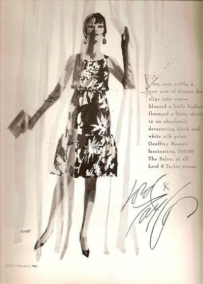
Dorothy Hood, Fashion Illustrator

This is probably the least-informative post I've ever done. That's because I can't seem to find anything on the Internet or in my reference material in the way of a biography of Dorothy Hood (1918-1984).

That strikes me as rather strange because she was the ace fashion illustrator for the famous Lord & Taylor store in New York in the 1950s and 1960s.

A couple of years ago I wrote about Irwin Caplan, a well-known cartoonist who taught fashion art back when I was in art school. Caplan regularly brought a copy of the Sunday edition of The New York Times to the classroom so that we could paw through it and see what the top fashion illustrators were doing. Since Lord & Taylor advertised heavily in the Sunday Times, we got to see a lot of Hood's work.

Somewhere I read that at one point Hood damaged her drawing hand and had to learn to draw with the other one. But I can't seem to locate that source either, so take it as hearsay.

All I can do for now is show some examples of her work. Fashion art (and photography) have changed since her time, not necessarily for the better.

Gallery

From 1954

From 1958

From 1958

From 1964

From 1964

From 1964

From 1965

From 1964

Thursday, May 26, 2016

Ken Auster, Mostly-Urban Impressionist

Charley Parker called my attention to the passing of Ken Auster (1949-2016). Some images of his paintings and a short biography can be found here.

Auster earned an art degree in college and then spent a number of years in commercial art, doing surfer-themed t-shirt graphics and other such work. Around 20 years ago, he shifted to painting. His style evolved into broad-brush, sketchy, impressionist (but not of the broken-color variety) painting featuring strong use of color to help create atmosphere. He did a good deal of plein air work, much of it in cities. In recent years he painted many bar and restaurant scenes.

An interesting practice was the titles her assigned to his works. Often they are ironic takes on what he was depicting, as can be seen in the sampling below.

Gallery

Coastal Cactus

Point Reyes

San Francisco street scene
Auster's urban scenes often made use of strong value contrasts. This also has some contra-jour.

Swarming - 1997

Primary Transportation

Land of Relentless Sun - c.2014
A rainy winter day in California (rains can get very heavy there at times).

Knock Out
The background image is George Bellows' Dempsey and Firpo (1924) located at the Whitney Museum of American Art. So I wonder if this is a scene from an actual bar.

King Cole Bar
The background painting is Old King Cole by Maxfield Parrish, located in the King Cole Bar in New York's St. Regis Hotel.

How About a Biscuit
The background image is Renoir's Luncheon of the Boating Party that is housed in the Phillips Collection in Washington D.C. Perhaps a reproduction or copy is in a bar unbeknownst to me.

Monday, May 23, 2016

Fritz Willis' Non-Pinups

Fritz Willis (1907-1979) was a first-rate pinup artist who did other kinds of illustration earlier in his career. But even then, his focus was on beautiful young women.

For more information about him and discussions regarding his work along with examples (some of which I present below), you can link here, here, here, here and here.

I get the impression that Willis might have been a bit more interested in his pinup's faces, rather than their bodies. That's because he sometimes painted heads that are too large compared to the rest of the body. You can check this if you're interested by Googling on Willis and then clicking on Images.

Here are examples of Fritz Willis' illustration art, mostly of the rare, non-pinup variety.

Gallery


Setting the stage, here are two pinups painted in Willis' mature style.

A story illustration, but I don't have the source.
UPDATE: A reader reports that this illustration is from the Saturday Evening Post story "The Airborne Female," in a December 1956 issue.


Two story spreads from Collier's Magazine

Story illustration from Saturday Evening Post -- 22 November 1958.


More unsourced story illustrations. Willis worked on full-color advertisements (fairly rare in the 1940s and 50s) and illustrated for major "slicks" such as the Post and Collier's. By these criteria, he was successful even before he drifted into art for pinup calendars.


He also did cover art for Ice Follies programs for many years.

The cover of a how-to book Willis did for Walter Foster.

July 1947 page for Esquire magazine, an early step towards pinup art.

I include this for its simplified brushwork -- not typical Willis.

Finally, a near-pinup bathing suit image.

Thursday, May 19, 2016

William Holman Hunt: The Consistent Pre-Raphaelite

William Holman Hunt (1827-1910) was a founder of the Pre-Raphaelite Brotherhood, along with Gabriel Dante Rossetti and John Everett Millais. As his Wikipedia entry notes, he continued its principles during his career to a greater extent than the others.

From today's perspective, Pre-Raphaelite art in its purest technical sense would be considered "hard-edge." The PRB link above notes that "sloshy" (presumably "painterly") art was something the brothers were strongly against. Subject matter varied, but Hunt's usually contained a moralistic or literary-with-moralistic-overtones core. But in order to earn a living as painters, the PRBs often found that they had to rely on portraiture. This was certainly the case for Millais, who "went establishment," being knighted and made president of the Royal Academy.

As for Hunt, I find his most important paintings more interesting than likable, though I don't actually dislike them. I suppose this is because I usually don't care for hard-edge painting.

Gallery

A converted British Family sheltering a Christian Missionary from the Persecution of the Druids - 1850

Claudio and Isabella - 1850

The Hireling Shepherd - 1851

Our English Coast (Strayed Sheep) - 1852

The Awakening Conscience - 1853

The Scapegoat - 1854

Isabella and the Pot of Basil - 1867

Bianca - 1869

The Lady of Shalott - 1886-1905

Monday, May 16, 2016

In the Beginning: Coby Whitmore

Maxwell Coburn (Coby) Whitmore (1913-1988) is considered by many -- including me -- as one of the great illustrators of the period 1950-1965. Biographical links are here and here. I briefly mentioned him here.

Like nearly all artists, it took Whitmore a while to settle into a mature, characteristic style. Below, I feature examples of his earlier work. These images were competently done, but do not stand out from works of other illustrators from that era. Nevertheless, his work was already appearing in major magazines, and by the mid-1950s Coby Whitmore had truly become the Coby Whitmore we know.

Gallery


Typical Whitmore illustrations from his mature period
The man in the upper image strikes me as looking a lot like William F. Buckley, founder of National Review.

Advertisement from around 1942
Whitmore is already adding a dab of the risqué.

From around 1944
I don't know the source, but it's probably from an advertisement or perhaps a story. During World War 2 women were used to ferry aircraft from place to place around the country. A few might have been test pilots who checked out newly-built aircraft. None, so far as I know, were test pilots of the classical kind who wrung out prototype airplanes. As long as I'm being picky, pilots almost always enter the cockpit from the left side of the aircraft, not the right, as pictured here.

Saturday Evening Post story illustration - 8 December 1945
The woman's pose echoes the one from around 1942, above.

Cosmopolitain cover, July 1946
Whitmore did a number of covers for Cosmo in the early post-war years.

Advertisement - 1947
The car in the background seem oddly old-fashioned -- late 1930s styling. But Whitmore was a car guy, and must have had his reasons for including that vintage.

Story illustration - 1948

Illustration for Schlitz Beer advertisement - c. 1949
This image and the one above it include plenty of background detail, something unusual for Whitmore. But in the late 1940s, many art directors expected it.

Illustration for Arrow Shirt advertisement - 1949

Saturday Evening Post cover - 5 January 1952
At last, Whitmore gets to seriously combine his love of cars and beautiful women. The styling is imaginary, though the basic shapes are early-1950s.