Thursday, September 29, 2016

Leslie Thrasher: Not Quite a Rockwell

A while ago I posted about Liberty magazine, a second-tier American general-interest magazine published 1924-1950, mentioning that "Liberty's cover artists, while entirely competent, were seldom in the absolute front rank of their day."

One cover artist included was Leslie Thrasher (1889-1936), who entered into a man-killing contract to provide the magazine with weekly covers for a five-year period. He managed this by doing a long, continuing saga of a young family using himself as the model for the dad.

Thrasher also painted illustrations for advertisements and Saturday Evening Post covers, the Post being the leading general-interest magazine of the day. So he was no second-rate artist, even though his hurried Liberty covers seldom added to his reputation.

Some of his Post covers can be found here. Brief biographical notes are here and here. Another, probably mistaken, take on the Liberty contract by Norman Rockwell can be found here.

Below are examples of Thrasher's cover illustrations.

Gallery

Saturday Evening Post cover - 8 June 1912
Thrasher was young when Post saw fit to put his work on its cover.

Saturday Evening Post cover - 12 January 1924
A Post cover from shortly before Liberty was launched.

Liberty cover - 13 December 1924
An early cover for Liberty.

Liberty cover - 27 December 1924
Two weeks later, this cover featuring a profane parrot.

Liberty cover - 27 October 1928
An example of a cover featuring a Thrasher self-portrait.

Liberty cover - 10 November 1928
That's Thrasher again, in the background struggling with a baby.

Liberty cover - 2 March 1929
Here he travels to pre-Castro Cuba.

Saturday Evening Post cover - 3 October 1936
Apparently some readers mistook this for a Norman Rockwell cover.

Saturday Evening Post cover - 16 January 1937
This appeared shortly after Thrasher died; it was probably in production and couldn't easily be pulled.

Monday, September 26, 2016

Some André Derain Landscapes

André Derain (1880-1954) is probably best known for joining with Henri Matisse in creating Fauvism in the early years of the 20th century. But that was as far as he got along the modernist path -- using plenty of bright colors not always associated with the actual subject matter. He did make use of noticeable distortion, but did not follow Braque and Picasso into Cubism. So far as I know, he did not make abstract paintings: he always featured a recognizable subject.

Some background on Derain can be found here.

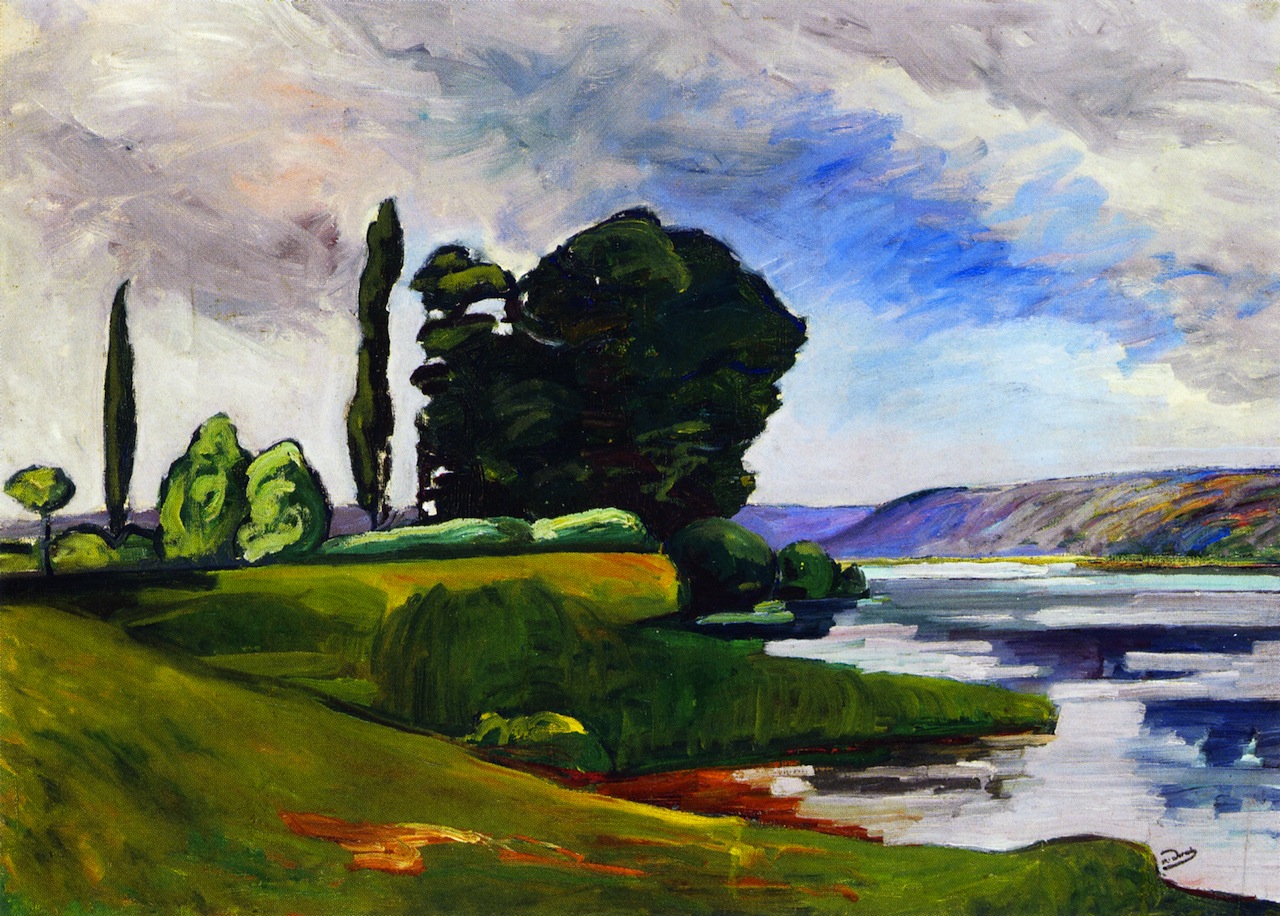
Derain was prolific, so this post features only landscapes to indicate changes in style. So far as I can tell, his paintings always included several of the modernist traits of form distortion, simplification of forms, flattening of the picture plane, and color distortion. The number of traits used and their intensity varied for any given work.

Gallery

Banks of the Seine at Chatou - c.1899

Jardin aux environs de Chatou - c.1900
These are early Derain paintings made before Fauvism.  Colors are only slightly more intense than they were in reality for the upper painting. At this point, he is mainly simplifying and flattening.

Landscape Near Chatou - 1904
This is a Fauvist painting.

Pont sur le Lot - 1912
While Derain was fiddling with a few Cubist ideas, he easily dropped back to his pre-Fauve pattern.

La route - 1932
Here he actually uses perspective to partly puncture the picture plane, though flatly painted areas mitigate that to a degree.

Vue de Donnemarie-en-Montois - c.1942
Painted during World War 2, this is about as close to traditional painting as Derain ever got. Only the foreground simplification suggests his modernist impulses.

Thursday, September 22, 2016

George Lepape, Golden Age Fashion Illustrator

Once upon a time, fashion illustration -- be it hand-drawn or photography -- was elegant. Quite unlike the ugly photos of strange looking models that populate both advertising and editorial content in current American fashion-related magazines.

For example, consider Georges Alexandre Adrien Lepape (1887-1971), a mainstay of French fashion illustration from around 1910-1930. His Wikipedia entry (in French) is here. English-language blog posts devoted to him are here and here. A lengthy French post is here.

Lapape's style is regarded as influenced by Japanese prints -- flat areas and thin linework, heavily design oriented.

Lapape married around the time his career was launched, and he had a daughter. For some reason, he seems to have ceased being active in fashion illustration by the very early 1930s, if images found on the Internet are any clue. He is known to have built a house by the Riviera, and died near Châteaudun, southwest of Chartres.

Gallery

Photo of Lepape
Dressed to the nines.

Pochoir from Les Choses de Paul Poiret - 1911
This publication for the famed couturier launched Lepape's career in fashion illustration.

Vogue (USA) cover - 15 January 1919

Vanity Fair cover - December 1919

L'eventail d'or - Gazette du Bon Ton - March 1920

Les Modes Élégants - fashion spread - 1922


Vogue cover - 1 January 1925
Interesting Voisin car, distorted perspective.

Vogue cover - November 1927

Vogue (USA) cover - 1 May 1928
Tall, narrow skyscrapers, tall, narrow lady.  Very 1920s.

'L'Initiation vénitienne' par Henri de Régnier - 1929

Vogue (France) cover - November 1930
Apparently a late fashion illustration by Lepape.

Monday, September 19, 2016

Up Close: Alfred Maurer at the Huntington

Alfred Henry Maurer (1868-1932) began as a representational painter influenced by James McNeill Whistler and then switched to various schools of modernism before committing suicide.

I wrote about Maurer here. A more recent article about him in The Wall Street Journal is here.

Earlier this year I came across a Maurer from his early period on display at the Huntington Library in San Marino, near Pasadena California. The Huntington has a good collection of late 18th century British paintings, but there is also a useful collection of American art from the decades around 1900.

Below are two examples of Maurer's work from 1901 that were shown in my previous post about him along with photos I took of the Huntington painting.

Gallery

An Arrangement - 1901
This seems to be Maurer's best-known painting from that time.

Girl in White - 1901
Another 1901 painting, perhaps of the same model.

Woman in Interior - 1901
This is the Huntington painting, also from 1901. The model might be the same woman as in the previous images. Disregard the hair color and consider the face.

Woman in Interior - 1901 (detail)
Close-up photo of the painting above.

Thursday, September 15, 2016

Brynolf Wennerberg and His Smiling Women

Gunnar Brynolf Wennerberg (1866-1950) was born in Sweden, but made a successful career elsewhere, mostly in Germany. His Wikipedia entries are only in Swedish and German as of the time this post was drafted. You probably can have your computer translate from either language. However, differences in syntax with English make for difficult reading in places -- though you ought to grasp most of the meaning.

Wennerberg was skilled at drawing and painting smiling women. Moreover, most of the images I've found on the Web have highly natural-looking subjects. This is even though female makeup and grooming fashions, particularly in the 1920s and 30s, required some other illustrators' results to seem odd to us.

Beyond his ability to portray, Wennerberg had a very nice painterly style.

Gallery

Beim Ankleiden - Käthe Berger

Costume ball scene?
Wennerberg illustrated a lot of carnival and costume ball scenes.

Der Charmeur
This might be a magazine illustration from around 1910.

Faun
A very nicely painted sketch with just enough detail to sell the scene.

In Erwartung
She is waiting, but for whom or what, I can't say.

Carnival

Morgengabe - c. 1920

Simplicissimus cover
I don't have the date for this, but between 1910 and 1915 shouldn't be far off.

Dancer

Dancer

Dancer
Three paintings, each featuring a Tänzerin.

Clothilde Eggerer - 1939
For once, a woman who is not smiling. Because of the war?

Spritzig - c. 1930

Portrait sketch - 1935
I think this is especially well done.  The guy could really paint.

Monday, September 12, 2016

Eric Fischl and Photoshop

Eric Fischl (1948 - ) is for me an important post-modernist artist because he broke from abstraction and moved to realist paintings of people in psychologically ambiguous situations. Plus, his work was commercially successful while being generally accepted by the New York art world.

Fischl's Wikipedia entry is here, and here is his web site that contains many examples of his work.

Due to his need to portray people in those psychologically ambiguous situations I referred to, he needed capture-the-moment body poses and gestures difficult or impossible to obtain from live models. Beyond that was the need to get correct effects of light and shade on his subjects. So Fischl necessarily was drawn to the use of photography for reference material. This is what classical illustrators usually were doing by the 1940s.

Another consideration was composing scenes. Again he borrowed from illustration by creating overlays, one to a subject, and moving them around to establish the ensemble best fitted for artistic and story-telling purposes. Early in his career he made use of glassine to create finished works on that support material.

In recent years Fischl has been relying on digital photography, using Photoshop to manipulate the positions of subjects to achieve what he feels is a satisfactory compositions. He credits his wife, landscape artist April Gornik, for getting him using that software.

A 2012 exhibit at the San Jose (California) Museum of Art dealt with his use of photography. The museum's website page dealing with the exhibit is here.

Here are a few examples of Fischl's use of photography for his painting.

Gallery

This is an example of a Photoshopped image.  I don't have an image of a completed painting for comparison.

Years before using Photoshop, Fischl began using conventional photography.  This is a key photo taken at a beach near Saint-Tropez, France about 1984.  The pose of women in the center was later used by him in several works.


Above are a digital image and a completed painting from his 2002 Krefeld Project. This seems to be pre-Photoshop.


Phototshoped composition and final painting, "The Gang," 2006. The woman in the foreground is April Gornik.