Monday, May 29, 2023

More Frederick Mizen Illustration Art

Frederic Kimball Mizen (1888-1964) had a long career in illustration and fine arts.  Although he never achieved the popularity of Norman Rockwell, John La Gatta, Maxfield Parrish and J.C. Leyendecker, he worked for several important clients: I wrote about his work for Chevrolet here.

There is little biographical information about Mizen on the Internet, and this seems to be the most comprehensive source.

Today's post presents some of his non-Chevrolet illustrations.

Gallery

Coca-Cola advertisement - 1926

Coca-Cola advertisement - 1927

Coca-Cola advertisement illustration - 1931
The setting is the Yellowstone National Park lodge near Old Faithful geyser. That gent in the foreground is drinking Coke.  Nobody seems interested in Old Faithful.

Railroad industry poster - 1932
In the background is the Empire State Building that opened the previous year.

Saturday Evening Post cover 10 February 1934
Illustrating a Post cover put an artist into The Big Time, professionally.

Saturday Evening Post cover 7 April 1934
Another Post cover.

Artwork for the 7 April 1934 Post Cover

Side-wheeler steamer somewhere out west.
Somewhere out west in the desert area there are few rivers wide and deep enough for such a boat, so I'm not sure where this scene takes place.

Pinup illustration from around 1950
Well, this helped put food on Mizen's table.

Early illustration from the 1910-20 decade.
An example of his early illustration work.

"Escorting a Criminal"
This illustration used plenty of good, painterly brushwork, and can be considerably enlarged if you are using a desktop computer.

Monday, May 22, 2023

Ryan Morse, Painter-Illustrator

Ryan Morse (1988 - ), website here, is a Denver-based artist and illustrator with a bold, representational style.

I find his work interesting and well-made.  Take a look.

Gallery


Monday, May 15, 2023

Harry Timmins, Prolific and Versatile Illustration

Harry Laverne Timmins (1887-1963) had a good run as an illustrator.   That's because he was highly competent and versatile stylistically.  Which was why he was prolific, keeping busy even during the Great Depression.

This versatility allowed his work to shine as illustration fashions changed, 1920-1940.  On the other hand, his style was never distinctive -- it can be difficult to identify his work absent a signature.  This helped him survive economically during hard times, while illustrators with more distinctive touches often fell out of fashion, their careers on the rocks.  Perhaps this characteristic held Timmins below First Team illustration status, working for second-tier magazines and not the likes of the Saturday Evening Post.

When his magazine illustration began to fade in the 1940s, he moved to California and did work of some sort for the movie industry.

The primary Web source on Timmins is here, and includes a biography here.

Not included below are many illuatrations he made in the 1920s for automobile makers. I might present some of those in a future post.

Gallery

Story Illustration - This Week Magazine - 1935
I find this interesting because it includes two of Timmins' styles in one setting.  The foreground features modeled features, the background has line-defined subjects and flat colors.

Goodyear Lawn Hose advertisement - 1920
This is very much of its time, as many advertisements of that vintage used lines and flat, non-modeled areas to create a scene.

Illustration for Arkansas Soft Pine advertisement - 1922
Around that time Timmins did this solidly-modeled painting.  As best I can tell, he favored watercolor and other "thin" media such as ink washes, perhaps bolstered by tempera or gouache.

Story Illustration - 1930
He seems to have traveled to Paris at the end of the 1920s because he made a number of illustrations featuring Parisian café scenes.

Story Illustration - 1931
This illustration and the one below were made about the same time, but have different styles.  This is very early '30s.

Story Illustration - 1931
And this is an example of what become the fashion by the mid-1930s.

Story Illustration - American Magazine - 1933
Another Paris café scene.  Note that Timmins carefully captured even those typical café chairs.  And the newspaper the man in the foreground is reading.  Click on this to enlarge.

Story Illustration - Ladies' Home Journal - 1932
This reminds me of the work of Henry Raleigh.

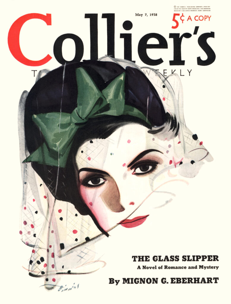
Collier's cover - 7 May 1938

Story Illustration - Collier's - 1939
Now Timmins is creating well-modeled subjects is the mainline style of the day using thin media.

Story Illustration - MacLean's - 1947
A late story illustration.  Timmins could create dramatic scenes as well as static ones.

Monday, May 8, 2023

More C.C. Beall Illustrations

I last wrote here about illustrator C.C. (Cecil Calvert) Beall.   Since then, more biographical information has appeared on the Internet.   Also, more images of his work.

Illustration Magazine's Issue 72 (May 2021) included an article about Beall.   It can be accessed online here.  Its preview link includes images of Beall's 1930s temporary work as an illustrator of "pulp" magazine covers.

Below are examples of Beall's non-pulp work.  Click on some to enlarge

Gallery

I included this Collier's cover in my previous Beall post, but for the above image I cleaned up the aged  colors.  I really like this illustration.  Especially the girl's face.

Another Collier's cover, from nearly two years later.

Art from a 1928 Essex automobile advertisement.

One of a series of 1923 Maxwell House advertisements.

An unusual, for Beall, Collier's cover.

Beall illustrated several government posters during World War 2.

Wartime story illustration.

Story illustration in Collier's, 29 May 1948.

Unidentified Story illustration.

Monday, May 1, 2023

Walter Biggs' "Impressionist" Illustrations

Walter Biggs (1886-1968) was an important Amercan illustrator whose peak career years were from the late 1910s to well into the 1930s.  In 2012 I posted about him here.  A brief Wikipedia entry is here.  My earlier post has links concerning him.

Biggs' early work was more hard-edge conventional than later.  By the early 1920s his work became more painterly, in that edges were softened and brushwork moved to the fore.  The style was "impressionist" in the American Impressionism sense.

The images below are some of his best works in that style.

Gallery

Illustration for International Silver - 1924
This is a better version than the image I used in my previous Biggs post.  I like it very much.

Couple on the porch - no date
Biggs was from Virginia, and liked to paint Southern scenes.

"He Had His Wish. The Hands of Time Had Turned Back" - Harper's Magazine - August 1919
This was about the time Bigg's style was moving more strongly towards impressionism.

The Long Skirts -- A title found on the Internet, but perhaps not original.
This appeared in Ladies' Home Journal, April 1933.

Soldiers at the Door - Cosmopilitan Magazine, 1937
An American Civil War story scene.

Family picnic scene - c.1934
I don't now where or when this appeared.  Media are watercolor and gouache.