Wednesday, November 30, 2011

Matisse and Fergusson: Color Versus Drawing


At its root, the issue of color versus drawing is a matter of taste. So there is no agreed-upon point where one can draw the line (pardon the expression) where one or the other should begin to take precedence.

Those who favor color are sometimes called "colorists." I thought it might be interesting to compare two colorists whose emphasis on drawing differed somewhat, this to illustrate what I noted above.

In one corner, I offer Henri Matisse (1869-1954) who went wild with color as a Fauvist in the early 20th century. After Fauvism faded, Matisse continued to emphasize color for the rest of his career. What he de-emphasized was drawing; people and other objects were presented in a sketchy and somewhat distorted way, being subordinate to colors.

Matisse was quite able to draw accurately. So why did he persist in distorting the images he painted? I don't know. Perhaps he was simply following modernist fashion. But I'm inclined to doubt this because he tended to intellectualize his work, stewing over whether he was making "progress." My guess is that he justified his casual draftsmanship on the grounds that the drawing should also serve the needs of composition and perhaps that well-drawn images would distract viewers from focusing on his color experiments.

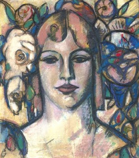
The opposite corner is John Duncan (JD) Fergusson (1874-1961), a member of the four-man Scottish Colourists group. Some of Fergusson's painting subjects were as casually rendered as Matisse's, but most of the time his images featured more careful draftsmanship.

Below are examples of their work. For Matisse I favor his odalisques, of which he painted many in the 1920s, because he was paying more attention to draftsmanship then than in his Fauve days or later on.

Matisse

Decorative Figure Against an Ornamental Background

Odalisque with Gray Trousers - 1927

La robe jaune - 1929-31

Woman in Purple Coat - 1937

Fergusson

Tete

Summer - 1920

Spring in Glasgow - 1941

Le voile persan - 1909

Monday, November 28, 2011

An Astonishing Rochegrosse


The Musée d'Orsay recently completed its renovation. Galleries have been reorganized, paintings rehung.

I have no plans to visit Paris any time soon, so like many readers of this blog, I'll just have to read reviews and try to imagine how things look.

One painting whose fate I'm curious about is this one:

Le chevalier aux fleurs - The Knight of the Flowers - c.1894
Click to enlarge.

It's by Georges Antoine Rochegrosse (1859-1938) and the d'Orsay's web site offers this commentary.

So why did I use the word "astonishing" in this post's title?

For one thing, it's huge -- 2.35 meters high by 3.76 meters wide. And it's bright; compositionally, there are few dark areas to tie things together. But what struck me most when I first saw it were the reflections on Parsifal's suit of armor. By pulling in the surroundings, they made Parsifal almost as ethereal as the rest of the scene.

I don't suppose professional art critics would ever call it a great painting. Me? I find it an astonishing (there's that word again!) tour de force.

Friday, November 25, 2011

Future Fashions from 1936


That's science fiction pioneer H.G. Wells at the left on the set of Things to Come, a 1936 movie based on his 1933 novel The Shape of Things to Come that was produced by Alexander Korda. To the right are Margaretta Scott and Raymond Massey.

The plot has a 1940 war (the most accurate prediction is the date -- the Battle of Britain was fought that year) in which England and much of the world sinks to near-barbarism after decades of conflict. A group of engineer-technocrats recreates a modern society in Basra, Iraq and then spreads it throughout the world, setting things straight in a Wellsian socialist-inspired utopia. The final part of the movie takes place in 2036 where a mission to the moon is launched.

Photos below show some of the costumes predicted for 2036, a century after the release date of the movie.


I don't know who designed the costumes, but they surely had Wells' okay, grudging or otherwise (he had considerable input to the project). Ultra-broad shoulders aside, the impression I get is that of snazzed-up Roman Empire outfits with a generally clean look in synch with late-Deco modernism of the 1930s -- which should probably be expected.

We are 25 years away from the movie's fashion predictions, so there's a remote chance that they will be fulfilled. The photo below of a celebrity (Nicky Hilton, whoever she might be) indicates how things stand in our casual times.


Wednesday, November 23, 2011

Syd Mead: Famous Designer of Unbuilt Cars


So far as I can tell, car stylist, industrial designer and visualization renderer of future environments Syd Mead (born 1933) never had any of his automobile designs enter production. It's possible that some of his industrial designs were produced, but I don't know of any offhand.

Yet Mead is well known by styling and design practitioners and some of his efforts are famous to groups of the public at large. For instance, he designed the future Los Angeles for the movie Blade Runner and the vehicles for the original Tron. More recently, he has been involved with computer game settings. Mead's web site is here; it contains many examples of his work and even t-shirts that you can buy from his on-line shop.

I first came to be aware of Mead back in my army days at Fort Meade (of all places!) when a buddy of mine showed me a copy of a brochure with Mead's designs commissioned by U.S. Steel. Many of those illustrations were included in his first Sentinel book, a copy of which I own.

One aspect of Mead's work that interests me is that it's hard to distinguish which designs and renderings are recent and which were done when he was working on the U.S. Steel project in the early 1960s. (As can be seen below, his very earliest efforts are easier to spot.) So Mead seems to have attained a personal version of the future that was strong enough to serve him for a career of 50 years. Let's take a look.

Gallery

Blade Runner visualization
His Blade Runner designs are probably his best-known work so far as the general public is concerned; but they likely would not know who Syd Mead is.

Student design while at Art Center School

Illustration of Ford Gyron show car - 1961
These are examples of Mead's work from when he hadn't attained his mature sensibility.

Concept car for U.S. Steel

Design for U.S. Steel

U.S. Steel project scene
It's a little hard to believe that these designs and renderings are nearly 50 years old.

Commuter car designed for Philips
This design could be produced; it's not very futuristic, which Mead acknowledges by placing a black contemporary car in the near-background.

Futuristic scene
This was done more recently than most of the illustrations above.

Future horse race

Automobile design
Another design that's not totally blue-sky futuristic; note the costumes of the background figures aren't as wild as in the image directly above.

Monday, November 21, 2011

David Gauld: A Fringe Glasgow Boy


I know little about David Gauld (1865-1936) who Roger Billcliffe includes in his Glasgow Boys book, but admittedly as having a "distant relationship with the Boys."

It seems he worked in stained glass as well as painting, and a couple of 1888 paintings are done in an outlines-with-flatly-painted-interiors style that, for a reason I can't explain, has always intrigued me. Another reason for presenting him here is that my wife recently booked us on a tour of Ireland and Scotland for next summer, so I need to prime myself for some gallery gawking in those places. (I've been to Ireland and Scotland, but that was before I got involved with blogging about art. So while having paid some attention then, I plan to be more knowledgeable this time; be braced for more posts about Scottish and Irish painters.)

Here are a few examples of Gauld's work.

Gallery

Music - 1888
St. Agnes - 1888
These paintings are done in the cloisonné style mentioned above.

The Procession of St. Agnes
St. Agnes-related again, but in a more conventional style.

Portrait of Irene Vanburgh
A nicely done portrait of the actress.

At this point, I have have nothing special to say about Gauld's paintings. But I'll keep my eyes peeled once I'm in Glasgow and Edinburgh so that I might confront one in person.

Friday, November 18, 2011

Auction Results: Christie's, NYC, 9 Nov 2011


I find it tricky to glean meanings from art auctions.

For one thing, most of the best and most famous works eventually gravitate to museums, leaving collectors and speculators to paw over what remains. Then there is the problem of separating purchases by those who buy because they love the particular work from those who buy with the intent of flipping it once the price is likely to have increased to their satisfaction. And there are buyers who collect what they like but are prepared to sell later if prices become tempting and then use the spoils to buy more art they like.

I tend to pay attention to sales results for representational painters of the late 19th and early 20th centuries as a gauge for assessing how strong a comeback such art might currently be making (for instance Alma-Tadema going from near-worthless to tens of millions of dollars over the last 60 years).

Then there are modernist paintings that I wouldn't dream of putting on one of my walls that auction for huge sums. Consider a few results from the Christie's "Post-War and Contemporary" auction that took place 9 November in New York:


$1,034,500: Untitled, by Richard Diebenkorn (1822-93)

$938,500: Untitled, by Agnes Martin (1912-2004)

$734,500: Lone Star, by Yashimoto Nara (b. 1959)

$362,500: Portrait of Robert Graham, by Alice Neel (1900-84)

$182,500: Slice of Pie, by Wayne Thiebaud (b. 1920)

$782,500: Dollar Sign, by Andy Warhol (1928-87)

Wednesday, November 16, 2011

More Walter H. Everett Illustrations Appear


Based on the surviving fraction of his work that he himself mostly destroyed, I judge Walter H. Everett to be one of the very finest painter-illustrators of 20th century. I last wrote about him here.

Until fairly recently little could be found on the Internet. But Leif Peng recently posted some Everetts that I hadn't encountered before. Peng found them on Greg Newbold's blog, and Newbold mentioned that he had been trading Everett scans with Kev Ferrara. The illustration at the top of this post is from the group of "new" Everetts just mentioned.

Clearly I've been well out of the Everett image loop, so I hope that Kev or Greg Newbold will drop a hint as to where those images were found. Regardless, the images solidify my initial judgment regarding Everett.

Henry C. Pitz in his book The Brandywine Tradition characterized Everett as follows:

Everett was cocky and confident, short but broad and deep-chested, with knotted arms like a wrestler. He had a strongly modeled, dark-skinned, rather handsome and pugnacious face that seemed to threaten bad temper. All this left one unprepared for the eventual discovery that behind this manner was a vein of poetry. Although he possessed all the outward signs of a brusque man of incessant action, he was in his heart a dreamer -- a daydreamer, incorrigibly lazy....

All his best pictures, even those of banal subject matter, had some flavor of an imagined world. His people were believable but not ordinary. Most pictures had a secret place; a tantalizing area where nothing was explicit, but where the eye was coaxed to muse and speculate. He preferred tonal subtleties, close values, edges that were lost and then found again....

Yet he was difficult, for he hated deadlines. Things were put off until the last moment or beyond it. He loved the long indolent hours of dreaming about pictures he would paint and when the day for delivery arrived he would go fishing to avoid the insistent telephone calls. Editors, wise in his ways, planned to spend the last twenty-four or forty-eight hours before deadline in his studio while he painted furiously and surely... For once galvanized into action, he was amazingly rapid and certain -- a true temperamental virtuoso.

Everett was a student of immensely influential Howard Pyle who is best known for illustrations featuring pirates and Revolutionary War themes.


So the illustration above from the May 1897 Ladies Home Journal strikes me as unusual. Moreover, compare it to the Everett below:


If the Pyle illustration had been painted around the time Everett was his student, I'd be wondering if the work was partly done by Everett, many of whose works are similar in spirit and also include blossoms. As things stand, it's possible that Everett was aware of that illustration even though he was 16 or 17 at the time it appeared in a women's magazine. Or perhaps Pyle has similar material to show his students while Everett was there.

(My source for the the Pyle publication date is Arpi Ermoyan's Famous American Illustrators, page 64.)

Monday, November 14, 2011

Art and Comics Coverge?


Above is the October 2011 cover of Art News, where the top heading says "Where Art Meets Comics." The article it headlines is here. In case the link disappears, here are two paragraphs from it dealing with its thesis:

"Over the last decade, the boundary between fine art and comics has grown increasingly porous. In 2002, original panels from Chris Ware’s comic book Jimmy Corrigan: The Smartest Kid on Earth, a minimalist meditation on longing and isolation, were featured in the Whitney Biennial. Four years later, the Hammer Museum and the Museum of Contemporary Art in Los Angeles collaborated on a seminal exhibition of 15 groundbreaking artists, called “Masters of American Comics.” In 2007, the Museum of Modern Art in New York opened “Comic Abstraction,” which looked at how fine artists have employed elements of comics’ visual language.

"This year will see a slew of related exhibitions. The Whitney Museum is devoting a retrospective (closing October 16) to the painter Lyonel Feininger (1871–1956), which explores his work as a cartoonist for the Chicago Sunday Tribune. (The characters he drew in his strips inspired wood carvings that he produced for the rest of his life.) In April 2012, the Oakland Museum of California will present the first major survey devoted to Daniel Clowes, the artist behind Ghost World, the graphic novel that inspired the 2001 film of the same name. And in April, the Musée d’Art Moderne in Paris will hold a full-scale retrospective of the counterculture comics legend Robert Crumb, creator of the straight-talking guru Mr. Natural and the hedonistic Fritz the Cat."

The thrust of the article is that contemporary comics are being looked at as "art." What was not mentioned is that some postmodern "art" looks a lot like contemporary comics. And no, I'm not thinking of Roy Lichtenstein who painted his take on comic book panels from the 1940s and 50s. Consider these:


Music (Borrowed Tune) by Brian Calvin - 2006

Loafers by Martin Maloney - c.2005

Kyoto Sky by Aya Takano - 2004

Friday, November 11, 2011

Streamlined Battleships


During the 1930s the industrial design profession was clawing its way into viability. One device pioneering practitioners such as Norman Bel Geddes and Raymond Loewy relied on was flashy, self-funded designs intended to catch the eye of newspaper and magazine editors.

And those days were the era when modernistic design often incorporated streamlining as a theme. It even reached the point where Loewy came up with a streamlined pencil sharpener.

If aircraft and pencil sharpeners could be streamlined, then why not battleships? After all, streamlining could lead to either faster speeds or more efficient cruising, depending on the situation. And maybe streamlined cladding, if done right, might deflect enemy shells.


Otto Kuhler, best known for his streamlined locomotive designs, did the battleship design shown above as a just-for-the-hell-of-it proposition.


This, from a 1941 Revere Copper and Brass advertisement, is another version of a streamlined battleship. I don't know who designed it.

The problem is, whatever advantages streamlining might offer, the examples shown here would not have been combat-worthy in World War 2.


In terms of armament, they are more similar to the pre-Great War USS Florida (BB-30) shown here than to World War 2 equivalents. American battleships of 1912 vintage were spare designs with turreted main batteries and smaller, anti-torpedo boat guns mounted in the hull. The tall cage masts supported observation compartments where spotters noted where shells were hitting and passed aiming corrections to fire controllers below. Florida's masts also supported searchlight batteries. Aside from the masts and related equipment, the newly-operational Florida could have been streamlined in the Kuhler manner had that concept occurred to naval planners and architects in those days.


This is the USS South Dakota (BB-57), commissioned in 1942. When new, its topside bristled with anti-aircraft guns and more and more were added as the war progressed. Streamlining is clearly antithetical to the need for strong protection from aerial attack.

I'm no naval architect, so I'll only note that the design in the Revere ad has a hull shaped more like that of a powered yacht than those of fast battleships of the early 1940s which featured a more vertical prow near and below the waterline.

Another problem is that the turret armament is impractical. In the first place, five real guns couldn't be fitted into those turrets. In the second place, five guns would make for extremely awkward ammunition handling even if that many guns could be crammed in.

Those streamlined battleship designs were never anything but futuristic fluff. Yet streamlining was in the air in the late 1930s and the notion might have been briefly considered by a few naval planners. If it had, then it was quickly rejected in the interests of practicality under combat conditions.

Wednesday, November 9, 2011

Koester: Rembrandt of Ducks


Being a one-trick-pony is something usually looked down upon. But what if that single trick is done with genius? Something to be said for that, thinks I.

Consider the painting below.


It's an audience favorite at Seattle's Frye Art Museum. And in fact it's really nicely done. In person, those duck feathers look almost buttery in their painterly smoothness, a real tour de force.

The artist is Alexander Max Koester (1864-1932), and here are a few more of his duck paintings.


Koester was born near Cologne and studied at the Karlsruhe Academy of Art. He moved to Munich and later to the Tyrol, painting landscapes and Tyrolean peasant life. But he was best at ducks. Especially white ones.