Friday, June 29, 2012

World's Fair Symbol Structures


The fact that Seattle's Space Needle had reached its half-century mark prompted me to write this post. It also got me to thinking about world's fairs and structures that came to symbolize them, intentionally or not.

If you are interested in delving into those expositions, Wikipedia kindly provides two useful listings. Here is a list of fairs that includes important structures and other relevant items associated with them. And here is a list of BIE sanctioned expositions, the BIE being an international fair-sanctioning organization founded in the 1920s. Not all major fairs since them have had BIE approval, the most important instance being the New York World's Fair of 1964-65.

The idea of a structure intended to symbolize a fair is a fairly recent development, as these things go. First, consider first great fair in London in 1851. Joseph Paxton designed an iron and glass structure called the Crystal Palace that served as the fair's symbol by default: it was the fair's only structure.

For a while other fairs followed suit, but eventually became collections of pavilions, each focusing on a different country, industry or other theme. Architecturally, there might be a focus building such as the 1893 Chicago fair's Administration Building with its large dome situated at one end of a rectangular reflecting pool. Although that building was prominent, I'm not sure how symbolic it was given that the fair's overall appearance was a kind of mega-symbol.

Explicit symbol structures didn't come into play at top-level fairs until the end of the 1930s. Since then, other fairs have used them (or not) to varying degree of success. Let's take a look at the famous ones, plus a wannabe:

Gallery

Eiffel Tower (1889) in 1937
The Eiffel tower was erected for a 1889 exposition to mixed reviews. But it proved so popular that it now is the symbol for Paris itself. The photo above was taken at the Exposition Internationale des Arts et Techniques dans la Vie Moderne of 1937, best known to art junkies as the place Picasso's Guernica was first displayed. The Eiffel Tower probably wasn't the symbol of this fair: it just happened to be on the Champ-de-Mars, the largest chunk of unobstructed Paris land available for such events. Otherwise, the two dominant structures besides the tower are seen framing it in the photo. At the left is National Socialist Germany's pavilion and to the right is the pavilion of the Soviet Union, ideological antagonists until the countries signed a pact two years later that signaled the start of World War 2.

Palace of the Fine Arts - San Francisco, 1915
I'm not up to speed on the Panama Pacific International Exposition, so I'm not sure if the Palace of the Fine Arts was considered the fair's symbol at the time. But it soon came to be so loved by the public that it avoided destruction once the fair ended. It still stands today, having gone through at least one major restoration.

Trylon and Perisphere - New York, 1939
Now we come to structures intended to be symbolic from the outset. The Trylon, a three-side pyramid, stood 610 feet (190 meters) tall and had no function other than being somehow symbolic of the future. Its mate, the Perisphere, contained an exhibit.

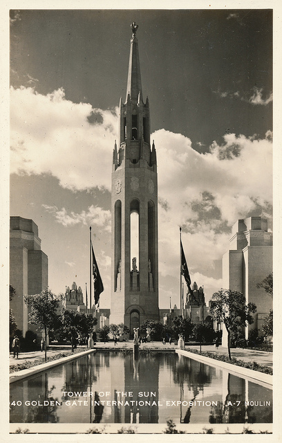
Tower of the Sun - San Francisco Bay, 1939
The Golden Gate International Exposition was held on an island dredged from the bottom of San Francisco Bay that was intended to be used as an airport after the fair closed. The 400-foot tower was the fair's symbol. It seems that all such symbol-structures attract both fans and detractors. This book offers the following observation (p. 82): "As for the Tower of the Sun, the 400-foot campanile sticking up from the low horizon, hardly anyone could tolerate it." The anyones quoted included columnist Herb Caen and sculptors Beniamino Buffano and Ralph Stackpole. Contrarian me? I think it was just swell.

Unisphere - New York, 1964
Sitting where the Trylon and Perisphere once stood, the Unisphere arrived to symbolize New York's fair of the mid-1960s. I've always thought that the Unisphere was a triumph of cliché and imagination-failure. Regrettably, it still stands.

Atomium - Brussels, 1958
The Exposition Universelle et venti Internationale de Bruxelles had the Atomium as its symbolic centerpiece. It is supposed to represent a scaled-up atom, and people can actually climb through the thing. It, too, is still with us for some inexplicable reason. (Unlike the Unisphere's failing, I find the Atomium simply silly.)

Space Needle - Seattle, 1962
I end this rogue's gallery with the beloved Space Needle from Seattle's Century 21 fair. It can seem a little awkward if you view it from the wrong angle, but it's distinctive in a graceful way. Or, to put it another way, it coulda been a lot, lot worse.

Wednesday, June 27, 2012

Molti Ritratti: Ida Rubinstein


Ida Rubenstein (1885-1960) was a Russian ballerina whose distinctive appearance appealed to painters even at a time when she could easily be photographed. Her Wikipedia entry is here, and it states that because her formal ballet training was limited, she was never first-rate in her field; she compensated by virtue of her stage presence.

Let's take a look.

Gallery

Ida Rubinsteitn as Phaedra - 1923
Here is a photograph taken a few years after the paintings below were completed.

By Leo Bakst (Ida as Cleopatra) - 1909
Bakst was the ace costume designer for Diaghilev's Ballets Russes.

By Leon Bakst - c.1910
Here is another Bakst take on Rubinstein, a portrait rather than illustrating a costume concept.

By Valentin Serov - 1910
Serov was a master of Russian portraiture. Most of his works were naturalist, but this Rubinstein shows him drifting into modernism shortly before his death.

By Antonio de la Gándara - 1913
Gándara was a fashionable artist based in Paris, so this portrait was probably painted while the troupe was there on tour.

By Romaine Brooks - 1917
Brooks had a three-year affair with Rubinstein, and this is one of the paintings from that time.

Monday, June 25, 2012

The Art Dictator's Art


Aleksander Gerasimov (1881-1963) was an important Socialist Realist painter. As his Wikipedia entry states, "His heavy-handed leadership of the Union of Artists of the USSR and the Soviet Academy of Arts were [sic] notorious..."

More details on his career can be found here.

I am no fan of centralized authority in any form, so I offer the following Gerasimov paintings, technically well-done though some of them might be, as examples of what gets produced under authoritarian circumstances.

Gallery

Lenin on the Tribune - 1930

Stalin at the 18th Party Congress

I.V. Stalin and K.E.Voroshilov in the Kremlin After the Rain - 1938
This painting won Gerasimov an important prize, though it's hard to understand why. Maybe Stalin liked the way his likeness was painted.

Portrait of the Ballet Dancer Olga Lepeshinskaya - 1939
A welcome break from Socialist Realism.

The Meeting of F.D. Roosevelt and the Shaw of Iran - 1944
This would be related to the Teheran Conference of 1943. So the subject is political, but in no way glorifies the Soviet regime.

Peonies - 1952
In his spare time, Gerasimov set politics and Socialist Realism aside to do a little Post-Impessionism for his own purposes.

Friday, June 22, 2012

LeRoy Neiman: Post-Career Thoughts


LeRoy Neiman died 20 June 2012. I really haven't thought of him in years except when I happen to notice one of his prints for sale in an art gallery. I suppose I would have been more aware if I'd kept up with Playboy magazine where his work appeared for literally decades. Alas for Playboy, I lost interest at some point in my twenties when it finally sank in that a girl in person is far better than a retouched photo of one in a centerfold.

The Wikipedia entry for Neiman is here and his own web page is here.

As Wikipedia indicates, Neiman had solid art training and the work he produced following his Playboy breakthrough had many fans. His original works and reproduction sell well and at good prices. Fortunate is the artist who can earn a good living from his toil.

A large share of Neiman's work had to do with sports, so I'll show a few examples here.

Gallery

Sandy Koufax

Orlando Magic

Scramble

What do I think of his work? I never liked it.

My reaction to any art is personal to the point where I can't pin down from where my prejudices emerged. For what it's worth, in a nutshell, I find Neiman's work too colorful and the application of paint too random (or sloppy?) for my taste.

This is despite underlying drawing being essentially correct. I've stated before and will surely state again that, given good drawing, an artist can get away with quite a lot so far as other aspects of a painting or illustrations are concerned. But for me, Neiman pushed those "other aspects" too far.

Wednesday, June 20, 2012

Who was Frank H. Desch?


I'm not an exhaustive researcher, but I do make an effort to come up with at least a little background information regarding painters, illustrators, cars, planes and whatever else I write about here.

But this post is one instance where I came up virtually dry.

The subject is a man named Frank H. Desch. He was born in Philadelphia in 1873 and died in 1934 and was an illustrator who apparently worked in fine art painting on the side.

The two Internet sources about him (I only drilled through the first couple of Google pages, I confess) are here and here. Both seem to be sites oriented towards collectors. The first one offers a book or catalog of Desch's known works. But the price is $40, which greatly exceeds my research budget for an artist who doesn't greatly interest me. So his career will remain a mystery unless a seriously knowledgeable reader is able to help us out in a comment.

That said, Desch had talent, as his fine arts work indicates.

Gallery


These are examples of his illustration work before 1920. It is pretty generic of the era.


The four paintings above are painted in what might be called "American Impressionist" style. The one at the top looks like a Richard E. Miller painting from the same period. Coloration is influenced by classic French Impressionism, but the subjects are clearly defined. This was something American painters preferred to do rather than create an overall effect á la Monet and those he influenced.


The two final paintings are non-Impressionist. The garden scene has the appearance of an illustration, but it's probably not magazine cover art because the woman's head is where the publication's name would usually appear. The bottom work by its style appears to be a commissioned portrait. The upper part of the subject is carefully rendered, though her hand and the lower part of her dress are more casually done.

Monday, June 18, 2012

Edgar Payne: Master California Impressionist


Edgar Payne (1883-1947) is one of my favorite painters of the California Impressionist school. That's because his paintings have strong composition supported by equally strong brushwork appropriate to his subjects.

Wikipedia has a reasonably detailed entry for him here.

Besides his art work, Payne collected his views on art in his book "Composition of Outdoor Painting" that was first published in 1941 and is still in print. I bought a copy several years ago, but have yet to work my way through it. It contains useful information, but be warned that the first 30 or 40 pages are verbal hand-waving about art and the artist. Obviously Payne considered these matters important, but to me his ramblings are a waste of both paper and the reader's time.

Another book, and one I consider well worth adding to one's library, is "Edgar Payne: The Scenic Journey" which is an extremely well illustrated catalog for a current exhibit of his work.

Speaking, of Payne's work, let's take a look:

Gallery

Rugged Slopes and Tamarack - 1919
Payne is best known for paintings such as this. Where a specific place is not in the name of the paintings, it's likely that Payne created the image from sketches done at different places and combined the details.

The Sierra Divide

The Rendezvous (Santa Cruz Island) - 1915

Laguna Coastline

Sycamore in Autumn - c.1917

Along the Riviera, Menton, France - 1922

Brittany Fishing Boats - c.1924

Sunset, Canyon de Chelly - 1916

Friday, June 15, 2012

Are Newspapers Over-Designed?


Aside from buying a Wall Street Journal two or three days a week, flipping through a free USA Today from the hotel when traveling and barely glancing at the local paper each morning (until football season, when I hit the sports page harder), I spend a lot less time reading newspapers than I used to. Years ago, I was so into newspapers that I had the New York edition of the New York Times mailed to me daily.

Nowadays I mostly rely on the internet for news, avoiding television almost entirely. Obviously, I'm not alone in this. Newspaper circulation has been declining for many years in the USA, and so have ratings for the major broadcast network news programs.

Newspapers have been fighting the trend, but declining circulation has yielded declining advertising revenue. Fewer ads means smaller papers as publishers try to maintain a profitable advertising - news hole page relationship.

There's another thing newspapers are doing that has annoyed me for several years. I'm writing about it now thanks to this item on James Lileks' blog. Besides blogging, Lileks is a columnist at the Minneapolis Star-Tribune and writes books on the side.

Here is what he said:

* * * * *

I think a lot about newspapers every day, partly because I work for one, partly because I’m revising a novel set in the glory days of a medium-sized newspaper in a medium-sized metropolitan era that has four. Four papers. I invented one for the books, the Citizen-Herald; it’s obviously not the Star-Tribune, since that exists in the books as well. When I think what the pages of the Citizen-Herald might have looked like, I realize one of the things that did papers in:

Good design.

Or rather, design, period. Big headlines, explanatory decks, good pictures, careful layout, splashy graphics - everything that presents the content takes away from the content. If you have a thick news hole and you’re putting out a tab with 60 pages, chock full of ads, you have the luxury to play, to stretch, to impress. But the model for the Citizen-Herald is the old Star newspaper in the 30s and 40s, a wide-swinging scrappy trolley-reader broadsheet that captured the jostle and bustle of the town in almost molecular detail. Eight to ten stories on the front page, at least. Twice as much on the inside. Sure, half of it was inconsequential - chatter and trivia, minor mayhem on the road next to a squib about an election in Malay, but it presented the impression of a world so vibrant it could barely be contained in the thin columns of newsprint. A good newspaper isn’t one you read front to back; a good newspaper is one you regret you didn’t read front to back, because it’s simply impossible to read it all.

The Star was like that - the big stories at the top of the page, pictures of giveaway kittens or a kid in a cast because he fell off a roof, Loop shootings, auto wrecks on the parkway, holdup in a cafe, each story getting smaller as you went down the page, until the bottom items were a two-line piece on Siamese imports, and an ad for Sanitary Bread.

* * * * *

An example front page is below.


The design feature that bothers me the most is increased use of large, color photographs on the front page (the example above is smaller than many I've seen). To me, it's a waste of space that could be devoted to news.

Like Likeks, I am so old-fashioned!

Wednesday, June 13, 2012

Alajalov: Illustrator or Cartoonist?


When Constantin Alajalov (1900-1987) painted the 22 June 1935 cover for The New Yorker magazine, employment prospects for college graduates were uncertain. I'm drafting this post mid-June, at the tail end of this year's graduation ceremony season, and a similar situation holds. In both cases, there was serious economic under-performance. But in 1935 college graduates were a much smaller share of the 22-year-old or thereabouts population, so supply-demand factors were more in their favor back then even though times were tough.

Alajalov (name accented on the third syllable) was a popular illustrator from the late 1920s into the 1960s, best known for magazine cover illustrations he created for Vanity Fair, The New Yorker and The Saturday Evening Post. Biographical information on the internet is sparse. And even inaccurate: his Wikipedia entry states that the Russian Revolution happened in 1916 -- 1917 was the actual year. The most useful link that I could find is here. There are some books from the 1940s dealing with illustrators containing sections about Alajalov, but this recent, similar kind of book by Fred Taraba might be easier to locate.

Taraba mentions that Alajalov was a fine-art painter and muralist as well as an illustrator. He and other sources stress that Alajalov would take a good deal of time and trouble to make the settings of his illustrations as accurate as possible. I think this care was essential because his signature work seems more cartoon-like than straight illustration. Yet the cartoonishness lies mostly in the way he depicted the faces of his subjects. And like a good cartoon, those faces reveal the character and current thought or emotion of those subjects. Further, the settings and situations he depicts match or come close to matching the experience of his viewers. Taraba notes that Alajalov tailored these elements to fit the average readership of The New Yorker (big-city, supposed sophisticates) and the Post (Middle America).

A final thought before turning to more examples of Alajalov's work. In his heyday, aside from The New Yorker and some 1920s publications such as Life and Judge, most mass-circulation magazine illustration for stories and non-fiction articles was naturalistic. So during much of his career, Alajalov's approach was largely unique (I have a major exception in mind, and will write about him at another time). Today, to dredge up a cliché, the shoe is on the other foot: comparatively little magazine illustration is naturalistic, the bulk being cartoon-like in one way or another.

Gallery

The New Yorker - 28 October, 1939

The New Yorker - 1 March, 1941

The Saturday Evening Post - 2 May, 1959

The Saturday Evening Post - 31 December, 1949

Monday, June 11, 2012

Emile Bernard: He Could Have Been Gauguin


Émile Bernard (1868-1941) strikes me as currently having a reputation in that gray zone between famous and footnote. In part, that might be because most of his noteworthy paintings were done over a comparatively short span of years early in his career. Perhaps a more important reason is that he was soon overshadowed by an artist whose work he influenced, an artist who became famous. Details can be found in this Wikipedia entry.

Bernard was involved in the development of Cloisonnism and Synthetism around the time he was working in Pont-Aven, a coastal town near the western tip of Brittany that was popular with artists. Paul Gauguin, who had decided to become a full-time artist, traveled there to paint and rub elbows with fellow painters while being able to live cheaply. At this time, Gauguin and Bernard painted in a similar style and they later disputed who influenced the other.

However, something noteworthy is that Bernard, by the time he was 20, had formed a philosophy of art that, according to Herbert Read in an essay that can be found here, greatly influenced Gauguin's drift from Impressionism to favor what Bernard had been contending. Now for some irony: While Gauguin followed the Pont-Aven path, Bernard did not; at least that's what the appearance of his later paintings suggests. Well, actually he continued to include some outlining in his images, and use of outlines was a component of the theory he spun when he was young.

Bernard was interested in religion and related issues to the point where his artistic career shifted away from the avant-garde. For example, he lived in Egypt for 10 years starting 1893 and in some respects "went native." After returning to France his career drifted, though he did eventually instruct at the École des Beaux-Arts.

Here are a few examples of his work.

Gallery

Madeleine au Bois d'Amour - 1888

The Harvest - 1888

Breton Women in the Meadow - 1888
The two paintings immediately above are similar to what Gauguin was painting in Pont-Aven.

The Three Races - 1898
Ten years later, Cloisonnism had been abandoned.

Lady With a Fan (also known by other titles)
This was probably done while in Egypt.

Portrait - c.1928
A touch of 1920s simplified-surfaces modernism at this point in his career.