Thursday, March 29, 2018

Volkswagen Illustrations by Bernd Reuters

Bernhard Wilhelm "Bernd" Reuters (1901-1958) is best known for his illustrations in Volkswagen brochures of the 1950s, the subject of this post. There seems to be little biographical information about him on the Internet, though here is his German Wikipedia entry.

Reuters, a year or so too young to serve in the Great War, began to hit his professional stride during the Weimar years with his clean, somewhat Art Deco style illustrations for various products. His reputation was sealed as a depicter of automobiles, working for many car makers. This seems unusual, given that to some degree brand imaging might become somewhat blurred with different brands using the same artist with his distinctive (though popular) style. Apparently Weimar German marketing worked a bit differently than here in the States.

Following World War 2 and the rise of Volkswagen in the late 1940s, Reuters began a five or six year run of producing striking, distinctive brochure images for the firm, some of which continued to be used following his death from a heart attack. Had he lived, it is likely that his VW career phase would have wound down during the 1960s as advertising illustration was replaced by photography.

The images below come from various sources including some scans I made from VW brochures in my collection. Click on them to enlarge.

Gallery

Graham, an American car maker, used Reuters to promote that it would have a stand at a German car show: 1931.

This 1937 illustration for Adler has the same spirit as his later VW work.

A 1938 illustration for Opel, General Motors' German brand.

Volkswagen brochure cover from the 1950s. Below are scans from various VW brochures of mine.


Monday, March 26, 2018

In the Beginning: Fernando Botero

Fernando Botero (1932 - ), Wikipedia entry here, is not one of my favorite artists, as I have posted. I like neither his art nor his politics, but do not particularly begrudge his success.

Since the mid-to-late 1950s, when he was in his 20s, Botero stumbled on his trademark subject matter of grossly fat people. That takes in nearly his entire career. But for a few years his style was different, though quickly evolving into what made him wealthy.

I found a few examples of the early Botero to show you:

Gallery

Woman Reading
Typical Botero painting to set the scene.

Frente al Mar - 1952
Most of these folks are scrawny.

Indian Girl - 1952
A normal-size person.

Horses on the Beach - 1953
Now we see some unnaturally chubby horses.

En blanco rosa y negro - c. 1952-55
A heavier human, but within normal bounds.

Photo a Botero with La Camara degli Sposi (Homena a Mantegna) - c. 1961
I almost think the overweight Diego Rivera should have been the artist here and not the normal-size Botero.

Thursday, March 22, 2018

Distressing Jeans

I find it interesting that many things tend to drift to extremes over time. Often enough, they seem to follow the pattern described by Crane Brinton in his 1938 classic study "Anatomy of Revolution." It's about politics. At some point conditions are very bad, but begin to improve. That's where reform movements kick in -- not when matters are at their worst. But the reform movements drift into radicalism because moderate reformers become regarded as not being pure enough in their beliefs and are purged. This is encapsulated by the phrase "No enemies to the Left." Eventually the movements drift to such an extreme that a successful reaction sets in.

This is not the exclusive case of politics and bloody revolutions and reactions. One far milder form is found in the world of clothing fashion. Here, a designer or clothing brand (or a designer working for a clothing maker) comes up with an idea about something that hasn't quite been done before. The company makes some items having the new style and the items sell well. So a competitor soon markets a similar, but slightly more extreme design with the intent of exploiting what is becoming a fashion fad. Then other firms jump in, adding more exaggeration and the initial firm joins the process. Soon it's a free-for-all where a number of rag trade outfits are offering a spectrum of such styles, many items pushing the limits of practicality. Reaction sets in when consumers get bored with the style and move on to a new fashion attraction. The only blood here is the red ink on balance sheets caused by large stocks of garments unsold when the market for them collapsed.

I've been noticing for quite a while a number of young women wearing tattered jeans. But now (I'm drafting this post early December 2017) the weather was getting quite cool, and I'm still seeing a lot of bare leg peeking out behind all those tatters. This post was triggered when I walked past the display window of my local American Eagle Outfitters store and saw some seriously "distressed" women's jeans on display. How much more distressing is possible, I wondered. Not much, I concluded.

Some background. Half a century ago, young men bought blue jeans from Levi's, Wrangler's and other brands. They were stiff and uniformly dyed. After a year or so of steady wear, the fabric would soften and the color faded, often most strongly in areas with heavy wear such as the knees and thighs. Eventually cuffs might become frayed and fabric might begin to wear through at the knees. This kind of wear-and-tear became something of a status thing. Some wearers of well-used jeans began to look down on folks wearing those stiff, new jeans. Clothing companies eventually caught on to this and marketed factory-faded garments. In recent years outfits such as Ralph Lauren were selling men's jeans that were not only pre-faded, but had factory-made fraying here and there.

This trend led to mass-produced worn-through knee areas on pant legs. And beyond, though mostly for women's jeans. Examples from American Eagle's website are shown below.

Gallery

Let's begin with jeans having a touch of factory fading.

Moving on, here are worn-through knees.

More faux- wear 'n' tear: frayed cuffs and holes on the thighs for some obscure reason -- not a place for normal wearing-out.

Now we must be getting close to the extreme. Much more of this trend and there won't be much of a garment left -- the fashion circling back to gal's cut-off jeans.

Monday, March 19, 2018

Walter Mellor, Traditionalist Architect

Fine examples of residential buildings with traditional styles can be found all over America. Perhaps the best are houses built for very wealthy people during the late decades of the 19th century and early decades of the 20th. Another source is college fraternity and sorority houses from that same era. I touched on that subject several years ago here.

My fraternity's building at the University of Washington was attractive, but I always thought the best of the lot was the Phi Gamma Delta ("Fiji") house before one of its wings was expanded, taking a slight edge off the design. Unlike most of the Greek system buildings at the UW, the Fiji house was designed by an outsider, not a local architect. That outsider was Walter Mellor (1880-1940) of Philadelphia. It seems that Mellor was a Fiji and designed a few other chapter houses. Background on Mellor can be found here and here.

Mellor's firm was Mellor and Meigs, and for a while Mellor, Meigs and Howe -- Howe being George Howe, later of Howe and Lescaze, designers of the early modernist icon Philadelphia Savings Fund Society Building (1932).

Mellor's firm was quite successful, specializing in expensive residences featuring Norman and sometimes Tudor and other historical themes. The images below were selected to feature a design quirk of Mellor's -- use of tall, sometimes two-story vertical windows often placed above main entrances. (The Norman style includes use of large, narrow windows, but Mellor often chose to exaggerate this.)

Gallery

Phi Gamma Delta fraternity house, University of Washington - ca. 1955 view. Note the tall windows.

Phi Gamma Delta fraternity house, University of Washington - Google street view (cropped). The revised wing is hidden behind the tree at the right. Seen here is how the original part looks these days.

Phi Gamma Delta fraternity house, Pennsylvania State University. A somewhat tall window can be seen on the right-hand wing.

Phi Gamma Delta fraternity house, University of Pennsylvania.

House in Chestnut Hill, Phildelphia. The door / window theme is similar to that of the UW Fiji house.

McCracken House, Germantown, Philadelphia. The largest image I could find.

McClean Farm Group building, Whitemarsh, Pennsylvania. Another small image, but showing the door/window theme again.

Offices of Mellor and Meigs (ca. 1912), 205 South Juniper Street, Philadelphia. This was an older building converted to architectural firm use. Yet another tall window.

Thursday, March 15, 2018

Exterior Wall Sculptures in Split

This is another post in an occasional series dealing with Art Nouveau architecture found in a number of smaller cities in Europe. I found the current subject in Split, Croatia -- a city with few examples of that style. What struck me was not the Vienna Secession version of Art Nouveau architecture, but the large metal sculptures populating the exterior: most sculpting associated with this kind of architecture is carved stonework or ceramic.

This 1903 building is called Sumporne Toplice ("Sulphur Spa"), located on the site of such a spring. The architect was Kamilo Tončić, but I have not been able to identify the sculptor.

Gallery

Establishment image: September 2011 Google view of Marnontova Ulica (Ulica, pronounced something like oo-litz-uh, is Croatian for "street").

Now for my photos.  The building is on the corner of Neretvankska Ulica, about a block from the outdoor Fish Market.  It needs some work -- note the small plants growing along the cornice.

The ground floor is nondescript, so this photo shows the sculptural action.  I'll focus on the lower tier of figures, so note here the higher works featuring faces, something more in line with Vienna Secession style.

Corner sculpting features men.

Whereas the main wall sculpting depicts women crying out.

Matching item seen from a slightly different angle.

There seem to be about four basic items that were cast several times each to create the ensembles.

Monday, March 12, 2018

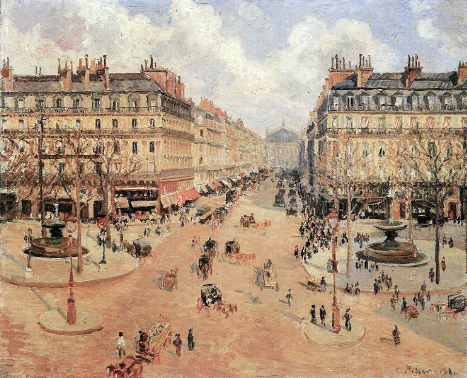
Pissarro Adopts a Monet Tactic

Camille Pissarro (1830-1903) -- Wikipedia entry here -- was developing eye problems as he reached his late 60s. It seems his eyes became irritated when outdoors for any length of time. Therefore it became difficult for him to paint out of doors, so he took to painting scenes from windows of places he rented. The link above (at the time of writing this) includes several images of his paintings of Paris' boulevard Montmartre near its intersection with the boulevard des Italiens.

The resulting paintings showed his subjects at various times of day, various weather conditions, and various times of year. This is somewhat analogous to Claude Monet's time-of day series of paintings of haystacks in the early 1890s and of the Rouen Cathedral a few years later. I would think Pissarro had Monet's concept in the back of his mind or even at its forefront when he painted the urban streets in the late 1890s.

Another series of paintings of Paris scenes was made from the Hôtel du Louvre, as mentioned (in Dutch) here with reference to one of those paintings. They all dealt with the place du Théâtre-Français at the intersection of the rue St-Honoré and the avenue de l'Opéra.  Readers who have visited Paris have almost certainly been at or near this area.

Some of these are shown below.  I've adjusted several of the captions found on the internet in compensation for a lack of a consistent set of titles in French.

Gallery

Avenue de l'Opéra, place du Théâtre-Français - 1898

Place du Théâtre-Français et l'avenue de l'Opéra, soleil du matin - 1898

La place du Théâtre-Français, soleil du matin, rue Saint-Honoré - (après la pluie) - 1898

La place du Théâtre Français - 1898

La place du Théâtre Français, effet du brouillard - ca. 1898

La place du Théâtre Français, pluie - 1898

Place du Théâtre-Français et l'avenue de l'Opéra, effet du neige - 1898

Place du Théâtre-Français, printemps - 1898

Place du Théâtre-Français, pluie - 1898

Thursday, March 8, 2018

E. McKnight Kauffer, Ace Poster Artist

Edward McKnight Kauffer (1890-1954), who signed his work E. McNight Kauffer and was called Ted, spent most of his career in England even though he was born in Great Falls, Montana. Sources dealing with his life and career are here, here and here.

Kauffer was studying art in Paris when the Great War broke out. He stopped off in London on his way to the USA, but liked the town and decided to stay there. He had an appreciation for simplification inspired by Modernism, probably gained while in Paris. Moreover, he was fortunate with respect to the timing of his arrival in London. For one thing, he was able to find some clients who also appreciated modernist touches in poster design. For another, being a foreigner from a neutral (at the time) country allowed him to work while other artists his age either volunteered or were conscripted into the army.

All that aside, Kauffer was a talented poster artist and had a very successful career through the 1920s and 30s. Not long after World War 2 began, he finally returned to America. After struggling for a while to get established, he finally became a regular designer of posters for American Airlines.

Gallery

The Cubist birds are perhaps his best-known creation.

From 1919.

Much of his work was for London public transit, this from 1924.


Two more posters from 1924.

This was done in 1932 and echoes the work of the French artist called A.M. Cassandre.

I include this 1938 Shell poster because its style is different from much of his work.

A book cover.

American Airlines poster, 1948.

Monday, March 5, 2018

When Architect George Howe Went Turncoat

The 1920s and 1930s were interesting times where aesthetics are concerned. My e-book "Art Adrift" deals with painting during that period. But pretty much the same thing was happening regarding architecture here in the United States.

Modernism in its high form was like a religion in that it was Manichean -- having defined sets of things that are either good or evil. Among the "good" things so far as architecture was concerned were that form should follow function and that there ought to be truth to materials. What was "evil" was creating designs based on historical styles, thereby ignoring pure function and mis-using new materials (among other things), an act of dishonesty.

Like the painters I discussed in my book, some architects were Modernist pioneers who by some point before 1950 had run out of new Modernist ideas. These were largely Europeans of the Bauhaus mode. Then there were practicing architects in Europe and, perhaps especially in America, who were trying to figure out what to do about that Modernism thing. Cherrypick an idea or two for application on a traditional base? In some respects, that was what Art Deco was. Or going whole-hog modernist, which is what George Howe (1886–1955) did.

Some background on Howe can be found here and here. In brief, Howe, a Harvard man, was classically trained at Paris' École des Beaux-Arts, graduating in 1912. He began his practice in the Philadelphia firm of Furness, Evan & Co., and in 1916 joined the firm headed by Walter Mellor and Arthur Ingersoll Meigs. By the early 1920s after having served in the Great War he was now a partner in Mellor, Meigs and Howe. The firm specialized in residential architecture using Norman and Tudor styles. Then in 1928 Howe left the firm, proclaiming his conversion to Modernism. He started his own firm, taking on the young Swiss modernist Architect William Lescaze as a partner. Their major commission was Philadelphia's landmark Philadelphia Savings Fund Society Building, one of the first and best modernist American skyscrapers. Thereafter, as best I can tell, Howe himself designed few if any noteworthy buildings.

But before he went Modernist, Howe was a thoroughgoing traditionalist architect. Examples of his work are shown below.

Gallery

A student project design for a post office.

Howe's 1917 Philadelphia home, High Hollow.

A Philadelphia Savings Fund Society branch office at 11th Street and Lehigh Avenue, ca. 1924-28.  Still essentially traditional, those undecorated wall segments hint at Modernism.

Goodhart Hall auditorium on the Bryn Mawr College campus, 1928  Howe and Meigs disputed who should take credit for the design, this argument helping precipitate Howe's departure from the firm.

The PSFS skyscraper under construction, probably in 1931.

Architectural rendering of the PSFS as seen at ground level, ca. 1930.

Looking up at the PSFS Building, completed 1932.

Aerial view of the PSFS.