I could find little biographical information about Mizen, so this will have to do.
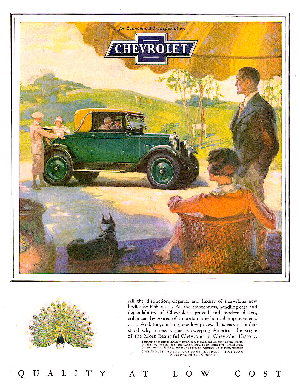
During the 1920s, much American automobile advertising used illustration rather than photography. This was especially true for ads using color, as color photography technology didtn't yield good results back then.
Chevrolet was General Motors' entry-level brand, so Mizen (and the advertising agency) mostly associated the cars with upper-edge middle-class women, rather than the ritzy folks often depicted in car ads in those days.
Click on most images to enlarge.
1927
That year's Chevrolet ads used framed paintings as artwork. This country club setting is more upscale than most in the series.
1928
But for 1928, art was in the form of vignettes.
1928
The framed areas featuring an image of Chevrolet included a wider-scope view or setting of the large vignette. A cute idea.
1928
Not much facial detail, probably because it was thought that such would focus attention on her, rather than features of the car. After all, humans tend to pay more attention to other humans than to objects in images.
1928
Here the lady's face is turned partly away from us. As with the image above, these interior views are not detailed vignettes of the images in the frames.
1928
Back to the earlier concept here.
1929
This 1929 ad art is technically a vignette, but features considerable framing. Mizen was a fan of the American southwest, so he must have enjoyed making this illustration.
1929
Now art in rectangular format. The scene here is a college football game day.


No comments:
Post a Comment