I'll add that he also was very, very good.
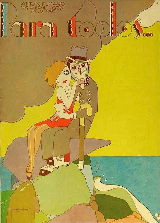
This post features some of his covers for the weekly magazine Para Todos, which another brief reference holds that he owned and edited for much of its 1920s existence. The title's literal translation is "For All" though perhaps a better, looser version would be "Everybody's" -- also the name of an American magazine published 1899-1929.
All the Para Todos covers I found on the Internet were done by Carlos. But given their quality and on occasion elaborate nature, I almost can't believe that he was able to create a cover every week in addition to his other activities.
Here is a sampling:


4 comments:
DP
You said it. This guy was not just good. He was very, very good.
I am reading your book, "Art Adrift". We were in college studying art at about the same time and went through similar experiences. I remember a painting instructor who never spoke to any of us for four semesters.
PS
I wish I could see the original printed copies of these. Considering the probable production method, this work can be appreciated even more. It looks like these illustrations were definitely produced with overlays to separate the colors rather than using camera separations. This means that the color scheme would have to be planned out in a very comprehensive form prior to the final rendering. All the rendering would have been done in black ink on separate transparent overlays. Most of the color looks 100% as opposed to tints produced with mechanical screens. What all this means is that the only full-color version of the art is the final printed piece.
It also looks like the work was printed using three or four assigned colors of ink rather than the standard four process colors.
The bulk of the art for complex color reproduction—using flat color areas—was done in this manner up until the perfection of color separation and process printing. Today the rendering for art like this would essentially be done by an artist on a computer using an application like Adobe Illustrator.
PS
Paul -- Thank you for your thoughts on reproduction technology Carlos probably used --information new to me and very interesting.
Really strong work. I love that art deco / art nouveau period when the design was such a prominent part of the image. It doesn't seem to matter so much any more, and that's our loss.
Post a Comment