Actually, I can imagine a likely justification from some of the younger folks in Nissan's marketing and product planning groups. Expressed in American English, words such as "edgy," "funky," "provocative," "postmodern" and "countercultural" and others might have been bandied about conference tables or infested emails and memoranda. For the Juke seems to have been slotted into a market segment of young buyers with just enough extra money to indulge themselves with a vehicle that makes a statement.
I'm note sure how large this market might be, world-wide, but Nissan hedged its bet by building the car on the Nissan B platform shared by a number of other Renault-controlled brands including the Nissan Leaf electricity powered car (which has a slightly longer wheelbase than the Juke).
The Juke does not have much brightwork, yet nevertheless is a "busy" design due to the elaborate sheet metal bulges and creases, especially those on its stubby sides. Such sculpting might be expected these days on standard-size cars, but everything is jammed onto the Juke. This is not to say that the Juke's shaping had to be austere and bland; but a compromise such as having the fenderlines flow a little more might have helped. The really off touches are the taillights and front turn-signal and auxiliary lighting fixtures set atop the fenders. They enhance the stubby appearance and generally clash with the rest of the design, such as it is. I find the use of round headlamps a nice touch, though their placement on the front strike-panel is both odd and risky.
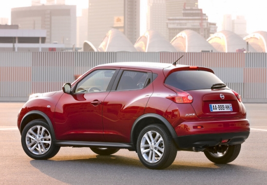
This side view clearly shows the strange roofline. It is nearly flat, which makes me wonder about its aerodynamic usefulness. But its most serious defect is that it slopes to the rear, pinching off potential carrying capacity for objects placed in the trunk area.
A view of the lumpy rear. The most interesting feature here is the wraparound backlight (rear window).
These views from above provide more detail as to how the body was shaped. I would have placed the front auxiliary light ensembles right above the grille opening with the hood cut-lines as their inner edge. But I suppose that wouldn't have been funky enough for the target market.
From the standpoint of the arts, I find the Juke interesting in that it strikes me as being yet another dreary symptom of self-indulgent, cultureless faux-creativity of this "postmodern" era that we must endure.


1 comment:
The Juke has been around for a couple years right? I recall when first seeing it that it resembled a Porsche Cayenne albeit smaller in every respect. Nissan has never had the nicest look to their cars...I have a soft spot (I'm 38:) for the old 280 Z car but like Subaru they somewhat fit the stereotype of appliances on wheels. Best luck to'em but if I were in the market for a personal, performance type car I would probably go with whatever iteration of the VW GTI. I find the Juke to be impracticable as a performance vehicle as it sits way too high, no matter how wide the tires and large the wheels the Juke doesn't really make sense. Also, I have not scene many on the streets...I can't even recall a recent experience.
P.S. Thanks for the post on car/designs I love it. Me and the wife are quite happy with her Prius and my 1991 Honda Civic DX for now...of course (I can't pass anything but the gas station in my Civi),but it's always nice to dream!
Post a Comment