Friday, August 29, 2014

When Kees van Dongen Almost Played It Straight

An artist can get boxed in commercially if his style is distinctive and he is successful. Clients or buyers can be willing to pay good money for a portrait or any other sort of painting by a famous artist provided that it has the characteristic look of that artist's work. This can be a good thing for the artist because it keeps starvation away. But if he is itching to try out some different styles, he either has to do it in the form of "personal" paintings or else expect a long period of training buyers to accept a new style.

I have no idea what Kees van Dongen (1877-1968) had on his mind once he attained commercial success with stylized paintings of women featuring exaggeratedly large eyes outlined in dark paint. He was perfectly capable of painting in a traditional manner and probably could have gone even further in a modernist direction than he already had, so there were creative options. On the other hand, he enjoyed having money and loved to entertain fellow artists and others, so he continued to paint in the van Dongen style, but within a range of variations. Examples of his paintings that edged in the representational direction are shown below.

I wrote about van Dongen here, and here is a biographical sketch.

Gallery

Le Coquelicot
This is one of van Dongen's most famous paintings in his classic style.

Arletty - c. 1931
Arletty was a singer and movie star.

Jean McKelvie Sclater-Booth
No van Dongen dark eye outlines here, but the general treatment is clearly from his brush.

La femme au canapé - 1930
Even further removed from his style; only the handling of the dress suggests van Dongen.

Le sphinx - 1925
Again the dress is the stylistic tip-off, the face and visible body bits being rendered quite tightly (for van Dongen).

LouLou - c. 1924
More in the van Dongen vein, especially the large eyes.

Mme Marie-Thérèse Raulet
A bit of his old Fauve color treatment, but otherwise largely conventional.

Mme T
More crisply done than usual, but T's arms seem too large.

portrait of woman with long hair
Unlike the previous paintings, this was probably done after the 1930s and has few van Dongen traces.

Wednesday, August 27, 2014

In the Beginning: Edward Hopper

Some people laughed back in December 24th of 1956 when Time Magazine (it was an important publication then, with an actual raison d'être) featured Edward Hopper (1882-1967) on its cover. Hopper was derided as old-fashioned, somebody who couldn't get with the abstract expressionist program. As it turned out, Time's editors in those days were better judges of artistic worth than many of the rest of us (I too was a brainwashed modernist). Hopper, nearly 50 years after his death, is considered a very important American painter and exhibits of his work draw large numbers of people.

For details on Hopper's career, here is his Wikipedia entry. It seems that Hopper worked as an illustrator at first in order to make a living doing art. But as Paul Giambarba in his blog "100 Years of Illustration" suggested, Hopper really didn't seem to enjoy that line of work. Nevertheless, he kept at it into his 40s until he was able to fully transition to fine arts painting and engraving.

Many painters in this occasional "In the Beginning" series of posts made extreme changes in style from their early days to their days of fame. Hopper was not one of them. His illustrations were influenced by the needs of art directors, so we can't give them much weight when evaluating the early Hopper. But his non-landscape paintings definitely prefigure his mature style. Mostly they lack the later refinement and clarity.

Gallery

Chop Suey - 1929
One of Hopper's better known paintings to set the scene.

Couple Drinking - 1906-07

Le Pont des Arts - 1907
Two scenes from his Paris days.

Summer Interior - 1909
He later painted many such interior scenes featuring young women in isolation.

New York Corner (Corner Saloon) - 1913
This hints at later streetscapes.

Illustration for "Your Employment System" - July 1913
One of his nondescript illustrations.

Soir Bleu - 1914
I'm not sure what to make of this because it is so atypical.

Road in Maine - 1914

Blackhead Monhegan [Maine] - 1916-19
Hopper spent time in Maine and did some landscapes. His later, famous landscapes include structures such as houses and lighthouses.

Morse Drydock Dial magazine cover - May 1919
More illustration work. He had to keep at it well into the 1920s.

Monday, August 25, 2014

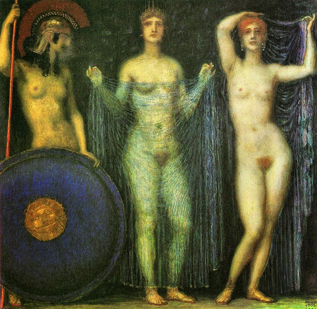
Towards the End: Franz von Stuck

Franz von Stuck (1863-1928) was a leading figure in the Munich art world, both as a secessionist and as an establishment art instructor. Although he painted fairly conventionally when it came to portraits, much of his work can be classified as Symbolist. In his case, symbolism was usually in the form of Classical or Biblical subjects. His Wikipedia entry is here, and I posted about him here.

Stuck's Symbolist paintings tend to be dark, but he made some bright non-portrait paintings along the way, especially around the early 1920s. But he continued his dark Symbolism into the final years of his career, as can be seen below.

Gallery

Sin - 1893
Stuck's best-known subject is "Sin," of which he painted a dozen or so versions. I include this to set the scene, but you can click on the above link to my post about him to see other examples of his art from his heyday.

The Circle Dance
Judgment of Paris - 1923
Sorry about the small size, but that's all there is on the Internet. The two paintings above are part of the Frye Art Museum collection in Seattle and show a not-gloomy Stuck at work.

Badende Frauen (Women Bathing) - c. 1920
A bright, non-Symbolist painting from around the same time.

The Three Goddesses: Athena, Hera and Aphrodite - 1923
Again in the same time frame, but more to the traditional Stuck style.

Pygmalion and Galatea - 1926

Judith - 1927
These two paintings were done within a couple of years of Stuck's death at age 65. He seems to have been little influenced by the Modernist "isms" that came along after 1900, his final works not being greatly different in spirit from what he painted 20 or 30 years earlier. The two Frye paintings suggest influence of the simplified, flattened representational painting style that emerged for a while after the Great War. The bathing women seem to have an Impressionist touch.

Friday, August 22, 2014

Great Ideas in 1950s Style

If you want a one-stop shop of 1950s style graphic design, I suggest the Container Corporation of America's advertising series called "Great Ideas of Western Man" that also embodied the now more or less defunct "middlebrow culture" of those days. Even the title now would be considered a thought crime in many colleges and universities in America and elsewhere.

A useful source of background information on the the series is here; it is well worth reading because it deals with how the series began, the people involved, the source of subjects and the marching orders for the illustrators.

The CCA ad series followed somewhat similar series from previous decades and continued until around 1975, but the greatest impact was in the early days, starting in 1950. Graphic style of the 1950s and for a while beyond often took the form of simple, flat shapes arranged in some sort of restrained clutter, and that's what we find here. The captions on the images shown below indicate the artist-designers, all of whom were prominent in the field.

Gallery

Herbert Bayer
Bayer was the art director, of sorts, for the CCA project.

Ben Shahn

Jacques Nathan Garamond

Lester Beall

Milton Glaser

S. Neil Fujita

Saul Bass

Wednesday, August 20, 2014

Marie Laurencin: Cubist Groupie to Dolce Far Niente

Marie Laurencin (1883-1956) hung out with Picasso and Georges Braque, was muse and mistress to Apollinaire, and early in her career was considered by some a serious modernist artist. Biographical snippets are here and here.

Her early modernist work doesn't seem to have progressed far into Cubism, and by the 1920s she mostly painted "sweet nothings" (as the title of this post indicates) in the form of dark-eyed girls in flat, pastel tones. I suppose Laurencin has her place in the Modernist Art-Historical Timeline, but from what I present below, her pedestal is a short one.

Gallery

Self-Portrait - c. 1905

Group of Artists - 1908
This painting has other titles, but its subjects are (left to right): Picasso, Laurencin, Apollinaire and Fernande Olivier (Picasso's mistress at the time).

Les jeunes filles - 1910-11
The main hint of Cubism here is in the lines and shadings; the subjects' forms have not been exploded and rearranged.

Self-portrait - 1912
Another merest whiff of Cubism.

Le bal élégante, ou la danse à la campagne - 1913
Laurencin is said to have had affairs with women.

girl - 1926
This and the three paintings below fall into what I call her dolce far niente period.

Le baiser - 1927

girl

girl - 1936

Jidelina - 1946
A post-war portrait. Not as flatly painted as those shown above, but an unexceptional, derivative work, typical of the times.

Doctor Le Masle - 1949
She sometimes depicted men. This is a late painting.

Monday, August 18, 2014

John Sloan's Topographical Paintings

I was never fond of the works of Ashcan School painter John Sloan (1871-1951) -- Wilipedia entry here.

To my way of thinking, Sloan was one of those artists whose paintings became progressively less satisfying to view. His early works (which I might get around to discussing sometime) were pretty good, though not distinctive. Mid-career paintings were less well done, in my opinion, but were distinctively Sloans, which is not a bad thing when it comes to long-term artistic notoriety, if not fame. During the last 20 or so years of his life, Sloan went off the rails and began using tempera paints to create underpaintings featuring topographical-like lines describing a subject's surface, much like the sort of engravings one sees on paper money. Atop that base, he applied oil paint glazes. I show some results below.

Gallery

Election Night - 1907

Women Drying Their Hair - 1912
Above are two mid-period Sloans to set the scene. When one thinks of Sloan, this is the general style that is most likely to come to mind.

Girl, Back to Piano - 1932
A fairly early topographical Sloan effort. The surface definition lines are mostly on the subject, not so much on the setting.

Barbara in Red and Gold

Helen [Farr Sloan] at the Easel - 1947
Two portraits. I have no idea why Sloan persisted with this style when it should have been obvious that resulting works were rather ugly. The technique is so strong and odd that it easily distracts viewers from the subject matter.

Santa Fe Siesta - 1949
A late painting illustrating Sloan's stylistic obsession applied to an entire human form.