Thursday, January 28, 2016

John Duncan Ferguson's Portraits of Women

John Duncan Fergusson (1874-1961) is associated with a group of painters called the Scottish Colourists. His Wikipedia entry is here and other information can be found here. He also is known for being the husband of modern dancer Margaret Morris (1891-1980).

Fergusson's style changed little after around 1910. He followed the path of tentative modernism where subjects were treated in a somewhat representational manner, but with simplification of form and related minor distortions. His colors were usually bright, but related to his subject matter, unlike the Fauvists who imposed unrealistic colors on subjects. Brushwork was often angled, parallel strokes, somewhat in the spirit of Cézanne.

His reputation seems to be rising: a recently discovered painting sold at auction for £638,000, as this Daily Mail article mentions.

The present post features Fergusson's portraits of women. At times his simplifications reached the point where it could be difficult to distinguished one sitter from others.

Gallery

Jean Maconochie - ca.1904

Le voile persan - 1909
One of Fergusson's better-known works, made when he had almost settled into the style used for most of the rest of his career.

Pam - 1910

Poise - 1916
This was the painting auctioned for £638,000.

Joan - 1916

Villa Gotte Garden - ca. 1920
Fergusson seldom did profile portraits. This has a slight Cubist feel.

At Gows - 1925

In the Patio (Margaret Morris Fergusson) - 1925

The Branches (Margaret Morris) - 1928

Souvenir de Jumges - 1931
A nice Art Deco feeling to this.

The Red Hat (Roberta Paflin) - 1933

La châtelaine - 1938

"Hillhead," Eileen - 1941

Girl with Bang - 1947

Blonde with Checked Sundress - 1958

Monday, January 25, 2016

Towards the End: Jules-Alexandre Grün's Last Crowd Scene

Jules-Alexandre Grün (1868-1938) spent much of his career as a poster illustrator. But when the occasion arose, he had a good eye for portraiture and composing believable crowd scenes, as can be seen in some large paintings he made. I last wrote about him here, and here is his French Wikipedia entry (the one in English is skimpy, so have your browser translate this, if it can).

Below are two of his best paintings of that kind followed by his final crowd scene, made as he was coming down with Parkinson's disease. Click on images to enlarge.


Un vendredi au Salon des artistes français - A Friday at the French Artists' Salon - 1911
Star of the painting (near the center, in white behind the woman in the mauve dress) is Geneviève Lanthelme (1883-1911), who died the same year the painting was completed under suspicious circumstances. Grün included himself and his wife. His wife Juliette is in front of the largest sculpture, wearing a violet dress. Grün is the bald, bearded man right behind her.

Fin de souper - After Supper - 1913
This is perhaps his painting that I like the best. I think it has to do with the lively young lady at the left.

Sortie de la messe au Breuil-en-Auge (Calvados) - Leaving Mass - 1934
This is the only image of this painting that I could locate on the Web, and it's marred because of the lighting where it's mounted, Église Saint-Michel - Pont-l'Évêque (near the junction of autoroutes A13 and A132 in Normandy).

Grün manages his crowd composition well, as usual, but the people are painted more thinly and sketchily than in the earlier works when he was in his prime.

Thursday, January 21, 2016

Some Albert Herter Murals

Albert Herter (1871-1950) was an artist who is best remembered (for those few who are even aware of him) as a painter of portraits and murals. His mature style was traditional, with just the slightest whiff of the cautious modernist-inspired simplification fashionable amongst conservative painters during the first four decades of the 20th century.

Herter's Wikipedia entry is here. If you read it carefully, you will find that his son Christian became governor of Massachusetts and later Secretary of State of the United States. The latter position was reached under Eisenhower shortly before the death of the previous Secretary of State, John Foster Dulles.

I plan to post more about Herter's work, but begin here with two of his murals (click on the images to enlarge).

Le départ des poilus, aout 1914 - 1926
This large mural is in Paris' gare de l'Est railroad terminal, and due to ignorance of it, I've never seen it. That's because I normally use the nearby gare du Nord when entering or leaving Paris by train.

Background regarding the mural, which Herter donated to France in memory of his son Everit who died fighting in the Great War, can be found here, here and here.

The scene depicts French army reservists called to the colors during mobilization at the start of the war. Under Joseph Joffre's Plan XVII, the main German offensive was expected along France's eastern borders, and that was where most of the mobilizing troops were sent during the first few weeks of August 1914. The soldiers are being seen off by family and friends.

The third link above mentions that the man in the white shirt raising his arms is Everit Herter. His mother is the women at the far left with her hands clutched. The bearded man at the right holding flowers is Herter himself.

Signing of the Magna Carta - 1915
This is one of four murals by Herter completed in 1915 for the Wisconsin State Capitol Building. Background on these murals is here. Due to their setting, these murals are composed is a formal, essentially symmetrical fashion.

Monday, January 18, 2016

René Vincent: Illustrating the Belle Époque Through the Années folles

René Vincent (1879-1936) was trained as an architect, but had a successful career as an illustrator during the first third of the 20th century in France. He contributed editorial art to the likes of La Vie parisienne and L'Illustration and did a considerable amount of advertising illustration, especially for automobile companies.

The best source of information regarding Vincent that I found on the Web is here. It's in French, but perhaps your browser will allow translation.

Vencent's style was clean and usually poster-like, even for much of his editorial work. It also could be witty. I find his work enjoyable.

Gallery

Berliet automobile illustration - 1906

Le retour de l"Ambrusqué - 1915

In La Vie parisienne - ca. 1916


A series in La Vie parisienne - 1917, 1918
Click to enlarge, though the text is still hard to read.

Cover art for Automobilia - July 1922
The car is a Peugeot 15 HP.

In La Vie parisienne - 1922

Peugeot 18 HP advertising - 1924

Golf, in L'Illustration - October 1927

"Bathing Time" in L'Illustration - October 1927
The car is an Hispano-Suiza.

Changing Tires - 1930

Skaters - ca. 1933

Unfinished Renault advertising illustration - ca. 1929

Thursday, January 14, 2016

Towards the End: J.C. Leyendecker

Joseph Christian Leyendecker (1874-1951) was a leading American illustrator for much of his long career. He produced more than 300 covers for the Saturday Evening Post, America's leading general-interest magazine during the first half of the 20th century. He also was famed for his advertisement illustrations for Kuppenheimer, a man's clothing maker and for Arrow collars and shirts. More background on Leyendecker can be found here and here.

His distinctive style featured strong, crisp lines and form definition along with hatched and sometimes crosshatched color overlays. A sense of his stylistic evolution can be glimpsed via this chronological gallery of Post covers.

Illustration fashions change, so Leyendecker's highly distinctive style became increasingly passé as the 1930s rolled along. Apparently his personality was changing during this time, which might have been a further career hinderance. A major blow was changes in the Post's editorial staff during the years around 1940. New editors and art directors eventually cast Leyendecker aside.

Gallery

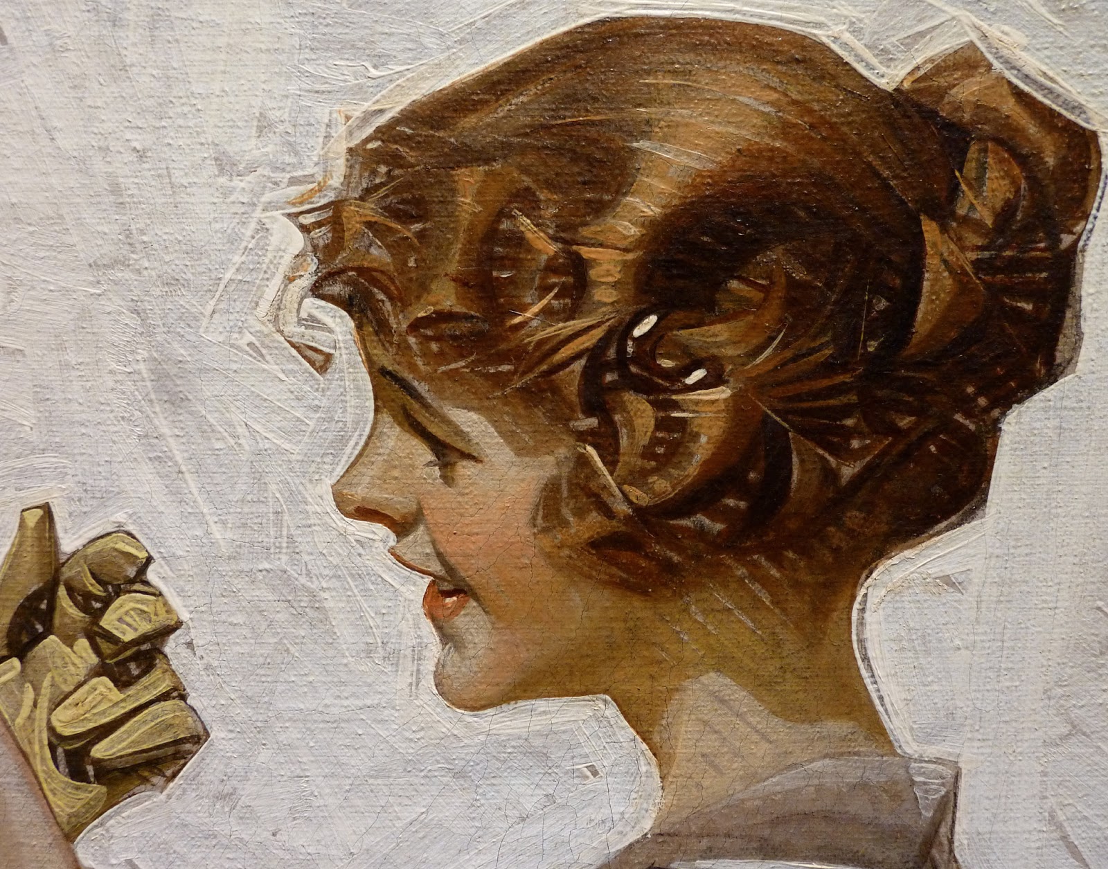
Detail from art in the Kelly Collection
I photographed this at an exhibit of Kelly items at Pepperdine University a few years ago. Note Leyendecker's distinctive brush style where there are regular brushstroke-related gaps between overpainting and an underlying color. Also, the background is created using a broad brush that blocks in the color while leaving visible strokes and gaps in coverage -- another of his stylistic characteristics.

Saturday Evening Post cover art - 24 November 1928
Another example of his style during his time of peak fame. Contrasted are a Pilgrim Father from the 1600s with a 1928 college football player.

Illustration for Arrow collars - 1932
The models are Phyllis Frederic and actor Brian Donlevy. Here the brush hatching is less prevalent. Leyendecker would use it or downplay it according to his feeling for the subject matter. Apparently, he opted for sleekness in this illustration.

Saturday Evening Post cover - 15 September 1934
Hatching returns for this Post cover. For some younger or overseas readers I need to mention that the overburdened fellow is a railroad porter doing his duty for the fancy lady.

Saturday Evening Post cover - 21 December 1940
Exhausted mailman during Christmas rush: the last Post cover not dealing with New Year babies.

Saturday Evening Post cover - 2 January 1943
This was his final Post cover, a continuation of his New Year's baby series. Leyendecker hatching is almost gone.

American Weekly cover art for 25 May 1947 issue
Crisp lines and fabric fold definition are still in the Leyendecker spirit. But I cannot be sure if the simplified style was an attempt to adjust to changing illustration fashion or else that he was simply dashing this work off to meet a deadline.

American Weekly cover - 19 December 1948
If it weren't for the signature, there is little here to indicate Leyendecker did this.

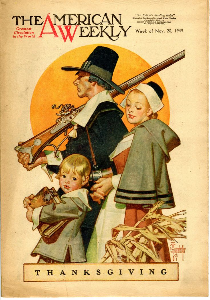
American Weekly cover - 20 November 1949
A very late illustration, again somewhat distant from his signature style. The orange circle is an echo of a Post cover theme from the 1920s and 30s.

Tuesday, January 12, 2016

In the Beginning: Joaquin Sorolla

Joaquín Sorolla y Bastida (1863-1923) has regained a measure of the fame he enjoyed in his lifetime. For a summary of his life and career, click here.

Sorolla incorporated little of mainstream modernism in his paintings. On the other hand, his mature style was freer than what Academy graduates were trained in. As best I can tell, his training was Academic in sprit, if not in every respect. Regardless, his early major works dealt with themes and styles that could meet with Academic approval.

Gallery

Bathing Hour - 1904
This painting made when he was about 40 contains many elements of Sorolla's signature style and subject matter. The Valencia (probably) seashore, a boat, oxen in the water, naked children bathing, and an older girl or young woman in damp clothing.

Father Jofré Protecting a Madman - 1887
A number of his early paintings were either historical scenes or social commentary, themes he largely abandoned in his 30s as he found his true artistic vocation.

Selling Mellons - 1890
Around this time Sorolla painted several paintings with similar appearance and subject matter to this. He would occasionally return to genre scenes until they became a major theme in his Provinces of Spain series for Archer Huntington.

Another Marguerite - 1892
More social commentary. Dark scene in dark surroundings.

Kissing the Relic - 1893
He sometimes painted religious subjects.

The Boat Builders - 1894
Finally, near Sorolla's beloved seacoast. Still missing is the bright sunshine found in his famous works.

Walk on the Beach - 1909
I'm tossing in this painting to remind viewers of Sorolla at his mature best. This painting shows his wife and a daughter at the shore. It's one of my favorite paintings. To see it in person, all you have to do is go to Madrid and visit the Museo Sorolla housed in his former home/studio.