Thursday, December 28, 2017

Porter Woodruff, Neglected Vogue Illustrator

Porter Woodruff (1894-1959) was one of five American fashion illustrators Vogue magazine had based in Paris in the early 1920s. He continued illustrating for Vogue through the 1930s, residing in New York City and Tunisia as well as Paris. He died in Tunisia. Why little else is known about him can be gleaned here (click on the "learn more ..." line).

Besides Vogue, he contributed covers to House & Garden magazine (another Condé Nast publication) around the time of the Great War, before moving to Paris. He also painted North African scenes that fail to impress me. You can Google on his name to locate some of these if you are curious.

Woodruff was not a great fashion illustrator, but was good in the context of his times.

Gallery

House & Garden cover - June 1917
A nice composition in synch with the architectural style.

House & Garden cover - November 1917

Sketch of Chanel costume - 1923

Vogue cover - March 1926
Interesting minimalist concept.

Wedding dress by Jean Patou - 1926

Fashion illustration - 1926

Vogue cover art - January 1928
Woodruff's best-known work.

Pen & wash illustration - Vogue - May 1929

Franklin Simon hat - Vogue - December 1931
By the 1930s, Deco geometry was out and flowing lines were in.

Monday, December 25, 2017

Telling Cruisers and Battleships Apart


Starting when I was a boy and for decades thereafter I had trouble telling American cruisers from battleships. Specifically, cruisers and battleships of the World War 2 era from, say, 1935 to 1950. Before the 1930s cruiser and battleship appearances were fairly distinctly different.

I was not the only one who confused the two types. Aerial reconnaissance observers fairly often identified enemy cruisers as being battleships. An example is the early Japanese sighting reports of an American task force during the battle of Midway in June of 1942.

Consider the two photos at the top of this post. Which ship is the cruiser and which is the battleship?

The upper image is of BB-60 USS Alabama, a battleship, and the lower image is of heavy cruiser CA-74 USS Columbus.

Here are ways to distinguish the two types of warship:

Gallery

Top: CB-1 USS Alaska, bottom: BB-63 USS Missouri, docked at Norfolk, Virginia - 1944
The USS Alaska was a very large cruiser not typical of those in the rest of the US fleet (only two Alaska Class ships were built). Regardless, the image is instructive. Cruiser lengths were in the same range as contemporary battleships, sometimes a little shorter, sometimes even longer.

However, cruisers were narrower to allow higher speeds. The fineness ratio (waterline length to beam) of cruisers approached and sometimes equaled ten, whereas that of Great War era battleships was about six, and World War 2 "fast battleships" ranged from about 6.5 to around eight. More specifically, the final US dreadnaught class of the early 1920s (Colorados) had a fineness ratio of about 6.4, whereas the Missouri's was 8.2 and the Alaska's was 8.9.

I include this photo because it's the only aerial one I know of showing a cruiser and a battleship close together. So generally speaking, cruisers are proportionally narrower than battleships.

BB-56 USS Washington
CA-71 USS Quincy
The Washington was one of the first US fast battleships, having a fineness ratio of 6.7, whereas the heavy cruiser Quincy's ratio was 9.5. These high-angle photos made the difference obvious, but seen from a low angle, as in the top images, the ships look similar because their superstructures are similar. Another difference is in the size of the main battery guns. Heavy cruisers has 8-inch guns and World War 2 US battleship classes had 16-inch guns.

CA-68 USS Baltimore
CL-48 USS Honolulu
For sake of completeness, we should consider appearance differences between heavy and light US cruisers. Baltimore's fineness ratio is 9.5 and that of the light cruiser Honolulu is 9.8, Baltimore being about ten percent longer. Setting aside displacements, light cruiser main armament was six-inch guns in greater numbers than heavy cruiser eight-inchers. So Honolulu has three main turrets forward of the bridge compared to Baltimore's two. This is distinctly different from battleship practice (aside from the Royal Navy's HMS Nelson and HMS Rodney that also had three turrets forward), making it easier to distinguish the Honolulu from a battleship. Later light cruiser classes had a different turret arrangement, but the comparatively delicate gun barrels are a strong difference from a battleship's armament.

Before the 1930s it was much easier to distinguish cruisers from battleships. Two examples from around 1920 are compared below.

BB-38 USS Pennsylvania
CL-5 USS Milwaukee
Cruiser Milwaukee has small turrets with small guns positioned close to the bow and stern, with a long stretch in the mid area having little but four smokestacks.  Battleship Pennsylvania's topside elements are more compactly arranged.  The reason for this difference is that the cruiser was designed for high speed and therefore required a much larger machinery area whose boilers and engines developed 90,000 horsepower compared to Pennsylvania's 35,000.  The post-1935 battleships and cruisers mentioned in the first part of this post had about the same horsepower from more advanced, more compact machinery systems, which largely explains their similar appearance.

Thursday, December 21, 2017

Ugly Paintings: Women by Picasso and de Kooning

Once upon a time -- 150 years ago, perhaps -- the consensus was that paintings should be beautiful. Modernism was a conscious, ideological reaction to and condemnation of traditional art. In other words, what academic painters did, hard-core modernists tried to do the opposite. So rejection of beauty became part of that hard-core package.

I don't hold that a painting must be beautiful to be great. But I also think that great paintings are far more often beautiful than not. Moreover, I find it difficult to think that really ugly paintings are great ones.

There are always a few exceptions, but not the ones of women by Pablo Picasso and Willem de Kooning featured here. The art world seems to disagree with me because the Picassos auctioned for many tens of millions of dollars, and the de Koonings aren't worth chicken feed either.

First, two Picasso paintings -- the first, a portrait of one woman, the second showing women. Then two de Koonings in the same sequence.

Gallery

Dora Maar au chat - 1941
An auction sale report is here.

Women of Algiers - 1955
A report for this painting of a bordello is here.

Woman I - 1950-52
As the numeral implies, de Kooning painted a series dealing with women.

Two Women in the Country - 1954

Picasso's paintings are more structured than de Kooning's, the Algiers being almost cheerful.
Borderline ugly, I'd call it. The Dora Maar is just plain awful so far as I'm concerned, though I'll credit Picasso for doing a reasonably good job on the kitten. I find the de Koonings simply horrible. His apologists would praise the emotion and artistic action seen in his brushwork. A lot of emotion does not guarantee a painting's greatness. Here, ugliness rules.

Monday, December 18, 2017

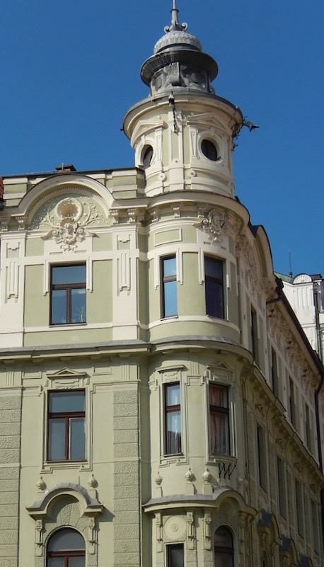
Art Nouveau Architecture in Ljubjana

Not all of it is good, and just like modernist architecture it would be bad if it were everywhere. That said, I am fond of Art Nouveau. When it's not overdone, it offers interesting decoration that goes beyond Greek and Roman ornamentation. The same can be said for Art Deco -- in some respects a late-stage Art Nouveau.

Most Art Nouveau architecture is found in Europe. The best-known examples are in large cities such as Paris and Brussels, but a number of smaller cities such as Riga in Latvia have plenty of Art Nouveau. Another small city to add to the list is Ljubljana, capital of Slovenia, a Slavic country tucked in by Italy and Austria and ruled by Austria's Hapsburgs, starting in the 14th century and ending with the collapse of the Austro-Hungarian Empire in 1918.

A major earthquake in 1895 resulted in some rebuilding in the Art Nouveau style -- actually Vienna Secession style, an Art Nouveau variation with less ornamentation and comparatively little of that with plant tendril themes. Below are some Ljubljana scenes I photographed when I was there a few months ago.

Gallery


Thursday, December 14, 2017

Walter Westley Russell: Portraits with Background Pictures

Sir Walter Westley Russell (1867-1949) is yet another competent English painter I am including on this blog: the supply of same seems inexhaustible.

A brief biography is here. Even though Russell is not well known these days, he was noteworthy enough in his time to be knighted.

Like many English contemporaries, his style changed little over his career. Based on images found on the Internet, he tended to make paintings with a warm (in the color sense) feeling, though there are some that differ. It seems he liked to portray women. A quirk in many of those portraits was his use of backgrounds with green-blue wallpaper containing many small elements in other colors. Besides similar or identical background wallpaper, Russell usually included framed pictures hanging on those walls. Doubtless these details were from his house or studio.

Gallery

Dover
Russell did some landscape painting.

Joseph Crawhall
Crawhall was one of the Scottish "Glasgow Boys" group of painters.

Air Chief Marshal Sir Hugh Dowding - 1942
"Stuffy" Dowding was in charge of aerial defenses during the Battle of Britain.

Camilla - c. 1910
A carefully done background, but no wallpaper in this comparatively early work.

The Blue Dress - 1911
Still no wallpaper, but there are pictures on the background wall, so we're getting closer.

Amelia - c. 1937
A late portrait with wallpaper and pictures.

Girl in a Muslin Dress
I don't have a date for this, but the background is archetypical Russell.

Marion
Again.

Cordelia - c. 1930
And again.

Isabella
Here Russell adds a mirror, but the standard background remains.

Monday, December 11, 2017

New Suzanne Valadon Biography


There are a few artists whose personal lives are more interesting than their work: Frieda Kahlo immediately comes to mind. Then there are others where paintings and biographies come close to striking a balance. Salvandor Dalí is a famous example. A less well-known example is Suzanne Valadon (1865-1938), whose biography is lightly sketched here. For some, she is best known for being the mother of Maurice Utrillo, a more famous Montmartre painter.

A while ago I visited the Montmartre museum housed in a building where she had her apartment and studio for a number of years. I took photos and posted about it here and here. Probably as a result of those posts the publisher of "Renoir's Dancer: The Secret Life of Suzanne Valadon" by Catherine Hewitt sent me a review copy. The book, already available in England, is due to be published in the USA late February: Amazon link here.

The image on the cover is of probably the most famous painting for which she modeled. It's by Renoir (hence the book's title), who depicted women in something approaching a uniform style. That's why the young lady doesn't resemble Valadon as closely as it might. During her modeling days, she slept around a lot, probably the reason for the book's subtitle. As for modeling, other famous artists she worked for included Puvis de Chevannes and Toulouse-Lautrec. The latter encouraged her drawing efforts (she was a "natural"), but it was the prickly Degas who was most responsible for giving her confidence and help.

I have a tattered 1959 edition of "The Valadon Drama: the Life of Suzanne Valadon" by John Storm (link to recent reprint here). I skimmed through it before reading Hewitt's book so as to have a mental yardstick for evaluation. There are other Valadon biographies out there, given her colorful life.

So why another Valadon biography? The author, who has a doctorate, set her goal as providing a well-researched treatment that would be accessible to the general public. Did she succeed?

Well, the bibliography is extensive, even referencing dozens of newspaper articles and web sites as well as the expected books and journal articles. She provides suitable background information on Valadon's various living environments as well as on the famous and not so well-known people in her life. This should be useful for readers who have little knowledge of the 1880-1935 Paris art scene or even France in general during that time. Hewitt mentions many of Valadon's paintings during the course of the book along with paintings and drawings made of her by famous artists for whom she posed (and sometimes more!). My review copy has no color images of such works nor a contents reference to any. However, the English edition has color inserts, so presumably there will be the same for the American edition. After all, it can be frustrating to read about paintings without being able to see them, so that is good. Paintings mentioned, but not in the book, can often be found via the internet, if a reader is especially curious.

The main substantive difference from Storm's book is the he insisted that she was never legally married to Paul Moussis, whereas Hewitt makes it clear that she was indeed married to him.

My main complaint about Hewitt's treatment is that she fairly often mentions the mental and emotional states of Suzanne, her mother, and some others that are not documented in the many footnotes. That is, she is making educated guesses. I assume that to keep the narrative flowing for her target audience, she does not qualify these statements. For example, she might have written "Suzanne was probably most worried about Maurice's latest drunken spree." I invented that sentence, but if it had appeared in the book, the word "probably" would not be found. My stripped-down review copy has no author introduction, so if there is one in the published version, perhaps Hewitt will mention her reasoning regarding this policy.

Thursday, December 7, 2017

New Book About Illustrator/Cartoonist John Cullen Murphy


The book whose cover is shown above is about illustrator/cartoonist John Cullen Murphy (1919-2004) and fellow cartoonist friends living in or near Fairfield County Connecticut during the early 1950s and beyond. It was written by his son Cullen Murphy who for many years worked with his father on the Prince Valiant comic strip. Some links dealing with Murphy are here and here.

A few weeks ago the Wall Street Journal had a favorable review of the book. Having grown up during the final glory decades of continuity and adventure comic strips, I almost immediately ordered a copy from Amazon. When it arrived, I read the whole thing in a single five-hour shot.

I was aware of John Cullen Murphy, but never followed his Big Ben Bolt strip or Prince Valiant, created by Hal Foster who transitioned it to Murphy starting in 1971. The reason is that both strips were from Hearst's King Features distribution syndicate, whereas my parents subscribed to the Seattle Times, and not to the Seattle Post-Intelligencer, the local Hearst rag.

It turns out that John Cullen Murphy was an impressive man. He was good at portraiture even in his mid-20s, could have made a good career in commercial illustration had he not been diverted into the comic strip trade, and was knowledgeable and sophisticated even though his academic education ended with high school. As for the latter point, it's further proof that real education can happen once one has left school -- provided one has the will and wits to learn on one's own.

Murphy was raised in New Rochelle, New York, in the county immediately north of New York City. Nearby lived famous illustrators J.C. Leyendecker and Norman Rockwell. Rockwell even used teen-aged Murphy as the subject of a Saturday Evening Post cover (shown in the book). During World War 2 he was attached to Douglas MacArthur's staff and remained friends with Mrs. MacArthur (whose portrait he painted) for many years thereafter.

Besides Murphy family lore, the book provides many interesting details regarding well-known cartoonists who lived nearby. Also included are fascinating insights on the comic strip trade including Hal Foster's thoughts on treating continuity for strips appearing only on Sundays.

Monday, December 4, 2017

Drafting Board Cities

Planned cities are nothing new: perhaps the first one, Mohenjo-Daro in present-day Pakistan, was created around 4,500 years ago. Usually such planning is little more than platting a grid pattern for streets. Here in the United States, large, early examples include Philadelphia in the 1680s and the grid layout established for New York in 1811.

Not all planned cities consisted of pure street grids. Philadelphia's plan included some squares for parks, and Savanna, Georgia has many such squares. At some point, vistas, focal points, circles and other details became fashionable concepts for planners slaving over their drawing boards. I suspect that there were times that a plan was proposed and accepted simply because it looked attractive as a graphic layout -- an extension of the plan-based studies 19th century architectural students had to produce.

Such street patterns might have seemed nice when displayed on a wall, but often were somewhat defective when implemented. Let's take a look.

Gallery

Brasilia
This image and the following one are from this collection of space views of planned cities. Brasilia features a sort of arrow or wing motif. I've never been there so can't offer an opinion, through I've read that inhabitants were not fully pleased with its layout.

Canberra
I've never been to Canberra, either. Its designer, Walter Burley Griffin, was influenced by Frank Lloyd Wright, so the plan has an "organic" feeling to it.

Longview, Washington
Longview is a small city planned in the late 1920s. The lake on the left side of this image from Bing is artificial, part of the plan. There are a few diagonal streets, holdovers from the thinking shown in the following images.

Chicago, Burnham Plan of 1909
Little of the Burnham Plan was implemented as designed. The grid-layout central area (the Loop) was too well established to be altered. (It's the area the river bends around in this view where the top of the image faces west, away from Lake Michigan.) In addition to some formal layouts by the lake, the street plan features diagonal avenues, circles, focal points and a civic center square from which many of the diagonals radiate. None of that was built.

Washington Plan of 1800
One such plan that largely came to be is the L'Enfant-Ellicot Plan for Washington, D.C., capital of the USA.

Washington, D.C.
Here is how the street layout looks today viewed from above. Perhaps those angled streets bouncing off various circles and small squares handled horse-and-buggy traffic adequately in the early days.
But when I was in the army stationed nearby in the early 1960s I found it a hassle to work my way to the Mall on those diagonal avenues even on a quiet Sunday morning. (Though there were plenty of parking spots on the Mall when I got there.) A pure grid pattern might have been better for traffic flow. Furthermore, despite all those diagonals, squares and circles, there are few impressive vistas once one leaves the Mall and Pennsylvania Avenue (running from the Capitol to near the White House).

Paris: central area
Paris with its boulevards by Baron Haussmann and others works better than Washington. That's because Paris' street layout is essentially unplanned, having grown from pre-Roman days through the Dark and Middle ages to the point where creating boulevards was necessary for traffic circulation. Note how irregular is the "background" to the dark boulevard pattern in this view from above.