Thursday, November 30, 2017

Lionello Balestrieri: Painter, Music Lover

Lionello Balestrieri (1872-1958) received honors in his day, but now seems to be considered a minor figure. For instance, although he was an Italian, there is no Italian language Wikipedia entry for him as of mid-September when I'm drafting this post. The entry in English is here, and there also is one in French offering other details regarding his life and career.

Balestrieri experimented with various styles, but most of his images seen on the Internet seem to be from the years around the turn of the 20th century when he hadn't strayed very far from traditional painting. That is, he didn't distort the proportions of his subjects, but his brushwork varied.

Music seemed to be a passion, and he painted many works dealing with the music scene.

Gallery

Il bacio

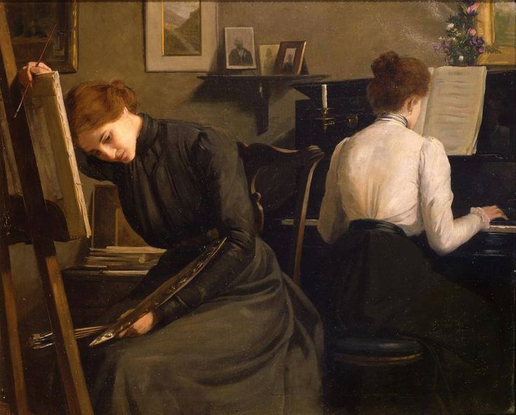
The Painter and Pianist

Beethoven (Kreutzer Sonata) - 1900
Beethoven is the bust in the background.

Woman on a Paris Street at Night

Chopin Triptych: Chopin and George Sand - c.1905

Chopin Triptych: Death of Chopin - c.1905

Andando a teatro - c.1910

Giovane donna che sorseggia il tè - 1910-14

Autoritratto in piedi - 1929

Monday, November 27, 2017

George Telfer Bear: Little-Known Scot

For some reason I've been interested in 1920s and 30s art, architecture, design, movies and other cultural things for most of my life. Some of that might be because there were remainders of those times still rattling around when I was growing up.

This isn't to say that I think what that interwar period produced was outstandingly good, though some of it was, especially the commercial architecture from, say, 1924 to 1932. And as I've mentioned in this blog and in my Art Adrift e-book, painting during those times was in a fascinating state. Modernism (anti-traditionalism, really) had finished 30-50 years of experimentation, an effort so complete that there was little left to innovate. So modernists didn't quite know what to do next, and other painters didn't know quite what to do with all those concepts modernists had come up with in the years before the Great War.

George Telfer Bear (1874-1973) was a long-lived Scottish painter who seems to have spent most of his career there aside from a few years in the Canadian prairies. There is almost nothing about him on the Internet: the two most revealing links are here and here.

Bear accepted some modernist ideas, but like many others in those days he did so cautiously. For instance, he did little or nothing in the way of distorting the proportions of his subjects. On the other hand, he did "flatten" his picture planes a little (reduced depth effects), and simplified his subjects slightly. As a result, most of the paintings shown below are clearly from the 1920s even though only one has a date.

His work strikes me as being not especially distinctive in the context just mentioned. To my mind they are simply representative of his times and their artistic fashions.

Gallery

The White Cottage
He painted outdoor scenes and still lifes as well as portraits of women.

La Jeunesse
This might be from the 1930s.

Girl with a Fan - 1931
More poster-like than usual for Bear.

seated woman
Yet another woman in a yellow costume -- could they be the same person?

Portrait with Still Life
Perhaps Bear's best-known work.

The Red Hat
A very 1920s style.

Thursday, November 23, 2017

Illustrators as Advertisement Subjects

I've mentioned more than a few times that I'd rather see prosperous artists than starving ones. Posthumous fame and high auction prices don't compare well to an unrewarded lifetime.

Leading American illustrators enjoyed financial success, at least while their work remained in demand. And their fame could lead to other sources of income. One case would be appearing in advertisements.

This post features two examples.

First, we see Jon Whitcomb in 1952, painter of gorgeous gals, claiming he loved Fatima cigarettes, a second-tier brand in those days. A biographical snippet on Whitcomb is here, and here is a link with examples of his work.

Melbourne Brindle was less famous than Whitcomb, but well-known nevertheless. He was a "car guy," indeed owning that 1916 Crane-Simplex with boating features shown in the upper part of the Gulf ad from the 1950s (click on the image to enlarge). During the late 1940s he illustrated ads for Packard and in the 1950s did the same for Chevrolet.

Monday, November 20, 2017

Alexandre Roubtzoff: Orientalist Does Jazz-Age Paris

Alexandre Roubtzoff (1884-1949) was born in St. Petersburg, Russia and trained in art there. However, shortly before the Great War he visited Tangiers and transitioned to Orientalist painting, spending most of his career in Tunis. His French Wikipedia entry is here, but at the time this post was drafted it was criticized as not being up to Wikipedia standards.

Not all his post-Russia works were set in North Africa. There are at least two dealing with mid-1920s Paris high life.

Gallery

Bédouine à la couverture (Zohra et Salha)
First of two examples of Roubtzoff's Orientalist work.

Alia Sitting and Grinding Vegetables

Impressions de Paris - 1926
There are at least two paintings, seemingly with the same title, showing jumbled details of Jazz Age Paris. Here is one.

Impressions de Paris - 1926
This is the other one I am aware of. The original is large, but this is the biggest image of the whole thing I could find on the Internet. However, I did find a large reproduction in a French automobile magazine, spreading over two pages. I scanned each page segment separately, and those images are below. Click on them to enlarge.

Both paintings contain many of the same elements, but they are placed differently. My guess is that the first image above was a study for or an earlier version of this painting.

Details include Metro signs, plenty of cars, newspapers ranging from the leftist L'Intransigeant to the rightist Le Figaro, many faces of young women (but few men's faces), and plenty of women's legs revealed by Flapper dresses. Very witty and fun.

Thursday, November 16, 2017

Up Close: Reginald Marsh

Reginald Marsh (1898-1954) was an illustrator and painter of blue-collar life who himself attended the very best schools (Lawrenceville and Yale). I wrote about him here, in a post subtitled "Yalie Gone Slumming."

The Ringling Museum of Art in Sarasota, Florida has a large Marsh painting in its collection titled "Wonderland Circus, Sideshow Coney Island," a 1930 work of tempera on canvas stretched on masonite. I visited the museum in May and took some photos of the painting, two of which are shown below. The original of the lowest image is fairly large, so click on it to enlarge and view details of Marsh's style.

Regarding style, aside from supports and media, his paintings and illustrations are similar in general appearance.

Gallery

The painting via the museum's web site.

A closer view. Marsh's signature and date are at the bottom.

The blue-eyed blonde staring at you, the viewer, strikes me as being the focus of the painting. She is holding hands with a stereotypical swarthy Italian, an occasional real-life happening that Marsh must have hoped would set-off WASPy viewers in his day.  Click on the image to enlarge.

Monday, November 13, 2017

Joseph Clement Coll: Color Illustrations

Joseph Clement Coll (1881-1921) died age 40 of an appendicitis. I recently posted about him here and mentioned that his pen-and-ink+brush style would have become unfashionable during the 1920s decade and wondered if he would have been able to adjust his style to the new times.

The present post presents examples of Coll's work in color including some illustrations where linework is largely abandoned while colored ink washes or watercolors are used to model his subject matter. This suggests that he could have maintained his career, though perhaps at the price of losing some individuality compared to other illustrators using the same media.

Jim Vadeboncoeur Jr. offers some background on Coll here.

Gallery

This is an example of Coll's regular pen-and-ink style.


Above are three covers of a Sunday supplement magazine distributed to various American newspapers. They are promoting a serialized Arthur Conan Doyle book.

Artwork for the first cover shown above. Note that in this instance Coll was not using line plus color fills, but instead is using color to help model surfaces of the subject matter.

Detail of "Astro the Seer and Valeska." Another example where linework is minimized.

Probably an interior illustration for Sir Nigel. This uses line and color fill.

No information about this detail of a study. This demonstrates that Coll wouldn't have had much trouble migrating to 1920s illustration style fashions had he lived longer.

Thursday, November 9, 2017

Up Close: Robert Henri's Salome

Robert Henri (1865-1929) was an important American painter and teacher in the decades around the turn of the 20th century (Wikipedia entry here).

Among his works were two versions of the Biblical character Salome, the dancer. I wrote about various interpretations of her here.

According to this and other sources, Henri got caught up with something of a Salome craze. The link states: "Robert Henri was a cognoscenti of modern music, dance, and theater. When New York audiences were scandalized by Richard Strauss’s 1907 opera ‘Salome’, based upon Oscar Wilde’s play of the same name, the opera performance inspired the intrepid artist to invite Mademoiselle Voclexca to perform the notorious ‘Dance of the Seven Veils’ in his studio."

I Googled on Mademoiselle Voclexca, but turned up nothing of interest. Clearly, it's a stage name, and her being active a century or more ago, references are probably buried in decaying newspaper file morgues or yellowing theatre programs.

I visited the Ringling Museum of Art in Sarasota, Florida in early May and took a few photos of their version of Salome that offer closeup views of Henri's brushwork. Click on the images for enlargements showing details of Henri's style.

Gallery

The Salome at the Mead Art Museum at Amherst College in Massachusetts. It seems sketchier than the Ringling version.

The Ringling Salome -- image found on the internet.

My photo showing the upper part of her body and costume.

Mademoiselle Voclexca's face.

Monday, November 6, 2017

Joseph Clement Coll: Ink, Pen, and a Bit of Brush

Joseph Clement Coll (1881-1921) died at too young an age, of appendicitis. A cynic might call that tragic event "a smart career move" because Coll's pen-and-ink+brush style would rapidly fall out of illustration fashion during the 1920s. On the other hand, he did produce some illustrations in other media that were competently done. That competence plus his sense of portraying dramatic action might have stood him well had he lived longer.

His brief Wikipedia entry is here. A more personal appraisal by Jim Vadeboncoeur Jr. is here, and a Muddy Colors post about him by Greg Ruth is here.

Coll produced a huge amount of illustrations during his comparatively short career, so there naturally was variation in quality. Below I present a collection of what I consider his better work. Most of his illustrations were vignettes or non-framed full-page illustrations with plenty of white space. When he did framed illustrations or illustrations of night scenes, the results were usually murky looking -- an effect hard to avoid given his preferred medium.

Gallery

Strong composition.

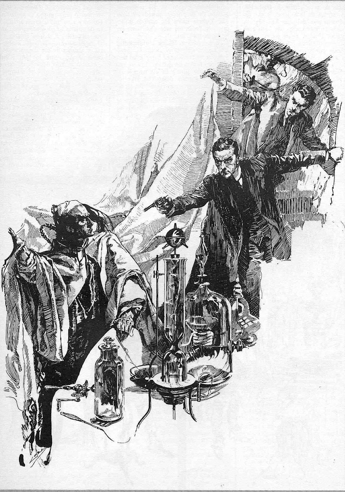
A confrontation with Fu Manchu.

Fu Manchu again.

Another striking composition.

A "King of the Khyber Rifles" illustration from 1916 (Kelly collection) that's so cluttered and murky that some of the action is lost.

A "framed" illustration, also from the Kelly collection, where the penwork works against the subject matter again.

Here we find penwork augmented by spots of bold brushwork.

Another example of Coll's brushwork-plus-line. There might be some water-thinned ink or ink washes here too, but one would have to view the original art to be sure.

A fine example of Coll's brush+line.

I wonder if some of this was scratchboard. It's framed, but not as heavy as in some examples above. At the top of the image appear to be U.S. Cavalry troopers, and the female might be Victory. Perhaps the 1916 Mexican incursion rather than the Great War.

Thursday, November 2, 2017

Reynolds-Stephens and the Thread of Life

William Ernest Reynolds-Stephens (1862-1943), that is, Sir William Reynolds-Stephens was both a painter and sculptor. And despite having been knighted, seems virtually unknown nowadays. For example, aside from one web site that requires registration to view, biographical information on the internet is sketchy as of the time this post was drafted (mid-June, 2017). There also are very few examples of his paintings to be found.

What I do know is that he was born in Detroit to British parents, soon moved to Canada and then on to England. He was trained as an engineer, but took up art in his early twenties, studying in England and Germany. By the time he was 40 he had essentially transitioned from painting to sculpture, and it seems that, to the extent he is known today (in England, anyway), it is for that phase of his career. And that's pretty much it, aside from this contemporary appreciation.

Given what I wrote above, how did I manage to "discover" Reynolds-Stephens? Well, I saw one of his paintings, "Roman Courtship" (ca. 1900) at the Ringling Art Museum in Sarasota, Florida in May. Here is what a museum docent has to say about it.

And I took photos, a few of which are displayed below (click on them to enlarge).

I found the painting to be strikingly composed and well-executed.  However, lacking a classical education, the symbolism escaped me at the time. Symbolism aside, it can be appreciated on its merits as well as being a fine example of late-Victorian painting.

Gallery