Ewart Melbourne Brindle (1904-1995) -- Melbourne Brindle, as he signed his name and was known by -- was a successful illustrator whose peak career spanned the early-1930s to the late-1960s when he chose to retire from commercial work. His Wikipedia entry is
here, and more background can be found
here.
His most characteristic illustrations, in my opinion, were done in pen-and-ink. A few of these are shown below along with works in other media. Some of the images can be enlarged by clicking on them.
Brindle was basically a careful artist who seldom tried for flashy effects. But his illustrations were not necessarily static and dull (unless an art director insisted on him doing so). My take is that, at his best, his illustrations were pleasing and satisfying.
Gallery
As noted in the headline, Brindle was a "car guy." He is shown at the top of this advertisement with his Crane-Simplex car -- an extremely rare and valuable one and only part of his collection.
An illustration done in the later-1950s. Note his standard signature at the lower left.
That signature is on one side of his gravestone: the other side has the usual information.
A Packard advertisement from around 1946 featuring a probably fictitious Army Air Forces colonel who loved the Packard-built motors in his P-51 fighters.
A Packard ad from 1948.
Illustration from a 1949 Packard ad. In these advertisements for Packard, the illustration style of the cars and that of the backgrounds are different enough to make one wonder if a different artist painted the cars. On the other hand, Brindle was quite capable of rendering an automobile: plus, his signature is on the illustrations. By the way, the Packards are distorted to make them seem more sleek than they actually were -- a common advertising practice in those days.
An illustration of a 1956 Chevrolet. Again, it is distorted by order of an art director.
Illustration of an early gasoline station.
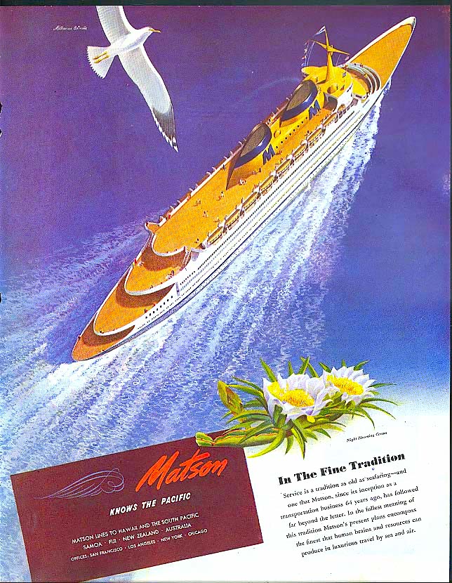
Matson Line ad from 1946. Yes, the ship is idealized.
Here is what I consider a characteristic Brindle illustration. It was made for an advertisement promoting the Territory of Hawaii in 1936. The view is of Honolulu harbor. At the left is a white-hull Matson liner. At the center is the city's famous Aloha Tower.
View of a Territorial University building from the same ad series.
Landscape painting of Block Island, Rhode Island that might have been painted after he retired.


2 comments:
Showing the cars sleeker than they are in reality seems to continue today in TV ads. I have often seen commercials for cars that look way cooler than the ones I see on the street. Watch a Ford pickup commercial, and notice how the truck rocks when it comes to a stop. It is obviously faked, but the ad creators thought it looked tougher or more appealing to would be buyers. Thanks for the post
Mr. Brindle apparently also did illustrations for railroad-ads. I recently discovered one while researching history & background ideas for a model railroad. I came across it on the internet where can be viewed some wonderfully-imaginative & effective vintage-ads from decades-ago, which also could be startlingly-realistic & quite-beautiful. The one to which I'm referring specifically was done for the C&O RR, from 1943. It's leading-caption reads "Listen in the Night, America". Immediately intrigued, I read the text, written in a quietly-patriotic way. I don't know who composed these words but the illustration is by Mr. Brindle, whose signature appears toward the bottom-edge of the ad. I'd never heard of the gentleman and was quite-pleased to find the information presented on this site. The artwork is semi-monochromatic, all-blues & grays, dimly-shaded to create a starry, late-hour of the night. A man's standing at an apparently 2nd-floor window, looking out at the town, concentrating on a C&O freight-train, headlight beaming, zipping along in the distance, gentle hills in background,crossing an elevated-series of arches across a highway leading into the unnamed-town. Though late(the hour unspecified),the man's dressed in ordinary business-clothes, viewing the peaceful-scene stretching-out before him, standing at side-of-open-window, partially-concealed in the dim shadows of an unlit-room, though a small lamp's on the desk next to him. He's looking thoughtfully at the town & distant-train, realizing how the RR's still-meeting the needs of a wartime-nation, even in the dead-of-night. I've pondered whether the man is gazing from an upstairs hotel-window or boarding-house(the kind of small-town structures which existed in that era--probably non-air-conditioned--though time of year isn't revealed, except that it's likely not winter), or from the upstairs-window of his own home. Both the text & artwork are great--they do something to me inwardly, and I find it quite moving, appealing--and unusual!!
Post a Comment