But for a few years in the late 1930s he had the plum assignment of illustrating Cadillac advertisements, a subject far from his signature work. Clearly, Whitcomb was more than a one-act-pony when it came to illustration.
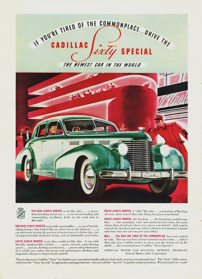
Some of his Cadillac advertisements are shown below. Given that they include his signature, I have to conclude that he illustrated the cars as well as backgrounds, people and other details. However, I need to note that many automobile advertising images were produced by two artists, one specializing in rendering cars, the other depicting the setting. A well-known example is the series of Pontiac illustrations where Van Kaufman did the settings and Art Fitzpatrick the cars. On the other hand, Bernie Fuchs was able to deal with the whole package, as presumably Whitcomb did. (Let me know if I'm mistake regarding Whitcomb.)
Click on the images to enlarge.
The kind of illustration Whitcomb was famous for.
1940 Cadillac Sixty Special
Compare the car in this illustration to that in the photo below.
1938 Cadillac Sixty Special - Auctions America photo
This is what Sixty Specials looked like -- a classical-yet-sporty and distinctive body for its time.
1938 Cadillac Sixty Special
Most of the advertisements included here posed the cars in futuristic settings. Here the car's perspective is distorted and the passengers are shrunken so as to suggest that the car is huge. This was standard advertising practice from the late 1930s through the 1950s and perhaps beyond.
1938 Cadillac Sixty Special
Not a very futuristic background here. The airplane seems to be a Pan American Airways Sikorsky S-42 that entered service back in 1934. On the other hand, the airbrush-like background offers a futuristic industrial design feeling.
1938 Cadillac Sixty Special
The shapes in the background hint at the Trylon and Perisphere theme structures of the forthcoming 1939 New York World's Fair.
1939 Cadillac Sixty-Two
Here we finally find some glamorous women that became Whitcomb's specialty.
1939 Cadillac Sixty Special
Another seaplane passenger liner in the background, but this one is an imaginary design.
1939 Cadillac Sixty Special
A domestic, yet Moderne setting. The man seems almost in proper scale (he is a door-width away from the car), but the woman is too small.
1939 Cadillac Sixty Special
Here Whitcomb loses his touch, seriously distorting the car's proportions.
1939 Cadillac Sixty Special
This Sixty Special is too short and the background isn't futuristic -- but more believable.


No comments:
Post a Comment