Monday, July 20, 2020

Clark Hulings - Western and Other Paintings

Clark Hulings (1922-2011) had a successful career as an illustrator as well as a fine arts painter. His Wikipedia entry is here, some biographical information on the Hulings website is here (scroll down), and a review of an exhibit of his work is here.

His health was poor when young, suffering from Tuberculosis, but lived to age 88 and was highly productive. Besides a Physics degree from Haverford College, he received art training from George Bridgman, Frank Reilly and Sigismund Ivanowsky.

His illustration career took place mostly in the late 1940s and the 1950s. Thereafter, he focused on painting, moving to New Mexico in the early 1970s for a better environment for his weakened lungs.

Hulings' paintings generally featured the southwestern United States and his regional subject art is largely displayed and marketed in Cowboy/Western art venues.  He also seems to have traveled extensively in Europe and painted scenes from there.

I cannot recall having seen a Hulings painting in person, so can't comment on brushwork and other details. The images below suggest that their appearance was close to photorealism, but that might be misleading. Several are copyrighted, but I include them so as to provide a sense of his capabilities.

Gallery

Jose on Maria - 1982
An example of Southwestern subject matter.

Cuyamungue - 1974
A landscape where brushwork is evident.

An Ancient French Farmhouse
This strikes me as being created for potential salability, but then Hulings was noted as a shrewd artist-businessman.

A Hilltop Town in Liguria - 1999
One of his Italian paintings.

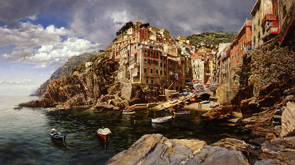
Riomaggio, Sunday Afternoon
And another, this of a Cinque Terre village. The perspective is the same as one would find in a wide-angle photograph. That makes me suspect that is was based on such a photo.

The Spanish Shawl
Not typical of Hulings' painting subjects, though early in his career he made portraits to earn some money.

Croppers Cabin cover art (detail)
An example of his illustration work, some of which was for paperback book covers.

Illustration
Another example, but here he used media untypical for him.

Thursday, July 16, 2020

Some Non-Pontiac Ad Art by Art Fitzpatrick

1963 Pontiac Grand Prix at Monaco's Hotel de Paris

Arthur "Art" M. Fitzpatrick (1919-2015) is famed in illustration circles for his classic 1959-1972 series of illustrations for Pontiac made in collaboration with Van Kaufman.  Fitzpatrick rendered the cars and Kaufman furnished the settings and people.  There was some overlap in that settings and people might be reflected on the cars. I previously wrote about him and the Pontiac illustrations here.
Fitzpatrick's Wikipedia entry is here.  An interview of him is here, and includes the following regarding his way of working on Pontiac ads such as that shown above:

"I photographed a car [for General Motors testimony at a congressional hearing] … same position/view with 3 different lenses, 35, 50, and 120mm. Photographers, for reasons that continue to escape me, were using long lenses, which shorten a car, making the rear wheel look bigger then the front ones. I always used a 35mm lens (wide angle). I made a pencil line drawing of an exact tracing of 35mm photo, and on another sheet over that did my “enhancing”.

Further detail regarding the "enhancing" is here, including this snippet:

"To produce his famous "wide" look, Fitzpatrick traced photos of the new car, cut the racings into pieces, then "stretched" the car into bolder proportions. "We wanted pictures that were different," Fitzpatrick says. "Impact is the name of the game, so we went with predominately front views -- even cropping the cars so that they looked too big for the page."

Fitzpatrick began his illustration career in 1946 with a contract for Mercury.  He freelanced for other brands until 1953 when he and Kaufman began working for General Motors.  He did Buick illustrations at first, then in 1959 began the famous Pontiac series.  Following Pontiac, he and Kaufman made some advertising illustrations for GM's (at the time) Opel subsidiary in Germany.

Below are a few examples of his illustrations for brands other than Pontiac.

Gallery

This illustration is of a 1948 Mercury "woodie" station wagon.  Fitzpatrick was still early in his advertising image career.  The perspective is a bit distorted (probably intentionally), and proportions of some of the details such as the headlights seem incorrect (possibly not intentionally).

A 1949 Mercury convertible.  Now we see a typical "Fitz" rendering of an automobile.

I do not know for certain if Fitzpatrick made this illustration of a 1952 or '53 Nash, but it looks like his work.

The same can be said for this 1953 Plymouth illustration.

Illustration of a 1954 Buick by Fitzpatrick.

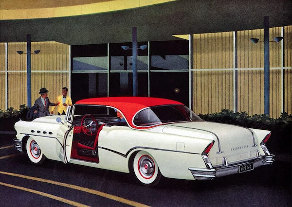
A 1956 Buick illustration.

1971 Opel, posed in front of Paris' famous Café de Flore on the Left Bank.  Note the Citroën camion in the background that adds to the atmosphere.

1971 Opel Manta.  These Opel depictions have a more solid feel than the Pontiac illustrations -- probably intentionally to make them seem less Pontiac-like..

Illustration of a 1972 Opel Commodore.

Cross-posted at: carstylecritic.blogspot.com

Monday, July 13, 2020

Marcel Brunery: Cardinals and Tablecloths

Marcel Brunery (1893-1982) was a French artist who made many paintings of Roman Catholic Cardinals in casual settings.

His biographical information on the Internet was nearly non-existent as of the time this post was drafted. Here is the most I could find.

What interests me about the paintings shown below is how similar the tablecloths in the various images are. I do not know if there is some liturgical meaning to the designs or whether such tablecloths were simply common at the time Brunery made the paintings. Perhaps they were from his residence and used as props for the settings.

Other commonalities appear below. Brunery had to sell paintings to earn a living, so some recycling of subject matter and even depictions might have been necessary.

Gallery

Afternoon Tea
Note the tablecloth. It, or ones with similar designs appear in all the images below.

An Afternoon Concert
A musical theme.

La sonate
And another. Also note that these paintings feature room decor, many showing areas much above the main subjects.

Testing the New Vintage

Sweet Indulgence
Compare the portrayals to those in "Afternoon Tea," the first image above.

La fête des cardinaux

The Game of Chess

A Difficult Move
Another chess scene.

A Toast to His Eminence

An Opening Salvo
... of champagne spray.

A Perfect Target
And another.

Thursday, July 9, 2020

Some Gustav Klimt Drawings

Gustav Klimt (1862-1918) was never mentioned in the art history class I took many years ago. Now he is famous. That fame largely rests on his early 1900s "golden" period works such as "The Kiss," "Adela Block-Bauer," "Judith" and "Pallas Athene." His Wikipedia entry is here.

Klimt also made many drawings that have been preserved. They are mostly of women, a number of which are erotic. Some of the latter can be readily found on the Internet, but the selection below is of the safe-for-office-viewing variety.

The styles of his drawings tend to parallel those of the paintings he was making at about the same time. Those below are shown in approximate chronological order based of their styles.

Gallery


These first three drawings seem to be from the time Klimt's paintings were mostly conventional.

This was probably made in 1896 when his style began to move from conventionality.

He often put the greatest effort into faces.

Apparently a study for his 1902 Beethoven Frieze.

The signature block is the same as for the previous drawing.  The word nachlass refers to posthumous collection.

From his late period around the time of the Great War.

Another from that time.

Monday, July 6, 2020

Assortment of Arthur Mathews Paintings

Arthur Frank Mathews (1860-1945) was a California painter whose favored toned-down colors and, when dealing with people, mannered scenes. All of this was very much of his time and locale. I enjoy viewing his works, especially when I can see them in person.

I last wrote about Mathews here, and here is his Wikipedia entry.

The images below are some that I grabbed from my painting database. No theme in mind other than showing some of the variety of his production.

Gallery

The Grape - 1906
I've seen this several times in San Francisco's de Young Museum, but it might not be on permanent display.

California - 1905

Carmel
Mathews sometimes ventured to the nearby Monterey area as this and the following two painting attest.

Monterey Bay

Afternoon Among the Cypress - 1905
This might have been in the present 17-Mile Drive area of the Monterey Peninsula

The Wave - c. 1900
He dabbled in scenes of mermaids.

Woman and swan
Women were a favorite subject.

Thursday, July 2, 2020

Toby Rosenthal, American Expatriate

Toby Edward Rosenthal (1848-1917) was born in Connecticut, spent his youth in San Francisco, and then moved to Germany around age 17 where he apparently spent much of the rest of his life. Or so claims his Wikipedia entry.

His painting style was conventionally representational. Moreover, he was skilled at portraying settings -- details, lighting, coloring and the rest. Subject matter varied. Some scenes were serious while some others were humorous.

In sum, I find Rosenthal highly competent, yet hard to pin down compared to contemporaries whose individuality was stronger and more consistent over their careers.

Gallery

Woman with Parasol
I can't quite read the writing at the lower right, so will assume for now that this was from early in his career.

The Beautiful Elaine - 1874
Apparently this painting was well-received when it traveled to America.

He Who Laughs Last - 1876
The left half of a diptych, the other titled "Who Laughs Last" showing the young man at the right sprawled after slipping.

Nude Seen from Rear - c. 1880

Sleeping Cardinal (The Cardinal's Portrait) - 1896
An amusing scene. Note the skillful depiction of the setting's details.

View Through a Window, Landsberg, Germany - c. 1900
Not that it matters here, but the prison in Landsberg was where Hitler was jailed following the Munich "Beer Hall Putsch" and wrote "Main Kampf."

His Madonna - 1916
A late painting, still done in conventional style. Apparently Rosenthal was able to ignore Impressionism and all the modernist "isms" of the early 20th century.