Thursday, June 4, 2020

George Bridgman, Teacher of Anatomy Drawing

George Brandt Bridgman (1864-1943) was born someplace in Ontario (the links below are vague about just where) and spent most of his career teaching anatomy at New York City's Art Student's League. There are several books he authored and illustrated that remain in print.

A useful summary of his career is here, and his Wikipedia entry is brief but has a long list of artists who studied under him.

Those former students include: McClelland Barclay, Will Eisner, Lee Krasner, Andrew Loomis, Paul Manship, John Cullen Murphy and Norman Rockwell. For a while Rockwell served as his classroom assistant, as the first link mentions.  Bridgman was a student of Jean-Léon Gérôme at the École des Beaux-Arts  in Paris.

Below are images of his drawings found here and there on the Internet. Bridgman favored a structural approach to anatomy featuring masses and some geometry.

Gallery


Monday, June 1, 2020

Leonard Campbell Taylor: Ladies with Puffy Skirts and Other Paintings

Leonard Campbell Taylor (1874-1969) was a member of the Royal Academy who painted in a somewhat painstaking representational style that was going out of fashion even as his career was starting. His Wikipedia entry is here.

Below are examples of his paintings up into the early 1930s. Most feature women and interiors. Not included here are his landscape paintings and illustrations made while serving as a war artist during the Great War. I haven't found examples dated from 1935 to his death, so I do not know if he ever adjusted his style to suit changing artistic fashions.

Gallery

Meditation - 1899

Patience - 1906

The Rain it Raineth Every Day - 1906

Japanese Prints, or The Portfolio - c.1907

Summer Afternoon (An Interior, Lord Birkenhead Seated) - 1913

Chess

Romsey Abbey

The Hall

Queen Mary - 1928

The Sampler - 1931-32
At this date, he seems to have decided to use retro subject matter along with retro style.

Restaurant Car - (London, Midland and Scottish Railway poster artwork) - c.1935
Judging by the woman's clothing, I think this was painted in the late 1920s or 1930, and not the date found on the Internet with the image.

Thursday, May 28, 2020

Stanley Cursiter's Early 1920s Women

Stanley Cursiter (1887-1976) was a Scottish painter who was Keeper of the National Galleries of Scotland from 1930 until 1948. I wrote about him here, and his Wikipedia entry is here.

During the first half of the 1920s he painted several works featuring attractive young women, especially one named Poppy Low.

Gallery

Black, White and Silver - 1921

Roberta - c. 1922
She might also be the subject of the previous painting.

Poppy Low - 1922

A Summer Night - 1923
The model is Poppy Low.

The Fair Isle Jumper - 1923

The Seamstress - 1923

House of Cards - 1924

Artist, Self Portrait, with his wife Phyllis Eda Hourston, and his model Poppy Low, Chez Nous - 1925

Apple Green - 1925
The appears to be Poppy.

Reclining Lady
Undated: This might be his wife.

Monday, May 25, 2020

Noel Sickles' Imagined War Scenes

Noel Douglas "Bud" Sickles (1910-1982) is perhaps best known for his 1930s work on the "Scorchy Smith" comic strip. Following that, he earned his keep as an illustrator. Some background is here.

Sickles was a very good illustrator. He could depict people, something competent illustrators of his day could be expected to do. But he also was excellent depicting vehicles of various kinds -- ships, cars, aircraft and military equipment. I discussed his versatility here

The present post features some of his illustrations from the early days of World War 2 that appeared in Life, America's number one image-based magazine at the time. As best I can tell, all the scenes below are the fruits of Sickles' imagination, but the details are realistic, showing uniforms, equipment and such. Click on images to enlarge.

Gallery

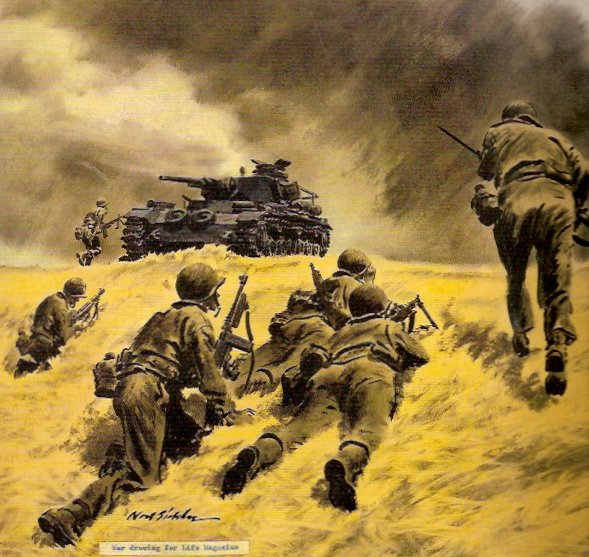
I wrote about this fine Life Magazine illustration here. Sickles made numerous illustrations for Life during World War 2, many with the subject of tanks and dealing with them. For what it's worth, I would not want to attack a PzKpfw IV armed with the tommy gun and other light weaponry shown in the drawing.

An anti-tank canon shown in a hypothetical African desert encounter.  I doubt that such an action took place, given that American forces did not fight in the open Libyan desert as the British did in 1940-1942.  If my conjecture is wrong, let me know in a comment. Also, the soldiers' helmeted heads seem a little too large -- a rare failing for Sickles. Perhaps this was a rushed project for him.

Here is a German Czech-built Panzerkampfwagen 35(t) stuck in a ravine while being attacked by partisans with Molotov Cocktails.  Again, the figures don't seem right. Clearly, he paid more attention to depicting the tank accurately.

From a 1942 Life article titled "Enemy Tanks are Vulnerable."

More diagram than a realistic illustration, this shows features of the German parachute assault on the Greek Island of Crete.

Finally, Sickles' contribution for a 5 March 1942 Life article titled "Six Ways to Invade U.S." Here Japanese are attacking Southern California. As best I can recall, Sickles seldom did night scenes. Interesting impressionistic feeling here. And the details of the mechanical objects are sketchy, another Sickles rarity. Perhaps he lacked reference material on Japanese tanks.

Thursday, May 21, 2020

Molti Ritratti: The "Queen Mum"

Elizabeth Angela Marguerite Bowes-Lyon, Queen Elizabeth The Queen Mother (1900-2002) is this post's portrait subject. Biographical information is here.

The "Queen Mum" as she was popularly called late in life, lived at a time when photographic portraiture became dominant over painted portraiture. However, due to her royal standing, she was portrayed using oil paints on canvas a number of times.

Some of the images are from the Royal collection and some others are from the National Portrait Gallery and are copyrighted. They are used here to illustrate how various artists chose to portray her over the years, influenced by current artistic fashions and by their own artistic backgrounds.

Gallery


Three photos. The first when she was in her twenties. I am not sure when the second (image cropped) was taken: perhaps in the late 1940s. The third seems to date during the early years of her marriage; I include it because her pose is similar to that in the following image.

By John Singer Sargent - 1923
This drawing was made the same year Elizabeth married Albert, Duke of York, who later unexpectedly became King George VI.

by Reginald Grenville Eves - 1924
This is essentially an oil sketch, though the artist signed it as a finished work. It does not flatter her, in part due to the rough brushwork on her face.

by Philip de Laszlo - HM Queen Elizabeth when Duchess of York - 1925
He was a leading portrait artist, and this is one of his best-known paintings.

by James Quinn - 1930
There seems to be something wrong here having to do with her eyebrows, upper nose, and eyes.

By John Helier Lander - official coronation portrait - 1937
Compared to the two paintings below that were made not long after, it seems that Lander might have shown Elizabeth as looking younger than she was.

By Gerald Kelly - c. 1938
I cropped this image slightly.

By Gerald Kelly - c. 1940
Kelly painted several portraits of her. This has a particularly "official" feeling -- note the crown at the left.

by Stanley Cursiter - 1965
Cursiter was skilled at portraying attractive women, but something went wrong when he depicted her arms.

by Michael Noakes - 1973
This is similar in spirit to 1960s American magazine illustration by the likes of the great Bernie Fuchs. That said, I place this on par with the fine de Laszlo portrait shown above.

by Robert Norman Hepple - 1987
Elizabeth was now in her late eighties, but this somehow doesn't seem quite like her.

Monday, May 18, 2020

New Mead Schaeffer Book


Mead Schaeffer (1898-1980) is one of my favorite illustrators. I wrote about some of his works here, here, here and here.

Now David Apatoff, America's leading illustration maven, has a book about Schaeffer due to appear in July. The cover is shown above, and information regarding it can be found here. Of course I ordered a copy and eagerly await it.

As I wrote here, Schaeffer claimed that he was happy to move from his signature period-piece illustrations so as to portray contemporary scenes. My take then and now is that his early,  pre- World War 2 illustrations were his best. I suspect Apatoff agrees, because the book's cover art is from that earlier career phase and not one of his later works.

A few examples indicating Schaeffer's stylistic evolution are shown below.

Gallery

A Count of Monte Cristo scene, 1928. Interesting mix of thinly and thickly painted areas.

A 1932 illustration for Good Housekeeping Magazine showing a German scene.

He painted a number of Post covers depicting American military personnel in a variety of wartime activities. Here his style is less painterly -- and far less distinctive, though it might have been more commercially viable given shifts in illustration fashion.

A Post cover from 1953. I do not know the extent to which this bland scene was the idea of Schaffer or that of the Saturday Evening Post's art director.