Monday, February 28, 2011

Tullio Crali: The Forever Futurist


Tullio Crali (1910-2000) was a pilot and self-taught painter who took up Futurism at a late date for it (1929) but at a comparatively young age for himself. Given his enthusiasm for aviation, he was part of the Aeropittua sub-field of Futurism.

Even though Futurism in general faded before its founder Marinetti died, Crali carried on with the project till the end of his very long life.

I suppose most critics nowadays would recoil at the bellicosity of some of Crali's paintings, but when they were painted they fit well with the temperament of Mussolini's Fascist Italy.

Being late to Futurism, Crali didn't get very hung up on the fussy, Cubist-like finely-chopped subjects depicted by earlier practitioners. Instead, his paintings tended to be simpler, more poster-like.

I wouldn't call Crali's paintings great, but I do find them oddly likable thanks to their bold design and sense of action.

For better quality and enlargements, try clicking on the images.

Gallery

Self-portrait

Le forze della curva (Forces of a Curve) - 1930
This early work features a race car, not aircraft.

Bombardamento notturno (Night Bombardment) - 1931
More a pretty poster than a terrifying image.

Ali tricolari (refers to tricolor Italian insignia roundels) - 1932

Ballelica - 1932
Not every subject was a machine.

In decollo (Takeoff) - 1932

Bombardamento di una fabrica (Bombing a Factory) - 1938
This bombardment seems more sinister and businesslike than in the 1931 painting above.

Prima che s'apra il paracadute - 1939
To me, this painting produces the greatest sense of motion.

Architectura (also known as Cityscape) - 1939

Incuneandosi nell' abitato (Diving on a City) - 1939
Probably Crali's best-known work.

Kamikaze - 1980
Painted when he was about 80.

Monoplano jonathan - 1988
Done near the end of his life -- and still Futurist!


Friday, February 25, 2011

Molti Ritratti: Misia Sert


A favorite muse for painters in the late 19th and early 20th centuries was pianist and arts facilitator Misia Sert (1872-1950). She was born Maria Zofia Olga Zenajda Godebska and also known as Misia Natanson, Misia Edwards and Misia Sert -- depending upon who her current husband was.

The rather brief Wikipedia entry for Misia is here and a link dealing with music and the ballet is here. But the most detailed background information I could locate on a fairly brief Google search was in this book review.

Her husbands were Thadée Natanson (Wikipedia entry is in French) who founded and ran the arts publication Revue Blanche, newspaper tycoon Alfred Edwards and painter Jose Maria Sert, best known in America for his Rockefeller Center RCA Building lobby murals. Oddly, given how much she was painted by others, I can find no portrait of Misia by Sert.

Here is a sampling. If your computer and browser allow, click on images for larger views.

Gallery

Photos of Misia
Even though she was touted as a beauty and attracted portrait painters like the proverbial flies to honey, Misia didn't seem to be camera-friendly. According to the third link above, she had good legs and an impressive bosom. Probably had an attractive personality as well.

By Henri de Toulouse-Lautrec (1895, 1897, c.1897)

By Pierre Bonnard (both 1908)

By Pierre-August Renoir (1904, c.1906)

By FĂ©lix Vallotton - 1898

By Édouard Vuillard (1899, 1897)
The upper painting shows Misia with Vallotton.


Wednesday, February 23, 2011

Covering the Famous: Ernest Hamlin Baker


Once upon a time there was an important weekly news magazine named Time. It was the leading magazine in its category from the beginning (it being the first of its kind in the U.S.), and for years its cover would feature an illustration-portrait of a newsmaker. Artwork prevailed (though not exclusively) through the 1960s and beyond, though photography slowly began taking over as the 1970s wore on.

A prolific cover artist during the 1940s and 50s was Ernest Hamlin Baker (1889-1975). He attended Colgate, where he was a track and field athlete and was active in student publications. As an artist, he was largely self-taught, but had the ability to work his way into the illustration field. This website has some biographical information and examples of his work.

Baker's mature style was strongly realistic. No modernist simplification for him: Baker seemed to glory in depicting every wrinkle and blemish on the faces assigned to him by Harry Luce and the editors who selected cover subjects.

Baker's art is probably unfashionable in many art-elitist circles. However, I tend to think that his covers represent valuable documentation of his times and Time's heyday.

Below are examples of Baker's work.

Gallery

American Legion poster - ca. 1920

Cover of January, 1934 Fortune magazine

The Activities of the Narragansett Planters - Wakefield, Rhode Island Post Office mural - 1939
This was a New Deal (but not a WPA) project, as this link attests.

Time magazine Man of the Year cover, Jan. 6, 1942
Features President Franklin Roosevelt; his new wartime allies Stalin and Churchill are in the background. Baker seems to have Winston eying Uncle Joe warily, a reflection of his true view of the Communist dictator.

Time magazine cover for Nov. 23, 1942
The subject is James Doolittle, leader of the famous Tokyo raid earlier that year and now commander of Twelfth Air Force in the newly-opened North Africa front. The olive drab color and white-on blue star represent the paint-job found on U.S. Army aircraft at that time.

Time magazine Man of the Year cover, Jan. 1, 1945
He is Dwight Eisenhower, commander of Allied forces that invaded France in June and at year's end were on a front near the German border.

Via this website, a spread from Ernest W. Watson's 1946 book "40 Illustrators and How They Work." Discussed is a mid-1930s portrait illustration of CIO labor leader John L. Lewis, a powerful figure in those days. Try clicking on the image for a much larger view. If your computer screen is large, you might be able to make out the text. To me the key item of interest is that Baker used thinned oil paints rather than watercolor, tempera or some other medium to get the effects seen in works such as the Time covers shown above.


Sunday, February 20, 2011

Frank R. Paul: Bad Art That Spawned a Genre


Yes, there existed what might be called science-fiction art before Frank R. Paul (1884-1963) appeared on the pulp magazine scene, but many believe Paul is the guy who counts as the effective inventor of the genre. And that "many" includes illustrator Frank Wu who posted this strong endorsement of Paul that includes a gallery of his magazine covers. So if the examples shown below aren't enough Paul, be sure to explore the link to Wu.

Paul was born in Vienna, trained as an architect, studied in Paris and migrated to the United States before the Great War. He came to the attention of Hugo Gernsback, who published science-hobbyist magazines. Science-related fiction was part of the content, and by the 1920s Gernsback had spun off a new magazine -- Amazing Stories -- that dealt with what we now call science-fiction. Frank Paul did the cover art.

Paul's strength was his imagination. He conjured up space ships, space suits, flying saucers and other items central to visualizing ultra-high-tech futures.

Paul's weakness, in my opinion, was that he was at best a journeyman artist. His magazine cover paintings strike me as being little more than elaborated cartoons. While I'm happy to give him his proper due as a pioneer, I also cannot deny that I almost wince whenever I see almost any example of his work.

Here are a few of Paul's magazine covers. As usual, try clicking on the images for larger, crisper views.

Gallery

Amazing Stories - April, 1926

Amazing Stories - July, 1926

Amazing Stories - November, 1926

Science Wonder Stories - October, 1929

Amazing Stories - August, 1930

Wonder Stories - December, 1935

Science Fiction - no date


Friday, February 18, 2011

Where Does One Build a Magic Motorway?


Norman Bel Geddes (1896-1958), a pioneer industrial designer and futurist who was famous in his day, had his fingers in many pies, as this Wikipedia entry suggests.

One of his largest projects -- perhaps his most famous -- was his huge model of how the United States might look in 1960, 21 years from the time it was created for General Motors' Futurama exhibit at the 1939 New York World's Fair. Being an automobile manufacturer, General Motors was interested in creating interest in and even enthusiasm for systems of high-speed highways that would make owning and using cars even more attractive.

I have to admit that, had I a time machine in the basement, a prime destination would be the '39 fair and GM's Futurama. Here are a couple of photos of the model:

Non-cloverleaf interchange as seen in General Motors' Futurama, 1939

Freeways intersecting in city center, General Motors' Futurama, 1939

About the same time as the model was being built, Geddes wrote a book about potential future freeways, elaborating on some of his thinking behind the Futurama project. It appeared in 1940 as Magic Motorways.

I'll skip over details such as his notion that cloverleaf interchanges weren't the best answer and that extra-high-speed lanes separated from regular traffic lanes would be a good idea. Instead, today I'll consider where Geddes thought these freeways should be built. Keep in mind this was about 17 years before Congress authorized the present Interstate highway system.

Maps and Diagrams from "Magic Motorways"
Click on images for larger, sharper views.

Original caption: Traffic flow volume--based on Study by U.S. Bureau of Public Roads


With regard to the two graphics above, Geddes writes (Page 253):"Motor traffic is expected to double in the next twenty years. The radius of traffic is also growing. In the East congestion is rapidly growing to the saturation point. To break up that congestion it is necessary to open up new ways out, to decentralize, to redistribute, to create breathing space--that is the coming need. It is a need that can be met first of all by a national highway policy." I should note that Geddes thinks centralized planning is a fine thing, a common viewpoint in the 1930s, hence his calling for a Federal solution to the problem.

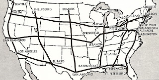
Original caption: Bulkley plan for superhighways--1938
In 1938, Senator Robert Bulkley of Ohio introduced a bill that would establish a national freeway system (see here and here for background information). The map above might have been based on support material for the bill; I don't know for sure, but Geddes does credit it to Bulkley.

The route system seems more notional than a result of serious study. Geographic considerations such as barriers (Hell's Canyon in northeastern Oregon, the Sierras south of Lake Tahoe) are skipped over. Then there are some genuine oddities. Why a freeway From Bismarck, North Dakota to San Antonio, Texas while the far more populous potential node of Minneapolis-St.Paul is ignored? And why are Phillipsburg, Montana and Lebanon, Missouri considered so important? Then there's Atlanta, connected to Pittsburgh over a lot of mountainous country while lacking a fast route along the Piedmont to Washington, D.C. and the Northeastern urban agglomeration. I wonder why Geddes bothered to include such an odd map; in any case, it's ignored in the surrounding text.

Original caption: A national motorway plan
A note to the lower right of the map on Page 278 of the book credits Norman Bel Geddes and includes the date 1939.

He explains the theory behind a curious detail of his proposed system as follows (pp 275, et. seq.):

Contrary to accepted practice, the motorways must not be laid down using cities as their terminal points, nor must they be allowed to infringe on city boundaries or the city proper.... While express motorways must be designed to carry fast, long-distance traffic, no existing roads need be scrapped. The country's 1940 roads will continue to carry local traffic, and their usefulness will be enhanced by connection with the new motorways....

The plan [shown on the map] is based on a relatively brief, preliminary study.... Its design sums up the basic requirements of such a [comprehensive] plan.

See how directly the lines lead from one region to another. Notice that a direct route connects Seattle and El Paso--making possible uninterrupted travel from the northwest tip of the United States to the southernmost section.... Nowhere do the cities connect the motorways, although they are all fairly close to them.... Traffic moves in almost a straight line from Boston to New Orleans without passing a single city. Yet no city of over 100,000 is more than 50 miles from a motorway and most of them are half that distance.

Look at the northernmost motorway, which runs east-west across the top ties of states.... [It] avoids Grand Rapids by 35 miles, and makes straight for Lake Michigan. At this point the lake is 50 miles wide. Never mind. There is no let-down on the motorway. It shoots directly across the lake on a long bridge.

He estimates that this Boston-Portland (Oregon) route would be only seven percent longer than a direct route taken by an airliner.


This isn't from Geddes -- it shows the present Interstate system (in blue)

Original caption: Motorway feeder to city
Unlike his Futurama model, motorways avoid cities. The illustration above indicates how Geddes visualized connections between cities and the superhighway system.


As we know, a national system of freeways was built. City centers were not ignored in many cases. We also found that urban growth tended to occur around points where interchanges to local highways and roads were placed, something Geddes didn't consider. Or perhaps he figured that all those smart planners would ensure zoning laws prohibiting development near interchanges. Such a system can be found in Germany; one normally can't easily hop off an Autobahn to find a motel and a McDonalds. (I ought to add that Autobahnen are now getting off-highway service areas with such amenities to supplement the normal service plazas. Still, many exits to cities dump you out in the country and another ten-minute drive is needed to get you safely into civilization.)

Norman Bel Geddes had a good imagination. Even though his ideas were not realized quite as he proposed, I find them interesting to study with hindsight.

Wednesday, February 16, 2011

Wilma Deering Looks Like ...?


The appearance of comic strip characters usually evolves from the first time they are shown until a definitive look is arrived at. The early Dick Tracy, Li'l Abner and Terry Lee (of Terry and the Pirates) were but wispy hints of the boldly-drawn evolved versions familiar to comic-strip buffs and those old enough to recall their heyday.

Occasionally, a character's look never quite settles down. Consider Wilma Deering, longtime girlfriend of Buck Rogers, the pioneering space-faring comic strip hero of "Buck Rogers in the 25th Century."

The Buck Rogers strip evolved from a science-fiction magazine story, appearing in newspapers early in 1929 (the Wikipedia entry on Buck Rogers is here). The original artist was Dick Calkins, an Army Air Service pilot and flight instructor in the Great War who went on to a career as a newspaper artist.

In my judgment, Calkins was never much of an artist, and the strip probably succeeded more on the novelty and glamor of space travel and strange other worlds (along with standard-issue swashbuckling in sci-fi guise) than in the quality of Calkins' drawing.

Eventually, Calkins' imagery became fairly consistent. But in the early months of the strip, the appearance of Buck, Wilma and supporting characters varied considerably. In fact, it almost seemed like more than one artist had a hand in the strip -- though as far as we know, help in the form of Rick Yager didn't appear for another four years.

The Wikipedia entries above disagree as to when and to what degree Yager took over from Calkins. Yager had responsibility for the Sunday strips, and his style there was definitely different from that of Calkins by the 1940s. I'm inclined to agree with the Calkins entry that Calkins did the dailies as late as 1947 or so. That's based on drawing style. On the other hand, Yager was able to mimic the flowing style of "Lichty" in the Grin and Bear It cartoon, so perhaps he indeed drew dailies in the brittle idiom Calkins had evolved as the 1930s wore on.

Below are examples of Calkins' version of Wilma Deering, four from the first year of the stip, and one from ten years later.

Gallery

This is from the second-ever panel, in which Wilma encounters Buck for the first time. He had just emerged from a 500-year hibernation in a cave, that sleep induced by a mysterious gas.

Wilma hasn't evolved much at this early point. For example, she still seems to be a brunette, though her anatomy is drawn more surely.

The images above are in the same day's panel from a few months later. Calkins' artwork has improved. Characters' features edge towards the suggested, rather than the laboriously drawn. So far as I'm concerned, from an aesthetic viewpoint, the seated Wilma is the best that Calkins ever did. Since her depiction was inconsistent day-by day, week-by-week, I suppose that, statistically, Calkins had to nail it once in a rare while.

Here's Wilma probably from a mid-1930s panel. Calkins' style is now more harsh -- a brittle feel. This was probably just a natural evolution on Calkins' part, though it's possible he was urged to make bolder, darker, more structured images so that the strip would stand out better on the cheap newsprint it was printed on. And Wilma, now a blonde for sure, isn't as well done as in the selections above.

This is from 1939. The crisp effect continues (as it will well into the 1940s). The Wilma to the left rates an okay, but the face-on view at the right is pretty bad. Try clicking on this image for a larger view.


If I have to characterize Calkins, I would call him inconsistent -- occasionally coming up with a satisfying image, but usually dishing out the level of hack-work that was acceptable to 1930s newspaper readers. This last point takes into account the average artistic competency demonstrated in adventure strips of the time. Far, far above that level was the talent exhibited by Alex Raymond (Flash Gordon), Hal Foster (Tarzan and Prince Valiant), Burne Hogarth (Tarzan) and the rapidly improving Milton Caniff (Terry and the Pirates).