A recent example is the new Apple Store in Seattle's University Village shopping center. It's less than three miles from where I live and I visit the Village at least once a day to walk around and go to a Starbucks. So I watched the construction at every stage of development. Playing my little game, I had no clue as to what store or stores the building might contain.
Construction lasted for about a year, the foundation work being done during Seattle's summer dry season. Such timing is almost always a good idea because building a foundation in mud and glop might lead to trouble. In Apple's case, foundation construction risks were heightened by the fact that 100 years earlier the site was on low-lying, possibly marshy land a few hundred feet from the shore of Lake Washington. In 1917 the ship canal system from the lake to Puget Sound was opened and water level of the lake dropped by around nine feet, putting the shopping center safely above lake level.
The above-ground part of the building eventually appeared and it was evident that it was not coming close to occupying the entire site. This, and the large wall areas devoted to what might be windows, became the focus of my mental game. Would there be more than one shop there? What would happen if the tenant left and the structure had to be modified for a new one? -- it didn't look easy to modify. All this contradicted conventional design practices for open-air shopping centers, of which University Village is a highly successful example.
Two or three days before the store opened it became evident that it would be a new Apple Store, replacing the existing one a few feet away. Then it all made sense. Apple stores have very high levels of sales income to square-footage of floor space, so there was no necessity for the building to fill out the entire site. Plus, given Apple's huge amount of liquid assets, the company is unlikely to abandon the store for a long time, so the matter of renovating it for a new tenant is unlikely to happen for many years.
Some background regarding the new Apple Store is here. It mentions that there is a basement. The basement is used for storage of inventory. And it's in that zone of low, possibly somewhat formerly waterlogged land of a century and more ago. It hope the storage area is highly waterproofed.

Now for the architecture: two iPhone photos I took on a Sunday morning before the store opened for the day. It seems that for the last few years Apple has been building some new stores using classical modernist style, though these store are not identical. This building sits on a platform of about the same extent as the overhanging roof. Although the overall design differs, its details gives me the feeling of Mies van der Rohe's famous 1929 Barcelona Pavilion.

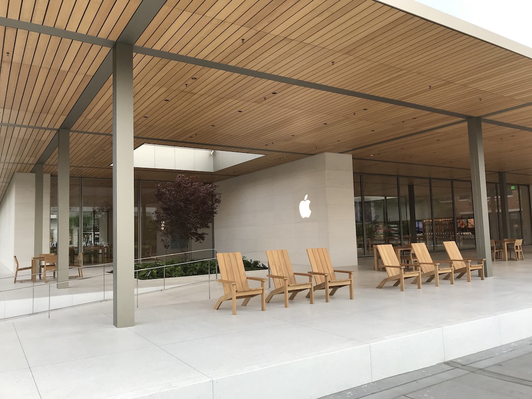
Very elegant. Better yet, it is unlike the nearby connected-storefronts of the Village. I am of the opinion that International Style architecture works well only when it is contrasted by its setting -- concentrations of International are visually lethal.
3 comments:
DP—
Even though I’m a Mac enthusiast, Apple stores hit me as being very arrogant. You have identified the new Seattle Apple store as designed in the International Style—actually, resurrected 1950s modernist. You commented, "I am of the opinion that International Style architecture works well only when it is contrasted by its setting—concentrations of International are visually lethal.”
One of the most important things about a commercial sales structure is that it appear welcoming—friendly looking. This place looks more like a law office. The computer has opened new worlds for mankind. It is one of the the most important developments since movable type. Rather than reflecting this, Apple presents us with a sales building designed to celebrate one of architecture's dead ends—cold, indifferent looking. To me it says, “We really don’t need your business.” This is a building designed with the company in mind rater than the customer.
PS
Paul -- Steve Jobs admired cleanly styled products, eventually hiring Jony Ive as lead industrial designer. Ive continues in that role, but has been branching into architecture, most famously in the new donut-shaped corporate headquarters building. As for the building I featured, it doesn't have to function as a normal retail merchandizing tool. Apple stores are destinations, not storefronts that catch one's whimsy or that suddenly remind a passerby that, yeah, I need to get one of those items I see in the window. In other words, I think Apple can use whatever store design it chooses without affecting sales much. And the store in question does fit Ive's industrial design thinking. As I suggested in the post, to me it seems a bit too derivative of an architectural icon for my comfort.
DP—
You are right. Apple can use whatever store design it chooses without affecting sales much—at least for the moment.
Apple was founded on building the computer "for the rest of us”. Their products were always deigned to be user friendly. When I opened my Macintosh in 1991, I didn’t see a logo or a brand identification. I saw one word, “hello”.
From the very beginning, Apple products were amazing but always welcoming and easy to use. The products were always designed and built with the user in mind. Customers knew this and a unique loyalty was created—not just a customer base.
We are in the midst of a revolution in the methods of retail sales. The retail stores of the future will probably be something closer to the Apple stores or Amazon stores. However, future successful retail stores will be still trying to attract customers—and to do so they must be designed with the customer in mind. As you mentioned, the Apple store featured “... does fit Ive's industrial design thinking.” This is the flaw that I see. A retail store of any kind must be welcoming and friendly. Here “friendly” means designed with the customer in mind.
PS
Post a Comment