In my opinion, modernist architecture usually works best when it is in a non-modernist setting. That setting might be a large lot filled with trees, gardens and lawns if the building is a residence or, if it is in an urban location, surrounding buildings having traditional architecture. If the structure is well-designed, it can have a jewel-like character.
But a large cluster of modernist buildings tends to be visually sterile and anti-human. After all, we humans evolved in natural settings filled with complexity and details -- not classical geometrical shapes. Which is why most pre-modern buildings of importance in Europe, Asia, Egypt and Central America employed ornamentation to varying degrees.
An example of classically sterile modernism applied to apartment structures is the 860-880 Lake Shore Drive complex in Chicago. They were designed by the sainted modernist Mies van der Rohe, so using that example shouldn't be regarded as a cheap shot on my part.
A postmodern structure that comes close to traditional appreciation of complexity of detail is the Shoal Point Condominium in Victoria, British Columbia. It's the large, reddish structure behind the houseboats in this photo that I recently took (click my images to enlarge slightly).
The architect is Paul Merrick, whose firm's Web site is here.
A snotty, condescending modernist take on Shoal Point by Trevor Boddy in Toronto's Globe and Mail is here
Admittedly, Shoal Point lacks clarity in terms of basic form. But that doesn't bother me because nature itself often lacks visual clarity. And an apartment or condominium building does not require the clarity of a train station or airport terminal. Shoal Point uses a number of common elements such as window shapes, but stirs them into a tangle where they visually pop out here and there rather than march together like soldiers on parade. And it also employs a good deal of ornamentation. Let's take a closer look.
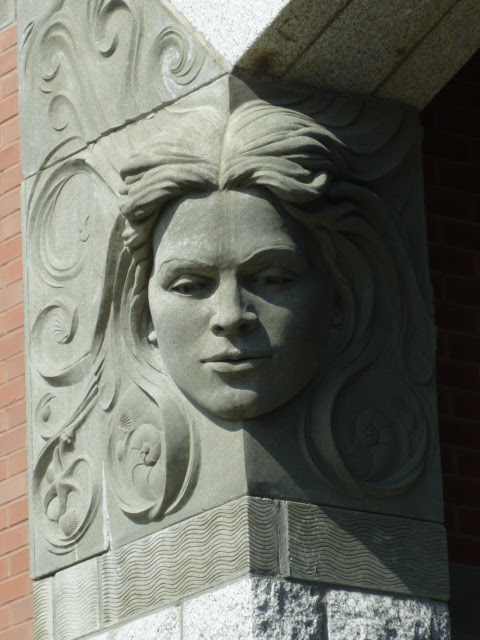
Sculpted elements are by Victoria artist Derek Rowe (no Wikipedia entry or personal web sit at the top of a Google search, but there is this).
This is the entrance by Dallas Road. There's a definite Art Nouveau feel to it, though the ironwork pattern is geometric (Secession?) rather than organic. I was taken by the sculpted faces.
Note the thematic seashore elements (starfish, seashell) in the lower hair swirls as well as fish in some of the images above.


5 comments:
Rather stylish, I'd have said.
Visual clarity means, I am guessing, an integrated approach to the architecture. That is very different from the question of whether the complex is sterile or decorated. True?
Hels -- "Visual clarity" is a label I thought up as I was writing the post. I was thinking of having the components of a structure arranged in such a way that visitors can quickly understand what is where. I used the example of transportation facilities that are (often) laid out so that it's clear that the ticketing area, waiting areas, gates and such are what they are and are placed to conform to the process of getting to a train or plane. An apartment house, aside from the entrance might be laid out in an odd manor such as the building shown.
Problem is, many train/plane/etc. terminals are poorly laid out. The most confusing one that comes to my mind is Terminal 1 at Charles de Gaulle airport in Roissy. It is the one built in the shape of a drum with multiple levels. When new, it was supposed to be fantastic, space-age stuff. Maybe it was that, but I find it highly confusing to get around. Essentially the drum-shaped exterior, while clean looking, dictated a mess of an interior layout.
Your comments on modern architecture and Shoal Point are interesting. Although not successful in all aspects our attempts to move past the "build a soulless box, sell it for max profit and move on" was way beyond what anyone then or since has had the fortitude to attempt. Only time will tell if my sculptural work on the building has any lasting interest. Thank you for at least paying attention to it. Derek Rowe (http://www.derekrowe.ca)
Your exploration of de-modernizing modernist architecture in Victoria is thought-provoking. When considering renovations or restoration projects, utilizing "https://usepromos.com/promo-codes/safelite-promo-code-$100-2022" can provide cost-saving opportunities for preserving architectural heritage. Thanks for shedding light on this important architectural discourse.
Post a Comment